Monochromatic quilt patterns – one hue wonders – are misunderstood. We love color sooo much that one color is – YAWN – nothing compared to ALL THE COLORS.
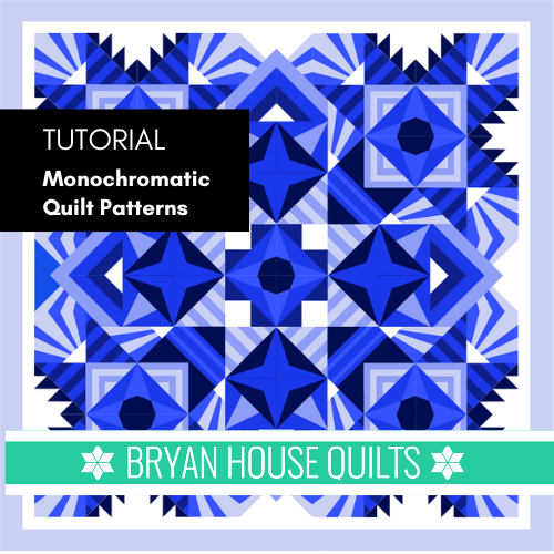
But what if you could use ALL THE COLORS OF ONE COLOR for the wow-est effects?
In this blog post, I’m sharing how to make a fantastic quilt with different colors of ONE color. I’ll guide you through the how-to guide for using one color in four ways – using temperature, intensity, contrast and value.
Then I’ll take you through the steps for choosing colors and fabrics for different palettes and effects.

Key Highlights
- Monochrome quilts are a great way to use a favorite color.
- Monochrome palettes are not only black, white and gray – any color and all it’s variations.
- Tints, tones and shades of one color creates palettes from subtle to vibrant.
- Using color tools – a color wheel and a value finder – help you choose the best fabrics.
- Get organized with a step-by-step approach to choosing color, fabrics and quilt blocks.
- Your creativity kicks in when you are limited to one color.
- Sorting fabrics from light to dark and textures shows you more possibilities.
Understanding Monochromatic Palettes
First, let’s erase the big misconception about monochromatic color palettes. NOT BORING!
Riffing with one color is creative and fun, often with surprising results. I’ll use one color with their tints, tones and shades in that color family – with prints and solids. So many choices!
I love these because they’re easily made modern with bold, graphic blocks, value changes and contrast. My BOM projects usually include a one-color palette choice.
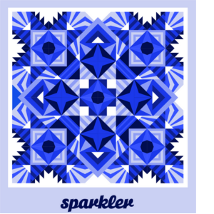
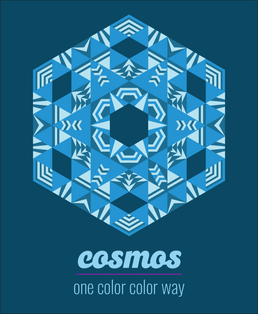
Go Monochrome! Go Scraps!
What to do with those small fabric pieces and ends? Monochrome quilting binge!
While you’re sew binging, monochromatic quilt patterns will solve quilty problems, boost your color confidence and make a very pretty quilt. Here’s why:
- Use up lonely leftovers from a fabric collection.
- Whittle down your fabrics of one color, like from your (name a color) phase.
- Easy to create with one hue to guide your choices.
- Make a quilt for someone who loves a certain color, say coral, and use up those pesky oranges.
- Match a new couple’s decor with bridal registry sleuthing – and nail that color family.
- Love the quilt pattern but stuck on color decisions. Go mono.
- Boost your creativity with unusual fabric combos that work.
What is a monochromatic color palette?
A monochromatic color palette is made with shades, tints, tones and hues of a single color. For quilters, this means selecting colors and fabrics that use a version of one color.
Tutorial: Planning Monochromatic Quilt Patterns
Make the most of your planning time by following these steps and tips. I know you’ll have fun when you approach it as a process.
Use Color Tools
Color tools are valuable items in the sewing room. I regularly use a color chips, color wheel, and value finder.
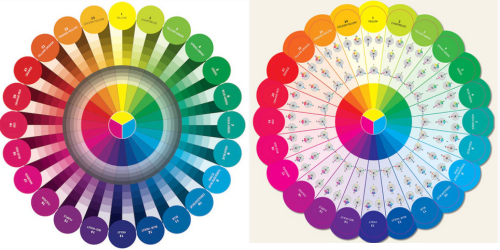
The color wheel shows you color schemes or harmonies. The wheel shows a gradation of each tint, tone and shade of a color. Since you’re relying on one color to do the work, you need to see where a color starts from.
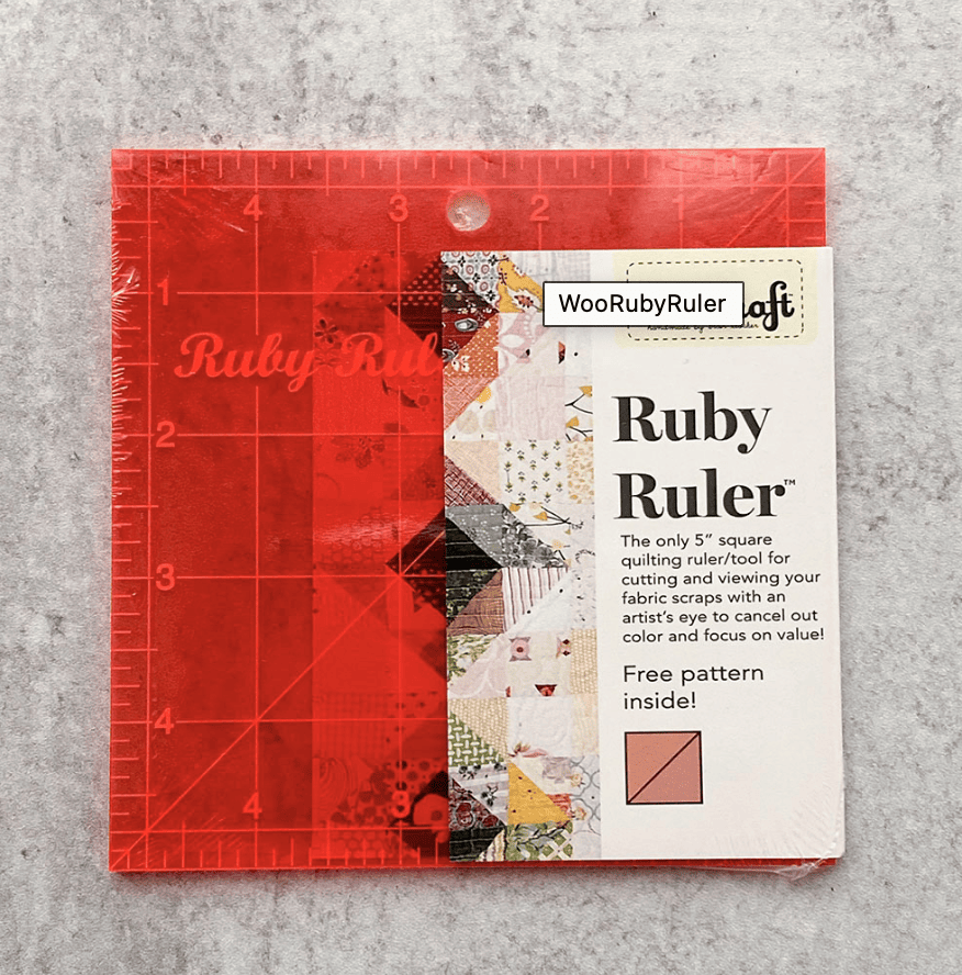
A value finder is the real deal for nailing down whether a fabric is light, medium or dark. It’s like an extra set of color eyes. Hold the value finder over the fabric – it cancels the color so you only see how light or dark the fabric is.
ChoosIng Monochrome Colors For Quilters
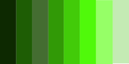
Choosing colors is fun and easy for this scheme. I’ve chosen green because there are so many greens to choose from in Kona cotton solids. The palette tutorial below shows four different ways (and there are more ways to do this) to conjure up a one-hue scheme.
Lesson 1: Blurred boundaries
- Values are more similar.
- Use between one to four values, that are ordered, such as very light, light, medium light and medium. This is called a low volume gradient.

Lesson 2. Strong contrast between values – these values are more different than alike.
- Use four values with more difference between them, such as light, medium, medium dark and dark.

Lesson 3. Choose similar temperatures or intensity
- Use greens that are all “warm” or all “cool”.
- Another variation is to use all saturated and intense, or all tones which soften intensity.
- The goal is to use temperature (cool or warm) and intensity (saturation) to create color harmony.

Lesson 4. Contrasts in temperatures and intensities
- Choose DIFFERENT temperatures and intensities to create CONTRAST
- Use warm and cool versions together.
- A color’s visual weight will come into play here, adding contrast. Kona’s green Jungle is very dark and weighty.

Ugly Fabrics Light It Up
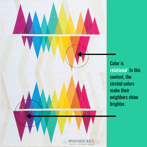
These quilts are a great way to use up “ugly” fabrics. You need them. They’re dim or darkish fabrics that can’t stand-alone, but make their neighbors shine. Ugly fabrics are essential in monochrome quilt patterns. They offer contrast and make other colors more intense or brilliant.
NOTE: Color is relational so the colors aren’t truly ugly. They seem less attractive next to their neighbor.
Here’s an example: I struggled with the warm palette colors in the Wavelength quilt. Another bright warm color wedged in between the orange and hot pink would make them too intense (circled in second row). Their intensity is too similar. I added a dark, grayish red to solve the dilemma. I added a very dark purple to the fourth row to make the magenta and medium purple pop more.
Do you like seamless gradients? Tons of contrast?
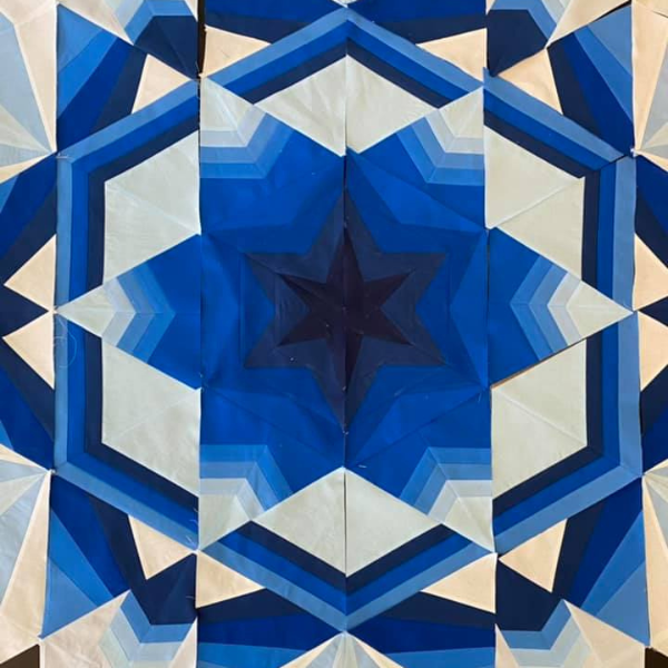
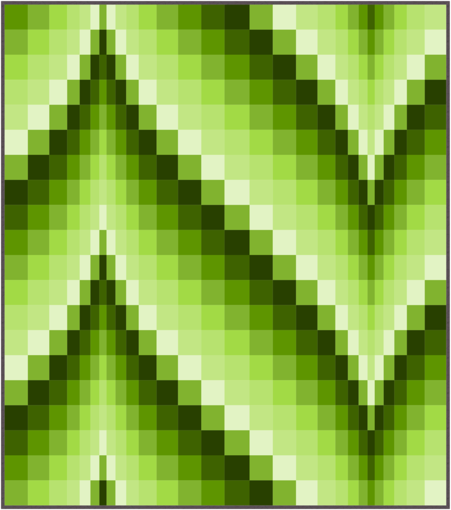
Gradients are professional blenders – they take a color from light to dark, creating instant depth and harmony. They work well in these quilts because you can use a hue, tint, tone and a shade of one color to make one. At first, they seem mismatched – like a toddler who dresses herself! That’s because we’re more skilled at matching fabrics, than harmonizing them.
Here’s an example of a seamless gradient quilt. There are so many transitions in value that the colors blur when the reach the center.
Subbing Out Black and White
Many modern quilts use black and white for strong contrast and backgrounds. Instead, create color harmony by using the very lightest and darkest values of the hue. You can’t tell the difference unless you hold them side by side with white and black. The subtle glow effect makes a “wow” quilt!
Choosing Fabrics
When you get a feel for your color options, you’re ready to choose fabrics. Use your wheel and main fabric to help you see what works, especially with prints and texture.
Try out these fabric recipes:
- Blenders
- Tone-on-tone fabrics with a prominent print.
- Subtle prints are multipurpose – they can look darker or lighter depending on where you place them.
- Mix solid colors with subtle prints.
- Choose solid fabrics when you want to maintain strong lines in the blocks and overall pattern. Prints will blur them.
- Choose print fabrics when you want a color blizzard – lines, textures and colors colliding in interesting ways.
- Play musical chairs with fabrics and try out unusual layouts and combinations.
Steps for Stunning Monochromatic Quilts
How to Sort Fabrics for Quilt Designs
Organizing fabrics creates a visual hierarchy from lightest to darkest, and coolest to warmest. Start by sorting fabrics from lights to darks in 5 or 6 stacks. Then sort each stack into two piles based on temperature – cool and warm. This gives you two ways to add contrast or find similars with each value.
How to Add Depth with Fabric to Monochromatic Quilt Patterns
Use more contrast to create depth and interest – they make us double-take. The problem? We usually buy more medium value fabrics – we need the lights and darks to add depth.
Ombre fabrics are great examples of contrast and seamless transitions. You could use them in this type of quilt – it’s not cheating!
Using high contrast combos might be out of your comfort zone. I get it. Pull out your very light, light and dark, very dark piles. Start pairing the very light and very darks – take photos of interesting pairs. Now add two more fabrics of a light and a dark to the pairs. Now you have created four-fabric combos with high contrast.
What are some popular monochromatic quilt ideas?
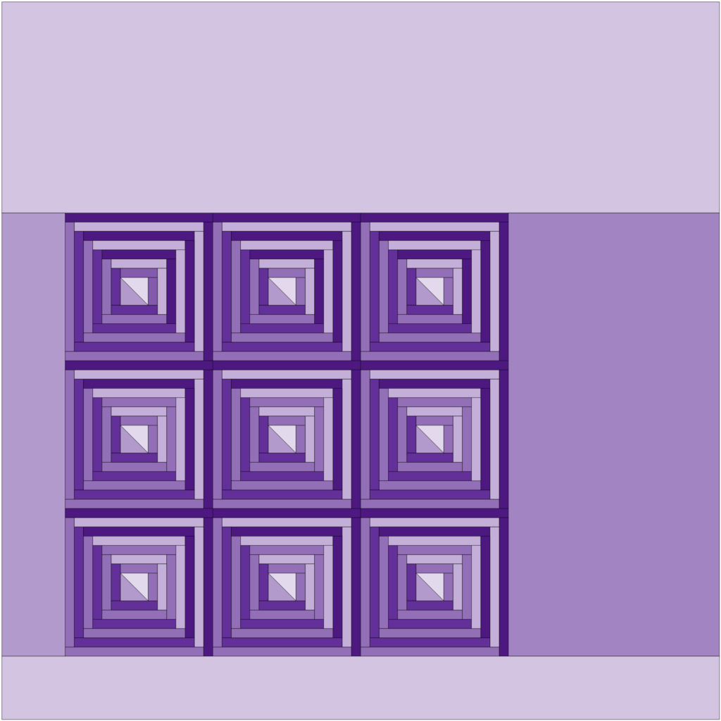
Almost every quilt pattern could work in a monochromatic scheme. Log cabin blocks pair easily one-color gradations. Triple Irish Chain blocks look amazing with subtle value changes in the chains and high contrast between the chains. Bargello quilts are masters at transitions in two directions.
Love Patchwork, Sewing and Quilting Blogs? A Quilty Visual Sampler
Monochromatic quilt patterns and blocks offer a wide range of possibilities for creating beautiful and unique quilts.
To prove that monochromatic quilt patterns are anything but boring, the yellow Suns Quilt Pattern on True Blue Quilts shows a design that would look terrific in any one color.
The Fronds pattern bundle in several monochrome palettes from Suzy Quilts blog.
See a series of fresh red/pink improvisational quilts in this series on A Quilter’s Table.
Carolyn Friendlander’s Slash quilt works beautifully in one color.
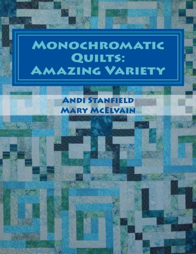
Each color in this book has its own quilt design ( 11 total) in a monochromatic palette. Quilts are made with a mix of techniques from simple to complex by Monochrome Quilts: Amazing Variety
Do you collect color palettes? A pretty palette is pinned to my Pinterest color board, so I can easily find color inspirations.
WRAP UP
A monochromatic quilt pattern is fun to plan and make, especially using your fabric collection because we tend to collect large quantities of certain colors! Color tools are instant helpers when choosing a palette and selecting fabrics. Keep your quilt interesting by mixing prints and solids, using warm and cool temperatures and light to dark values. Easy-to-make gradations add depth and harmony while ugly fabrics make other fabrics shine. The best part of quilting this pattern is using your creativity to make a beautiful quilt with one color you love.

Frequently Asked Questions
What Is the Best Fabric for Monochromatic Quilt Patterns?
When putting together a fabric selection, it’s important to consider the color wheel and select fabrics that belong to the same color family. You need fabrics that vary in value, temperature and intensity to make a visually interesting quilt. Add in prints to blur the design lines and use only solid fabrics to emphasize lines and shapes.

DOWNLOAD FREE QUILT BLOCK PATTERN: OUTSHINE
Outshine, my newest triangle block is a free block pattern with a tutorial. Piece the triangles together to make a stunning quilt. Start yours here!

JOIN MAKE MODERN TRIANGLES ANYTIME

Introducing the Aurora Block of the Month, an all NEW design inside the Make Modern Triangles Club. for 2024! Learn more about making modern triangles with our BOM quilts, including Aurora.

Thank you for this blog on Monochromatic quilts. In all my years of sewing/quilting, I never thought to make this type of quilt. This motivates me to start going through my fabrics to see what I can put together in this type of quilt. Never to old to learn new tricks.
I love monochromatic quilts