Choose easy analogous color combinations for quilts – a simple method for choosing three-color harmonies with visually stunning results. This foolproof color scheme makes color easy. I will show you lots of inspiration and simple lessons on how to use the “3-color wonder” in your quilts.
In this post I’ll show you how to:
- make this combination using cool or warm colors – perfect for modern quilts
- choose quilt blocks for this scheme
- add glow, mood, depth, interest and visual harmony to your quilts. All the good stuff.
I’ll start with the basics then show you how to take it to the next level with examples. This is going to be fun and inspiring!

KEY Highlights
- An analogous color combination is created with any two or three colors next to each other on a color wheel.
- You are limited to two or three colors but unlimited variations of them.
- This color scheme is known for creating soothing and cool to energetic and passionate vibes.
- Shades, tints, and tones add surprising twists to your quilts with depth, interest, mood and visual harmony.
- Learn how to create glowing effects and gradients. with three colors.
- Inspiration for quilt designs
Meet Your New Favorite Color Scheme
No more second-guessing color choices! That’s why I recommend using color schemes. They deliver a perfect colorway with a few easy decisions: two to three colors and where to place them in your layout. Bottom line: An analogous color combination is a simple way to make beautiful quilts.
An analogous color combination has three fool-proof features:
- Easy to choose: They are next to each on the color wheel. No second-guessing.
- Mistake-free: Just pick two or three and it works for many modern quilt designs. I can’t mess this up.
- Play favorites: Pick your favorite color and select two adjacent ones to round out the palette. Take a holiday from second-guessing yourself.
UnderstANDING Analogous Color Combinations for a Quilt
I love the depth and insta-harmony three colors and their offshoots make. So, so easy.
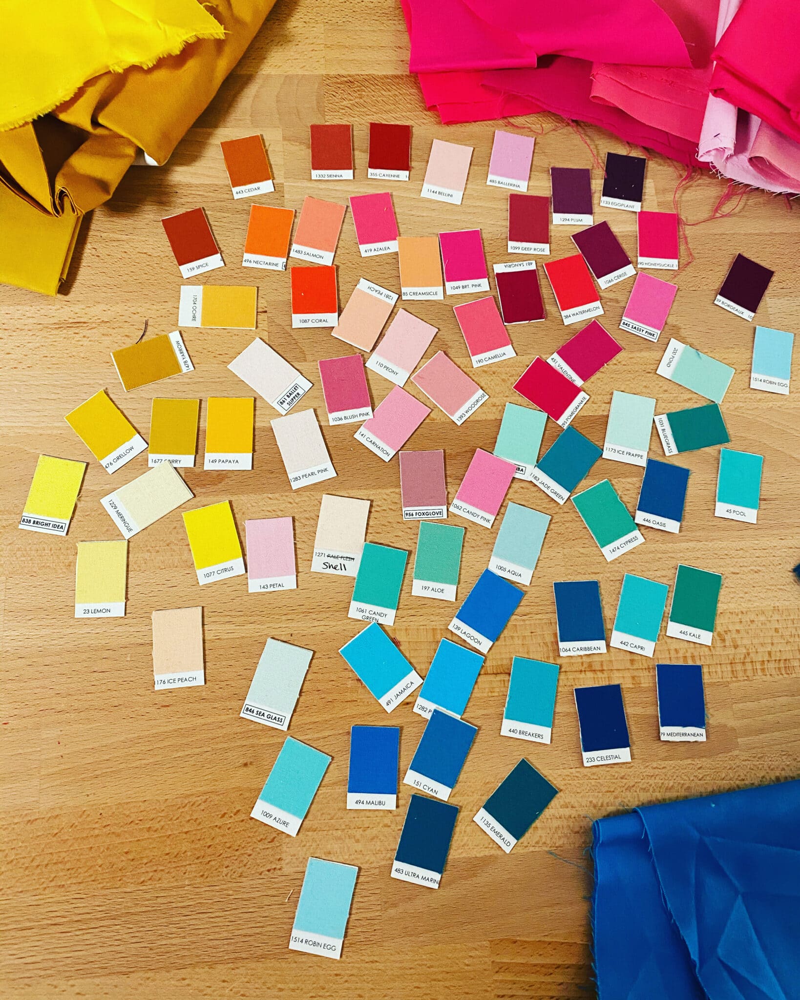
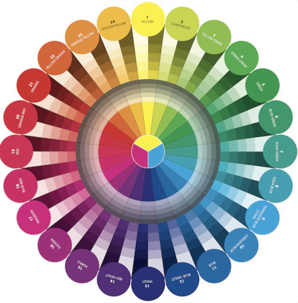
I like to use a quilters color wheel and solid fabric “chips” (little Kona swatches) to start the process. The color wheel quickly identifies primary, secondary and tertiary hues and their adjacent neighbors.
Your color wheel may show 12, 16, or 24 colors. None of them are wrong. In fact, there are infinite colors. Luckily, color wheel makers have kept it small enough to fit in my bag.
Make a modern triangle in my free class and learn the magic of Freezer Paper Piecing! Download the free pattern and I’ll walk you step-by-step through the technique. Get started here!
The Basics of an Analogous Color Combination
To understand adjacent schemes, take a quick segue into this post about color harmonies. Many color wheels are divided into twelve hues, including the three primary hues (red, yellow, and blue), the three secondary hues (orange, green, and violet), and the six tertiary hues (formed by mixing primary and secondary hues). for this scheme, quilters choose two or three colors next to each other – a dominant, supporting and accent for this scheme.
Color Theory in Quilting
I’m fascinated by color theory. Every quilter wants to use color well. But…can you name five quilters who like reading color theory textbooks? Exactly. (nerd alert – I’ve read them)
Theories about color explore the relationships between them and how they interact with each other in design, human psychology and nature. Artists, scientists, inventors and doctors have contributed to a wider understanding of how color works.
Let’s take advantage of their research so we use color well without a textbook deep dive! Use a scheme which is already based on what works. Your color favorites and a little knowledge goes a long way.
Keep it simple – start by using a color wheel with built-in schemes and guides.
Tip: Special Color Wheel for Quilting
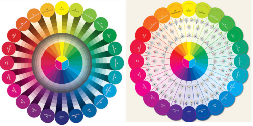
WHOA there. Before you click BUY NOW, make sure you select a quilter’s color wheel which is based on screen printing ink colors: cyan, magenta, yellow and black. These are used for printing fabrics. They are mixed in percentages with the others to make all the colors. It’s kind of amazing.
Quilters can’t mix fabrics like artists mix paint – we have to use what’s available from manufacturers or dye our own. Hence, our very own wheel. Check out this quilter’s color wheel designed by color expert Joen Wolfrom.
Why ColorFUL Neighbors Make the Best Neighbors
Colorful next-door neighbors make the best neighbors on the color wheel because they create an overall harmony and seamless blending. Why? Because they have similar color temperatures. Whether cool or warm, the color climate is just right for colors next door. Harmony is good – all ends well that blends well!
LESSON 1: Select Your Colors by Navigating the Color Wheel
Selecting the right ones for your quilt is a biggie. We just want’ em to get along. By following the natural progression of colors on the wheel, your job is done.
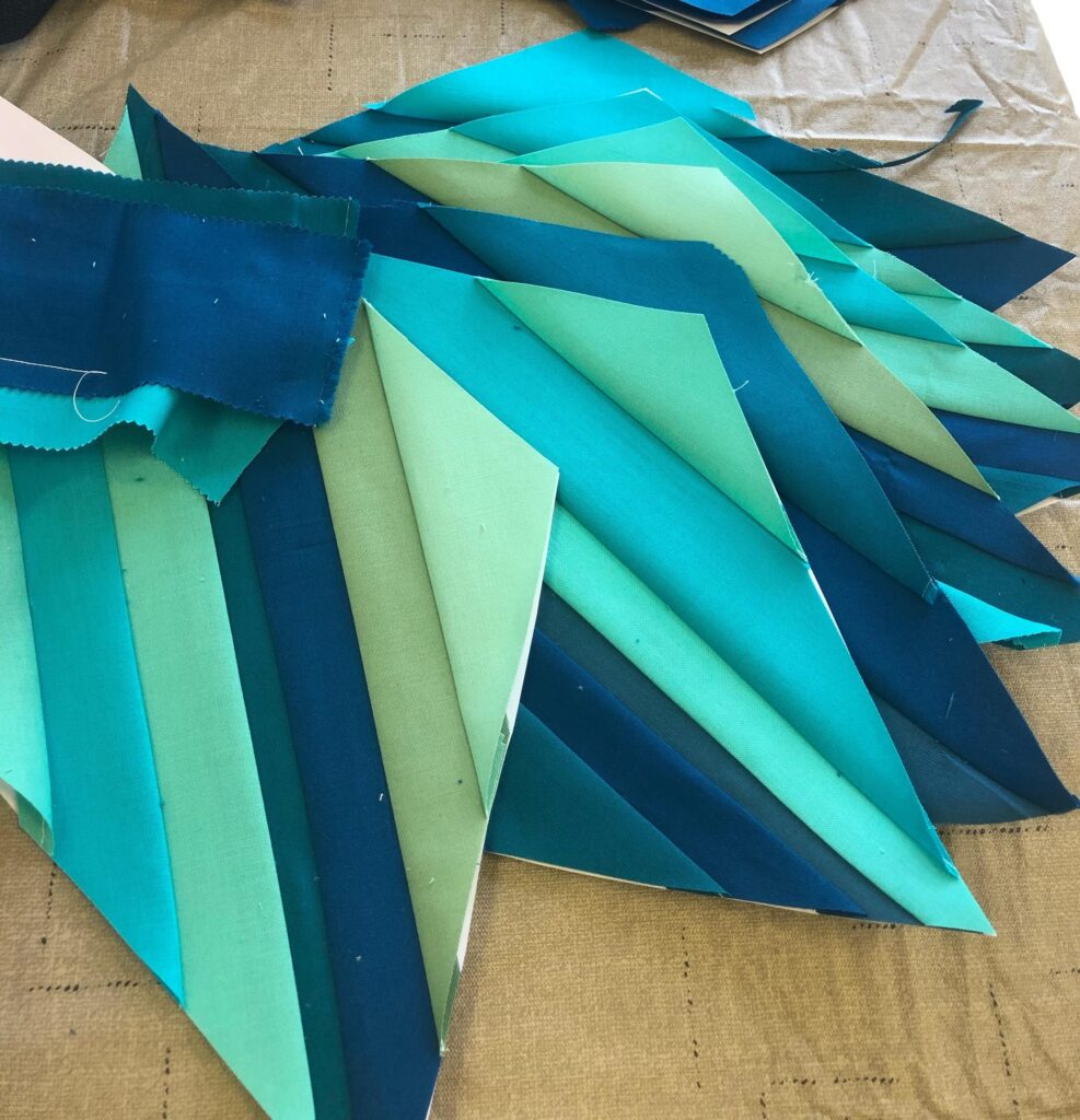
First, pick a dominant or main color in your color scheme. Can you guess what it is in Murmuration below?
— suspense —
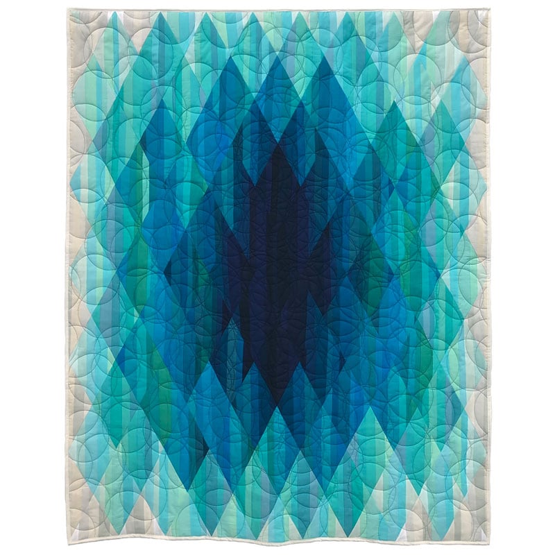
Blue!
Next, select the secondary color adjacent to it on one or both sides on the color wheel. This one adds a bit of glow to the dominant one. Go for the glow. I chose blue-green.
Next, pick your third member of the trio from either side of the dominant or secondary one. I chose green tones.
choosing fabrics
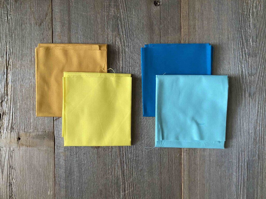
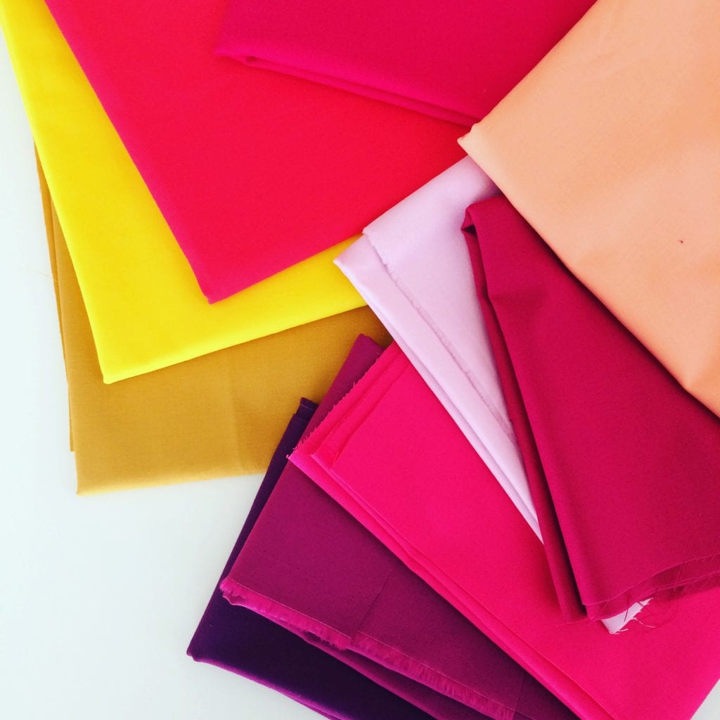
Now it’s time to pick fabrics. I chose many blues and blue-greens, mostly from my stash. More than 50 colors were used. But I don’t recommend starting with 50 fabrics the first time – 6 to 12 is plenty.
I like to use the 60-30-10 rule for color placement. Sixty percent are blue, 30 are blue-green and 10 are green.
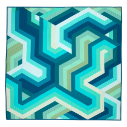
Murmuration used 10 analogous colors from yellow-green to blue on a 24-colors wheel.
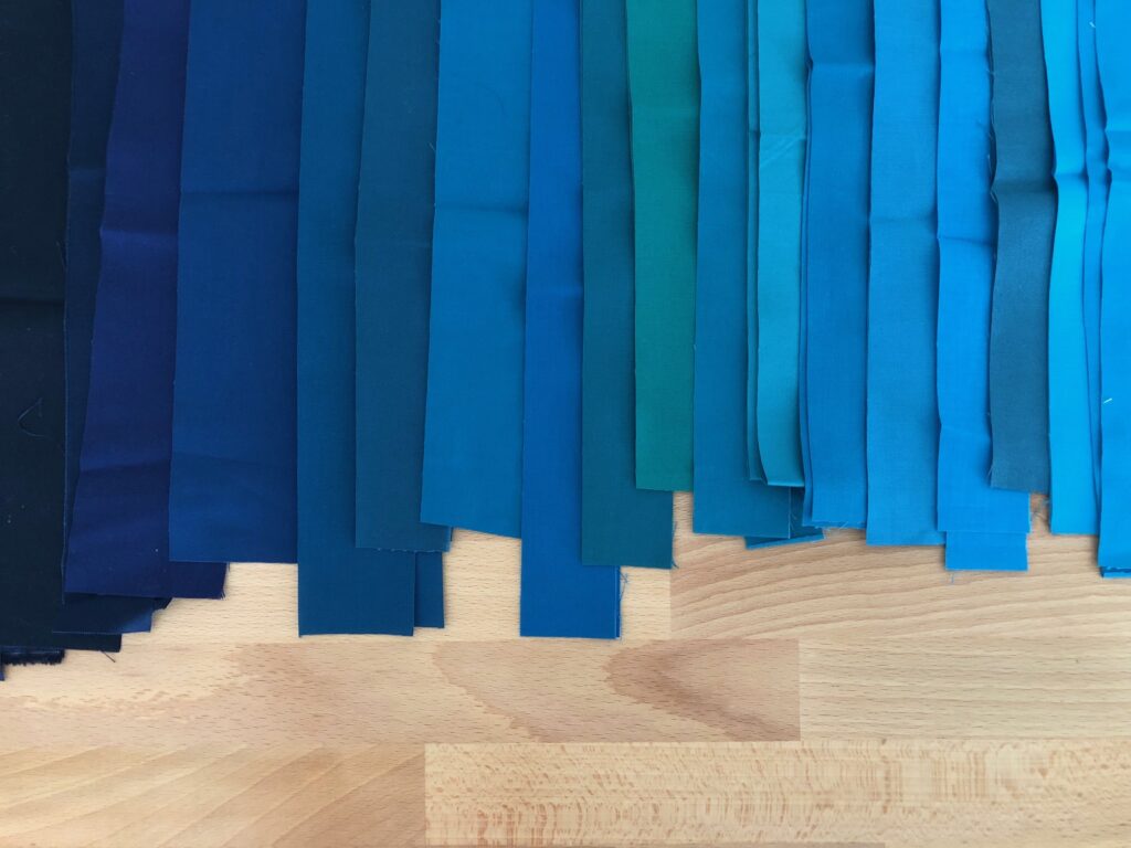
SORTING FABRICS BY VALUES
Next, I sort them into value groupings: Dark, medium-dark, medium, medium-light, light and very light. Make sure that blue and closer-to-blue fabrics are 60% of each value grouping. Once you start the process, the colors fall into place.
Typically, I’ll use three colors and expand those into 9 to 12 very light to dark values of the colors.
Then I plan the layout, based on how much contrast, blending and gradations I want. Value guides the placement in the quilt design. I love to audition and play with the fabric strips to capture the pretty! And no matter what you place together, it will look darn good. That’s a foolproof analogous scheme for you.
LESSON 2: QUILT BLOCKS FOR Analogous COLOR COMBINATIONS
Did you know that the type of quilt block can choose the color scheme for you? Yup.
Many basic quilt blocks are made with two mirrored sides – half square triangles, diamonds, nine-patch and flying geese. have three areas – primary, secondary and accents. Typically, I’ll use three hues and expand them into 6 to 9 very light to dark values of the colors. Or you can let the type of block choose the color scheme, instead of you!
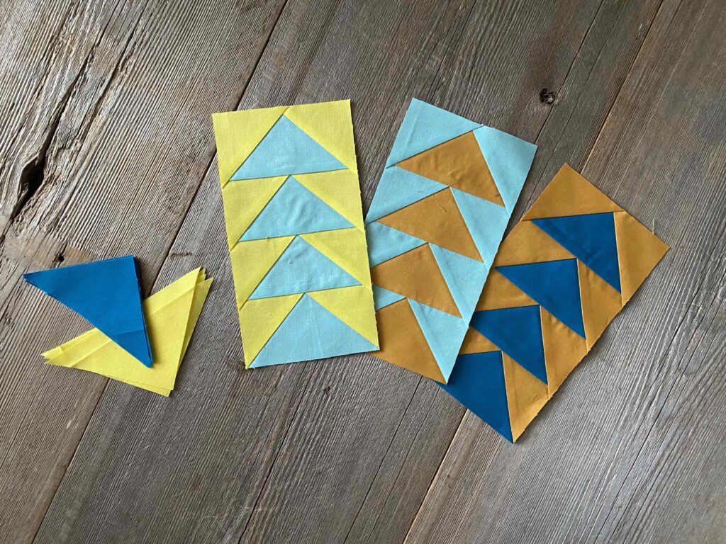
Flying Geese Quilt Blocks
Try the versatile flying geese block. Because block placement is straightforward in this design, it’s easy to place your colors. Any two-color block works well. Almost.
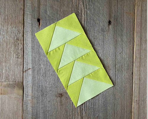
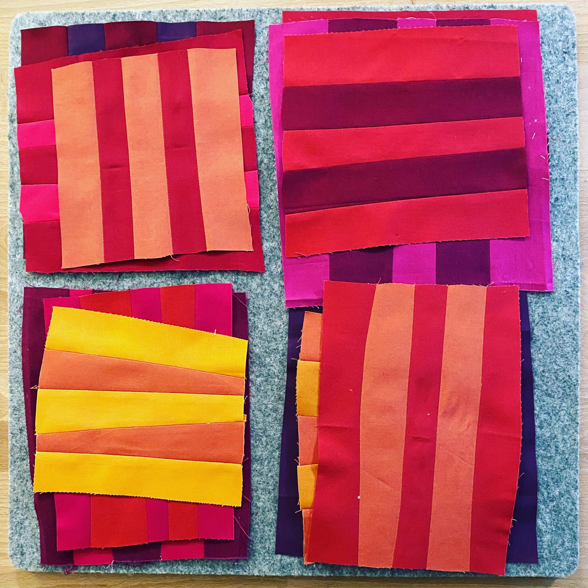
These yellow-greens are too close in color to provide contrast.
I chose two analogous pairs, then mixed them up. More contrast in the yellow and gold in the second try!
It’s fun to mix analogous color combinations with other analogous pals.
Nine Patch
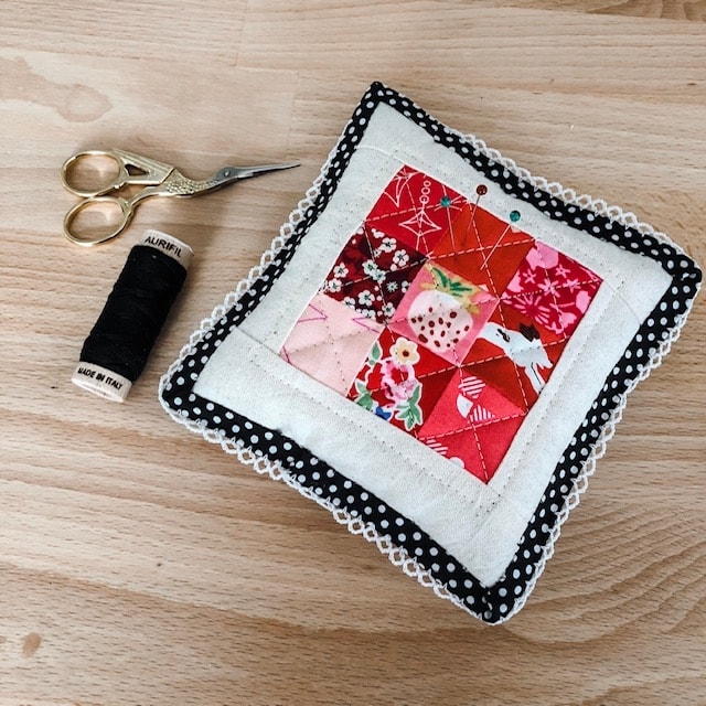
A nine-patch block is an easy way to practice placing analogous color combinations. Put your lightest or darkest color in the center and play from there, creating depth or glow. This grouping includes light violet, red and red-violet and their tints and shades.
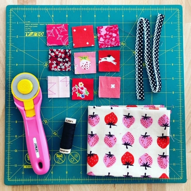
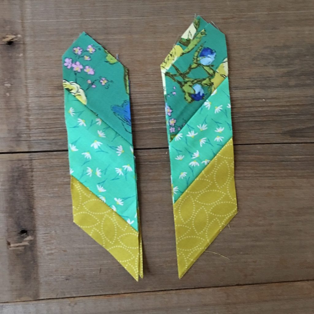
This cutie also proves I can make quilts with prints!
Striped
Another fun block for analogous schemes is striped because – bonus! – your color eye gets schooled in the process. You’ll learn to see the differences between neighboring colors and how they interact.
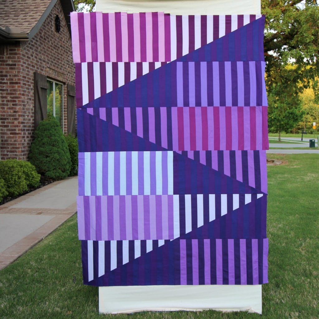
Pathway is a version of stripes with four adjacent colors plus white.
My favorite designs use radial symmetry with a medallion style layout – most of my block of the month quilts use this style.
LESSON 3: Design Techniques with Analogous Combinations
Using Shades, Tints and Tones
Let’s get fancy.
Analogous harmonies are known to be visually pleasing and comforting. These color harmonies create wonderful “no brainer” color palettes that match well and create serene, comfortable designs. However, watch out for too much blending where the colors are so similar the palette becomes muddled.
To avoid a muddled look in your analogous color palettes, choose one color to dominate, a second to support. Use the third color – along with your neutral or background – as an accent. This combination is sometimes referred to as the “60-30-10” rule, where 60% of the design is the dominant color, 30% is the support color, and 10% is the accent color.
Using shades, tints and tones is fancy stuff, but not difficult. Your quilts become visually stunning with these color changes. Shades are created by adding black to a color, resulting in a darker and more intense version of the original hue. Tints are created by adding white to a color, resulting in a lighter and softer version of the original hue. Tones, on the other hand, are created by adding gray to a color, resulting in a muted, subtle version of the original hue.
Let’s compare a muddled palette with one that includes tints, tones and shades of those colors. Here are my muddled choices:
I expanded it below by adding a tint, tone and shade to each color above. The contrast and energy increases with these changes.

Here’s the full enchilada including the original muddy colors…

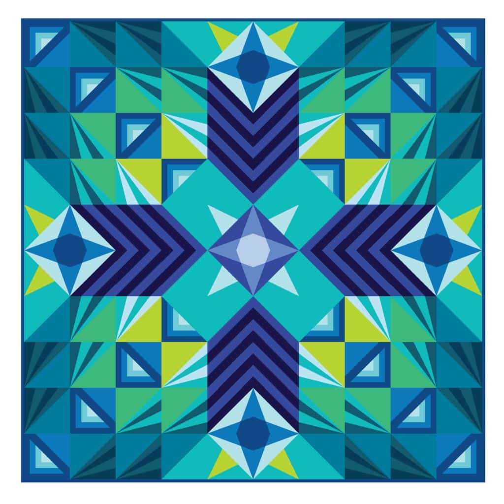
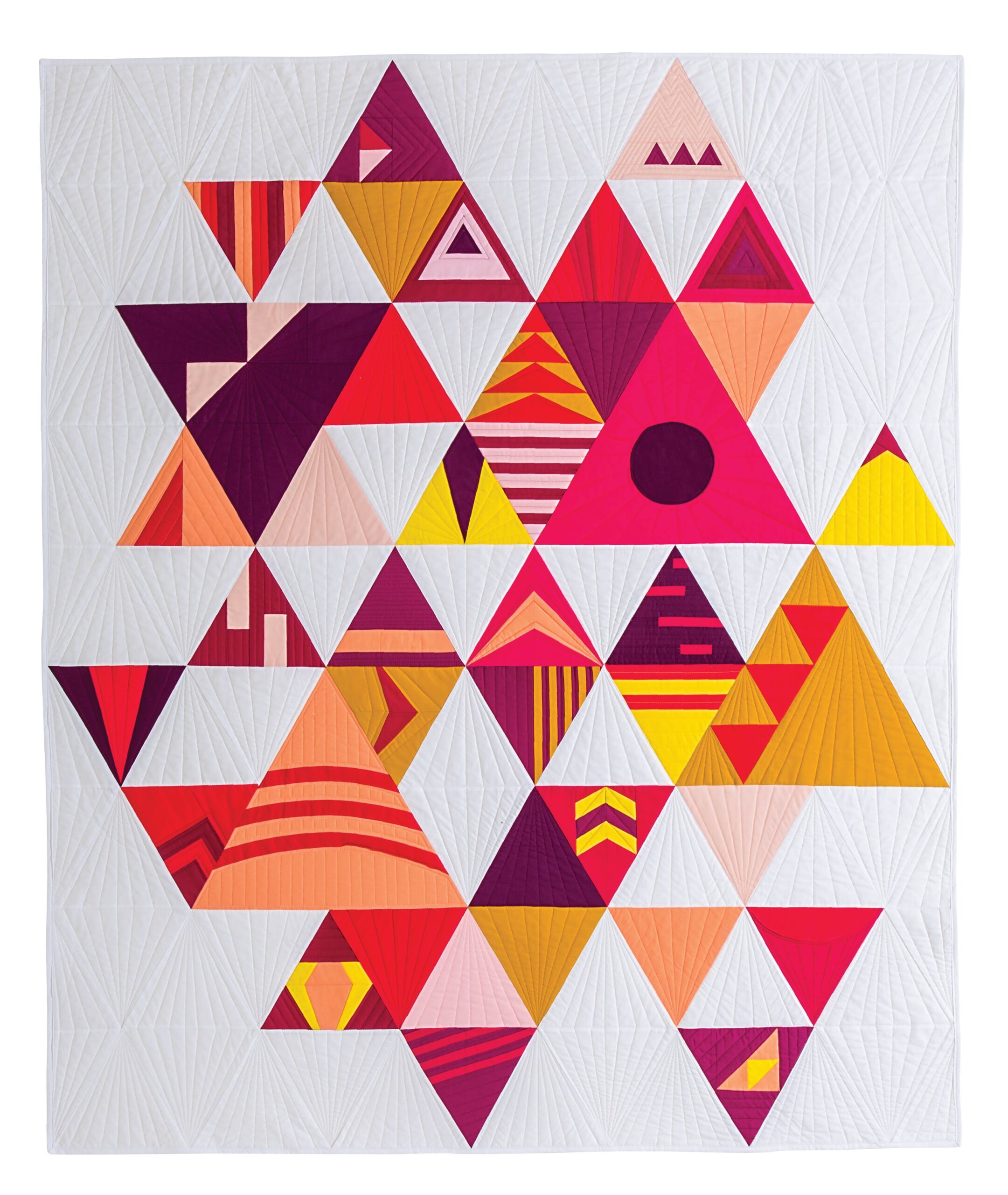
Enough contrast gets the glow going! Stargazer glows below…
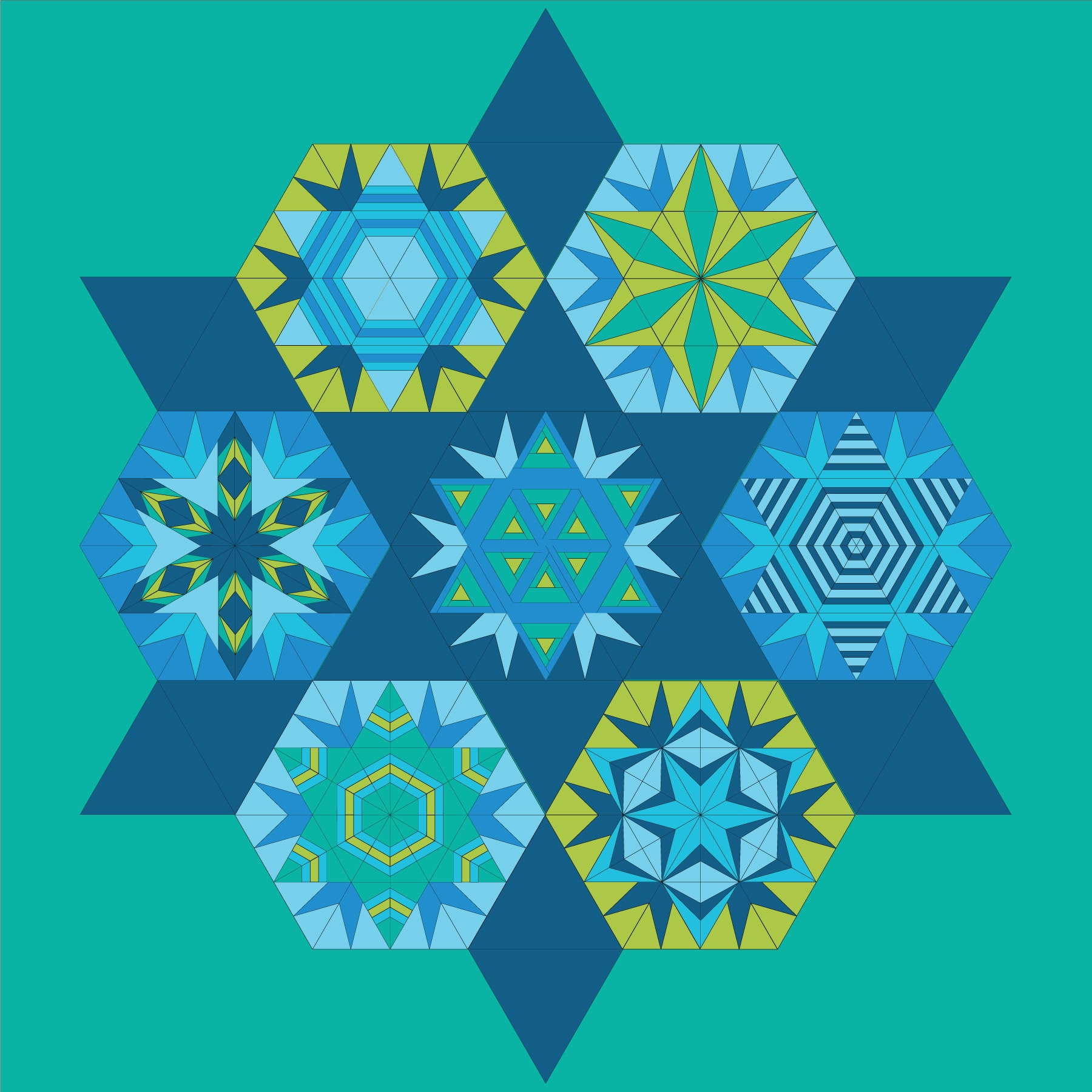
Aurora, the newest block of the month quilt, shines with this palette from blue to green to yellow.

Create Depth and Interest in Quilts
- Which shapes repeat? Repetitive shapes are kept interesting by using different color combinations from the same trio.
- Are the blocks directional? If yes, consider using gradations for movement.
- Experiment with different shades, tints, and tones in your palette to add depth and visual interest to your quilt. This design trick makes elements appear closer or farther away
- Even though the colors are next to each other on the wheel, they create a glowing contrast when values change.
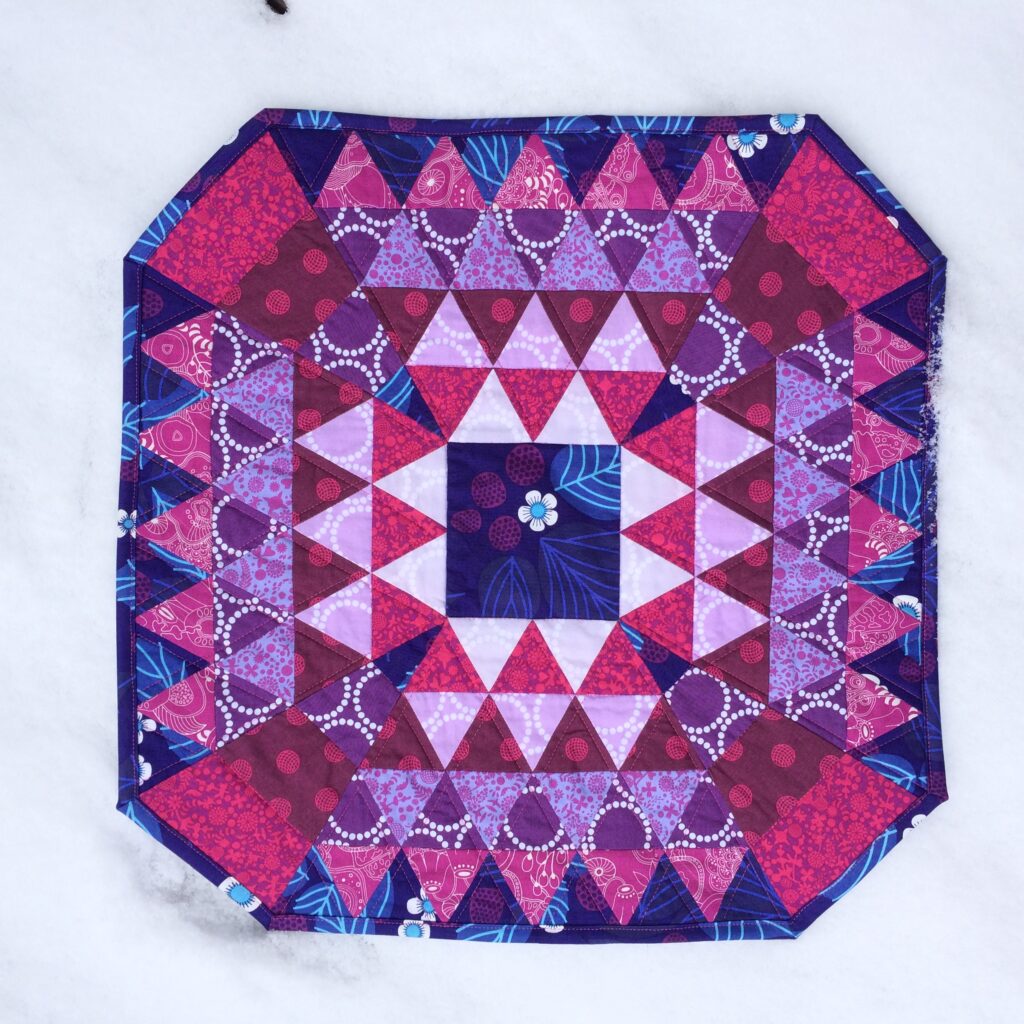
Notice how the center has a pink glow around it? I worked out a value and color gradation from the outside in, creating depth and contrast.
FOCAL POINTS
Playing off the focus block or shapes in a visually stunning effect with this scheme.
Stargazer shows an analogous color combination with blues, green and yellow-green – it has four focal points in the main color in the four light stars, and also dark blue directional stripes.
- Place color strategically to make elements stand out or retreat. A dominant color could be a focal point. Place lighter colors in the foreground and darker ones in the background provides an illusion of depth.
- Use modern prints instead. This technique adds texture and makes your quilt more interesting.
Create Harmony with Balance
How do I create harmony in a quilt? By balancing the key design elements – color, line and shape. The colors in this scheme are harmonious but they need visual balance to complete the harmony. This varies widely in any quilt design.
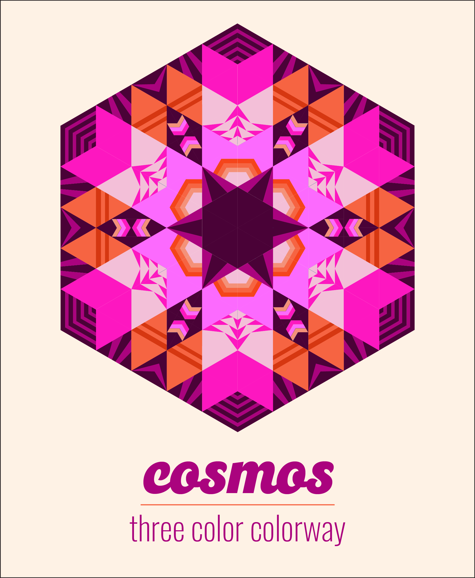
The Cosmos quilt made by Laura M., a Make Modern Triangles member, is a great example of balancing saturation (bright and very dark blues) and values.
- The dark background provides contrast and calm
- Light blue fabrics give your eyes places to rest
- Bright yellow-greens and blues create movement around the radial symmetry design.

Psychological Effects of Color Combinations
Different color combinations evoke different feelings and color moods. What is the feeling I want to create with color and design? Analogous can be a moody, somber or sunny colorway.
Adjacent colors are especially effective at this, depending on the specific colors used. Warm colors, such as red, orange, and yellow are energetic and vibrant – they express excitement and warmth, anger and danger. They may also convey passion or creativity.
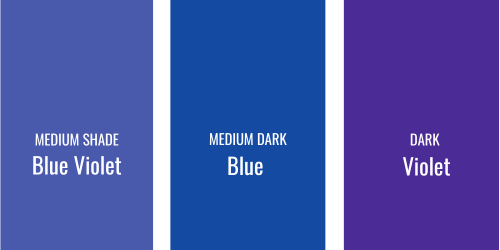
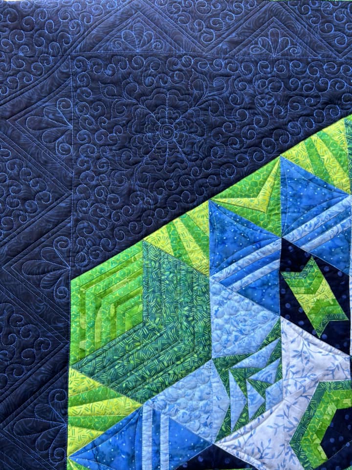
Cool adjacent colors, such as blue, green, and violet, create a soothing calm. These suggest calm, tranquility and relaxing and often paired with natural elements in a quilt.
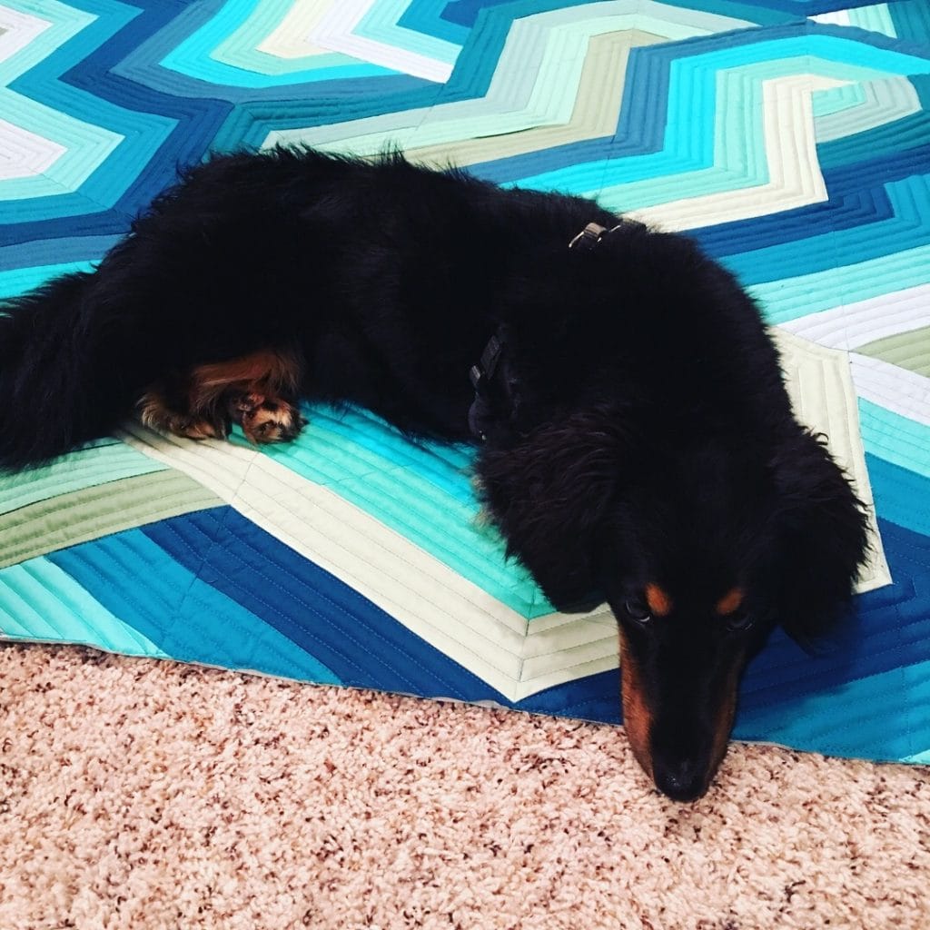
What do you feel when you see this quilt?
Cool analogous colors, such as blue, green, and violet, create a calming and soothing mood. These colors are often associated with nature, tranquility, and relaxation. Quilts using cool analogous color schemes can create a sense of serenity and peace.
CREATING COLOR MOODS
Moods and feelings are often associated with objects, not only experiences. Most objects have a color associated with them. Some have very strong color associations like blue for sky and green for plants. A red tricycle could evoke feelings of playfulness or danger, depending on how many times you fell off!
Color is universal and personal. Lavender may remind you of a trip to France or a favorite prom dress, which evoke feelings and memories. We use color to tell stories in art, decorate our homes and create quilts. Analogous color combinations are especially effective at creating a specific color mood that resonates with your desired theme, story or ambiance.
Apply Analogous Schemes TO YOUR PROJECTS
Besides color theory and design, what are practical tips to use this scheme successfully?
- Seasonal quilts: Seasons offer a trifecta of similar colors. Quilters often create projects to reflect the seasons.
- Making a quilt with a color you don’t like? Add two adjacent colors. Use the unpopular-with-you color as a secondary in muted colors.
- When you want to use a favorite fabric, create a color mood around it for more drama.
Look for examples to study analogous schemes applied to quilt designs. Use a quilt design software like EQ8 to audition colors in your designs. By studying examples of analogous color schemes and applying the principles of color theory, you can create quilts that showcase the beauty and versatility of analogous colors.
Successful Analogous Quilts
Analogous color schemes are simple to create for quilts with successful and visually captivating results.
By applying color theory and schemes to a pattern or designs, you can create beautiful, balanced and harmonious quilts.
Design plays an important role in successful quilts such as color placement with gradations, value and saturation.
Analogous colors are often found in nature, especially shades of blue and green. Use your personal color associations and natural palettes to capture moods and feelings in your quilts.
By studying examples of successful quilts that utilize analogous color schemes, you can gain inspiration and insights for your own quilt designs.
Conclusion
An analogous color combination adds vibrant and subtle touches to your quilts. Color theory and schemes, design techniques and psychological effects of color all work together for harmonious and balanced quilts. From selecting your fabrics to placing them in a design, this scheme sets you up for success. Watch your color confidence grow when you make a beautiful and visual appealing quilt. Don’t hesitate to experiment with different shades and tones. Remember, balance is key in ensuring your analogous color quilt stands out. Embrace this creative journey with confidence and let your unique style shine through in every stitch!

Frequently Asked Questions
What Are the Most Popular Analogous Color Combinations on Pinterest?
The most popular analogous color combinations include blue-green, green, and yellow-green; red, red-orange, and orange; and violet, blue-violet, and blue. These color combinations are widely used in quilting for their harmonious and visually appealing qualities.
How Do I Balance Saturation in a Quilt?
To balance saturation in a quilt, it’s important to consider the dominant, secondary, and accent colors. The dominant one shouldn’t overpower the supporting and accent colors. Use the color wheel as a guide to ensure a balanced color scheme.
Can Analogous Colors Be Used in Modern Quilting?
Yes, analogous colors can be used in modern quilting. Using these in quilting is not limited to specific styles or trends. Whether you prefer traditional or modern quilting, they add depth, interest, and visual harmony to your quilt designs.
What Are Some Mistakes to Avoid When Choosing Colors for a Quilt Design Layout?
Some mistakes to avoid when choosing colors include using too many colors in a quilt, neglecting the concept of color harmony, and not considering the mood and atmosphere you want to create. It’s important to carefully select colors that work well together to convey a mood, feelings and ambiance.
How do I Mix Pastel and bold colors in an Analogous Color Combination?
Mixing prints and solids with analogous colors can add texture and visual interest to your quilt designs. Consider incorporating different patterns and textures that complement the analogous color scheme. This combination can create a dynamic and visually captivating quilt.
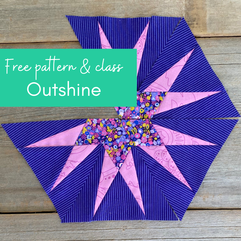
DOWNLOAD FREE QUILT BLOCK PATTERN: OUTSHINE
Outshine, my newest triangle block is a free block pattern with a tutorial. Piece the triangles together to make a stunning quilt. Start yours here!


JOIN MAKE MODERN TRIANGLES ANYTIME
Introducing the Aurora Block of the Month, an all NEW design inside the Make Modern Triangles Club. for 2024! Start anytime, take your time and finish anytime. Learn how to make modern triangles with our BOM quilts, including Aurora.


[…] Choose Easy Analogous Combinations for Quilts […]