Full color quilt palettes are so doable with my 4 easy strategies. Choosing many colors is super fun for some quilters and intimidating for others. Create a palette with three or more colors for your quilt with confidence using four strategies that always work. Not only do they work, they positively pop, sizzle and glow!
In this post, learn how to easily choose colors for full color quilts (multi-colored with 3 or more colors). You can create color palettes that only look complex and make you look like a color phenom.

WHY I LOVE FULL COLOR QUILT PALETTES
When I was ready for what I called “sophisticated” color palettes, I had to buckle in and learn about color theory. I was writing my Modern Triangles book and tasked myself with creating unique color palettes. Very motivating with a big deadline, lemme tell ya.
I ended up with colors that made me excited to make a dozen quilts for a book! And I couldn’t stop talking about how to use colors with confidence. (thank you to all who listened patiently and nodded heads).
Along the way, I developed 4 strategies that worked with my designs (and any quilt). Multi-colored designs are so easy that make multi-colored quilt palettes easier to create. I’ll take you through the same steps with a variety of quilts to show you how.
Color and value share the Glory
I’m fascinated by how color and value interact in a quilt and their placement. Creating gradients where colors flow from light to dark make exciting quilts. Using color harmonies like three colors next to each other on a color wheel. It’s kind of my thing.
When I started using original color schemes in my new quilts, I loved the results. Did I really make that?!
HEY VALUE, COLOR SCHEMES For Quilts WORK HARD, TOO.
If a color scheme doesn’t work, values can’t save the day. Values are great tools for creating contrast and dimension but the colors need to work together in the first place. Using a color scheme makes that soooo much easier.
In each strategy below, I will explain the color theory and show you how it works for a three or more colors quilt.
The only notion you need is a quilters color wheel versus an artist’s color wheel. I’ve included one below for reference.
Quilters can’t mix fabrics like artists mix paint – we have to use what’s available from manufacturers or dye our own. Hence, our very own wheel. Check out this quilter’s color wheel designed by color expert Joen Wolfrom.

Strategy 1: RAINBOW GRADIENT

WOW, right?!
Jennifer used a Guicy Guice fabric collection. Block of the month quilts like Aurora required 8 colors to make the rainbow version. She mixed in prints, mostly tone-on-tone, with solids, which works beautifully for a rainbow palette.

Why does it work?
First, every color in a rainbow palette acts out all of the parts of color harmonies in the same palette. Every color harmony is included.
Color harmonies are color combinations among the 12 hues on the color wheel. They are grouped into three sections:
- Primary – the three primary colors are Red, Blue, Yellow.
- Secondary – the three secondary colors are Orange, Purple (Violet) and Green, each one situated equidistant from the primary colors.
- Tertiary – the six tertiary colors are Red Orange, Red Violet, Blue Violet, Blue Green, Yellow Orange and Yellow Green, which are situated in between a primary and secondary color.
Here’s the underlying color theory about rainbow color palettes…
- Did you know that every color on the wheel is a combo of two primary colors – red, yellow and blue?
- Every color is next to two colors on either side that forms a color harmony called analogous. It only take two colors to make an analogous scheme and the rainbow palette has many analogous pairs working together – a natural, harmonious flow that makes our eyes happy.
- Every color in a rainbow palette has a complementary partner, directly across from it on the color wheel, such as red and green. No matter how many colors you include from rainbow, it has a partner. More harmony!
- Even if you have an odd number of colors in your palette, the color next to the color directly across from it forms a split complementary. You can’t mess this up!


COLOR SCHEMES For Quilts WORK HARD, TOO.
If a color scheme doesn’t work, values can’t save the day. Values are great tools for creating contrast and dimension but the colors need to work together in the first place. Using a color scheme makes that soooo much easier.
Strategy 2: COLOR HARMONIES – 3 OR 4 colors
COLOR choices for POP, Sizzle and FLOW
The simplest 3 and 4 color palettes are analogous, which are neighboring colors on the color wheel.
You can easily make a harmonious quilt based on:
- Colors
- Contrast with color placement – pop
- Blends -flow
- Gradient – sizzle
- Temperature – contrast with warm and cool colors
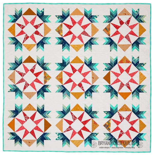
The Stargazer BOM main palette shows how all of these contribute to full color quilts using an analogous color harmony.


CONTRAST With Colors
Contrast: Take this palette a step further by adding in the tints and shades. Tints and shades are printed on the front and back sides of a cardboard color wheel.
Analogous colors are close neighbors on the color wheel that lack big contrast so we create it by using tints and shades of those same colors.


Contrast with tints and shades (POP) FOR A FULL COLOR QUILT EFFECT
The focal point of a medallion quilt is the center. To make it pop out, I used a tinted blue-violet to contrast with the darker blue shades. This is repeated in the same blocks around the quilt to move the eye around and create harmony.
Contrast with placement (POP)
Create contrast by placing the colors farthest apart in your analogous palette next to each other in your quilt layout. Below, see the key lime next to the darker blues? POP!
Second, in the same photo, see the dark blends of blue forming an arrow. Sizzle!

Using Gradients (FLOW)
My modern triangle quilt designs always include gradients, a not-so-secret sauce. The first trick is auditioning the fabrics in pairs and triplets. Second, it’s okay to choose a light teal to as the lightest color in a gradient with three blues. The “close enough but not quite” color makes your palette sizzle.
Gradients add depth and a three-dimensional vibe. It makes the oohs and aahs happen!

Strategy 3: STEAL THAT PALETTE For a full color quilt
That’s right, STEAL a palette. When you find a multi-color fabric you love (all the time), swipe the colors for your quilt palette and use the multi-color print for the backing.
The Stargazer quilt above was made by Betsy R., a Make Modern Triangles member. She created the color palette, and everyone oohed and aahed over it. This palette is wildly different from the main one I generated. She expertly used the blocks for gradients, blends and contrasts.
With the help of digital tools, stealing this lovely palette for full color quilts is a cinch using my favorite color palette generator:
- Go to https://color.adobe.com/create/image
- Snap a photo and upload into the Theme Extractor


Next, select the tint and shades to round out the palette.
Then it’s time to fill in the coloring page. After the page is filled in, go shop your stash or favorite quilt shop.

strategy 4: COLOR RATIO For a full color quilt
The last strategy for a full color quilt is using color ratios. The Stargazer BOM Sunset color palette is based on a 60-30-10 ratio.
Start with a split complementary color harmony. Choose two colors directly across the color wheel from each other, then include one or two colors on each side of one of the colors. The yellow-orange stands alone while red-violet gets color buddies.

Next, assign a percentage to each color. For example, Stargazer has 100 blocks. Think of the percentages in numbers of blocks. Stargazer has 100 blocks so 60 blocks are one color set, 30 another color set and 10 percent the third color set.
- 60% of the colors are warm colors in magenta, coral and pinks
- 30% of the colors are in cool violets.
- 10% of the colors are yellow-orange.

