Color schemes for quilts create stunning designs.
They are a fascinating part of color theory. Knowing how to use color schemes will help you master color in your quilts.
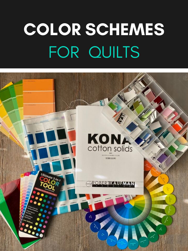
Color Schemes For Quilts and Choosing Fabrics
When they work you know it – when they don’t, you REALLY KNOW IT.
I thought I was a color genius with my rainbow palettes. I had color trouble.
The missing piece was color schemes, also known as color harmonies. Devoted to the reliable rainbow palette and safe fabric collections, I was in a color rut.
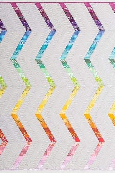
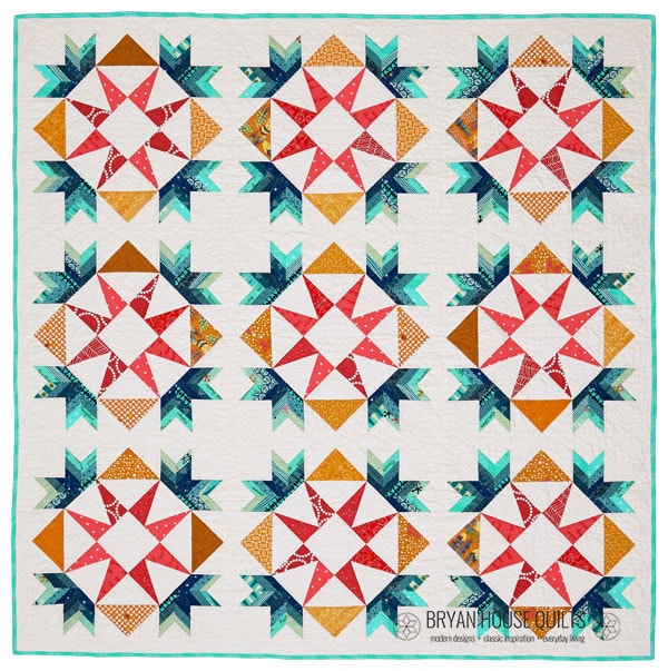
While writing the Modern Triangles book, I wanted “not rainbow” for my featured quilts. Instead, only sophisticated, modern and original color palettes would do.
Losing my color confidence didn’t help. I’d convinced myself that I was a quilting-in-color zero.
PLAYFUL Color Theory
So I studied color theory like a college student and played with color like a kid. Learning about color theory through play was a mighty powerful tool.
When I played with color palettes with fabric swatches and color chips, I didn’t stress over getting color right. I tried combinations and saw how colors worked…or didn’t.
In the end, the book was written and each quilt had a a new-to-me color palette. Oh my gosh, I did it! Color confidence: 0 to 100!
So today I’m sharing how I use color schemes for quilts with lots of examples. Harmony in color on quilts is stunning.
We all want that, right?!
WHY YOU NEED COLOR SCHEMES For Quilts
Are you struggling with color?
Struggling with color is like being mad at your best friend.
I LOVE color but why couldn’t I make color work?
Maybe you’re color relationship is troubled, too. Mine was in a rut.
Have you said this?
… ugh, I can’t work with (insert dreadful color).
… I can’t work with color without getting too crazy.
… It takes forever to decide on a color palette.
… I can’t build my own original color palette.
… I’m only comfortable working with bundles and collections.
… I can’t create pop without creating clash.
… I’m not confident in my color choices so I stay in my comfort zone.
… I don’t know the right colors for the right patterns.
Here’s what I learned: When you start dating outside the fabric bundle and rainbow palettes, choosing colors on your own is precarious.
Change is straight-up uncomfortable.
And our relationship to colors is personal. Mine had been about feelings and favorite colors, without the theories.
That stopped working for me when I designed more quilts that needed something more.
I started using original color schemes in my new quilts and I loved the results!
HEY VALUE, COLOR SCHEMES For Quilts WORK HARD, TOO.
If a color scheme doesn’t work, values can’t save the day. Values are great tools for creating contrast and dimension but the colors need to work together in the first place. Using a color scheme makes that soooo much easier.
Consulting your color wheel is a great first step. Color schemes give you guidelines but they also free you to play. Instead of all colors on deck, invite a few to play within the scheme.
START WITH A COLOR (COLOUR) WHEEL
Thank you, Sir. Thank you very much.
Sir Isaac Newton, inventor of calculus and the law of gravity, also created the color wheel. Thanks to Newton, the first scientist knighted by the Queen of England, choosing colors for your quilt is less guesswork, more fun with a color wheel.
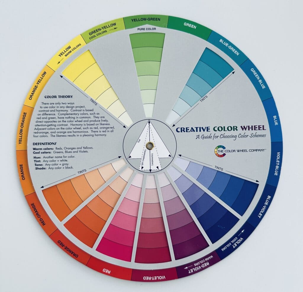
If you’re not familiar with the ins and outs of color wheels, read the tiny bit below on how color wheels are set up.
Otherwise, skip down to Color Harmonious.
COLOR WHEEL OVERVIEW
A color wheel shows 12 hues (hue is another word for pure color). They are arranged into three sections:
- Primary – the three primary colors are Red, Blue, Yellow. At least two of these are the basis of every other color on the wheel.
- Secondary – the three secondary colors are Orange, Purple (Violet) and Green
- Tertiary – the six tertiary colors are Red Orange, Red Violet, Blue Violet, Blue Green, Yellow Orange and Yellow Green.
The primary, secondary and tertiary colors are shown along the outer edge of color wheels.
Most people are familiar with the primary and secondary colors but the tertiary colors may be fuzzier to recall.
They are located in between a primary and secondary color. For example, green-yellow and yellow-green are located between yellow (primary) and green (secondary).
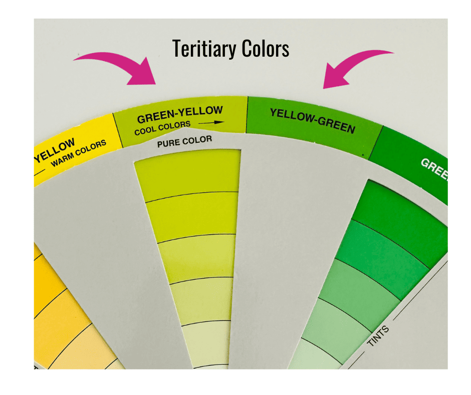
Note: An artist’s color wheel uses cyan, magenta and yellow (CMY) as primary colors to mix true tertiary colors. We use fabric as our paints so the color mixing has been done for us. Our color wheels use red, yellow and blue for the primaries. Interestingly, fabrics are printed with CMYK as primary colors plus black.
Color wheels include tints one side of the wheel and shades on the other side.

- Shades are created by adding black to a pure hue.
- Tones are created by adding grey to a pure hue.
- Tints are created by adding white to a pure hue.
Color wheels show color schemes by moving the top wheel and pointing to a color schemes wherever it lands. This is super handy.

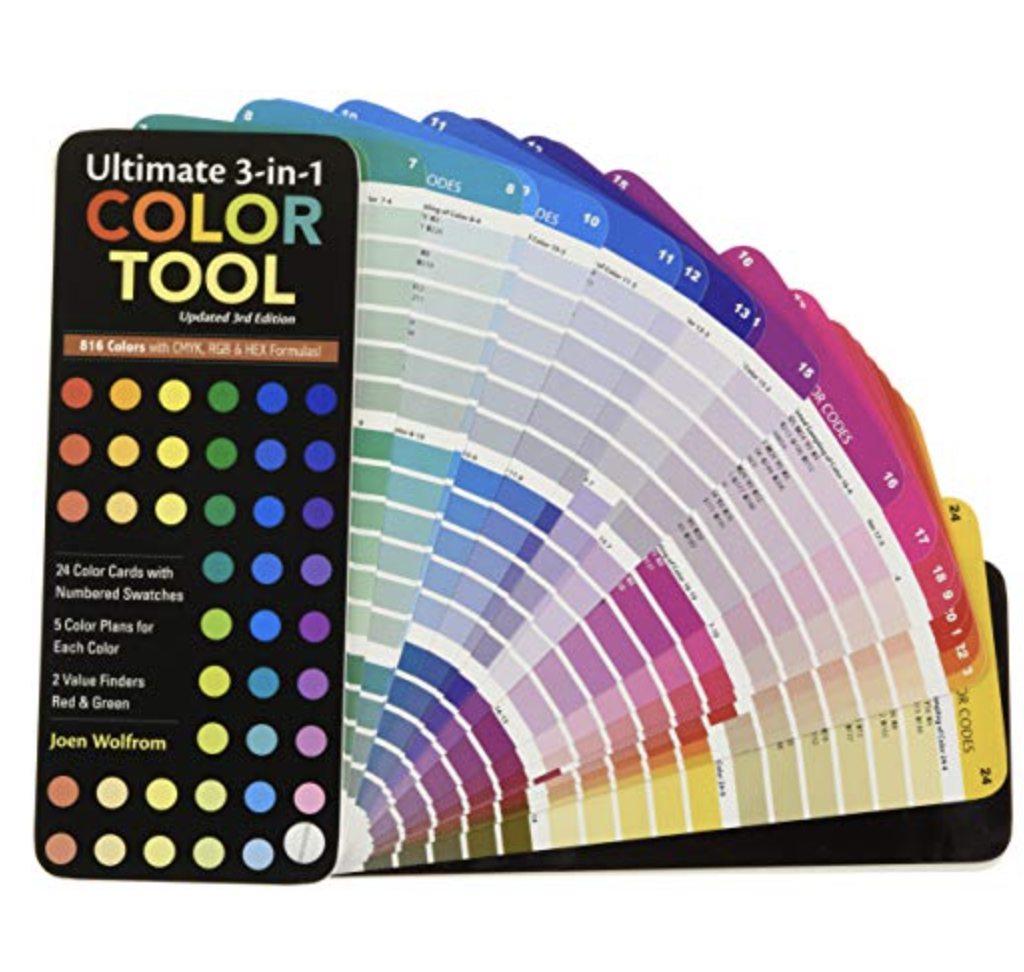
Quilters have color tools designed for quilting. Read about my color tool picks for quilters.
Okay, let’s get started!
Warm and Cool Colors
Colors are grouped by temperature on a color wheel – cool to warm. However, green is a sneaky chameleon – it shows up as warm in yellow-green and cool in the other greens.
If you pick a color scheme with colors across the wheel from each other, you will automatically have a cool and a warm color. Except for Sneaky Yellow Green which pairs with Red Violet.
How do you use temperature in a color palette?
Cool fabric colors are a resting spot for the eyes. Warm colors draw more attention. Having both in a quilt creates balance and harmony.
Here’s Solstice Block of the Month in Summer palette. See the temperature changes?

Color Harmonies
Color harmonies are color combinations based on a color wheel, which Newton proposed in 1704. Commonly known color combinations are primary (red, yellow and blue), complementary (red/green, blue/orange, yellow/violet) and monochromatic (all the same tints and shades of one color).

The other schemes are analogous, triad, tetrad, split complementary and square.
Bottom line: Choosing a quilt color palette with these color combinations works!
Color Schemes for Quilts
Each color scheme below has a bonus color play prompt. Taking it off the color wheel and into your hands makes color magic happen.
Monochromatic (SAME COLOR) Scheme Quilt
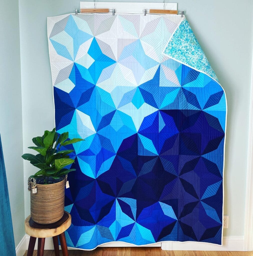
A monochromatic fabric palette is created with one color. An entire quilt made with one isn’t boring. Round out the palette with cool and warm versions of the same color.
Same color quilts have tons of possibility, even though your background colors and borders are in the same color family. Try tints and shades as your neutral colors, backgrounds and borders. They make colors in the main show glow or deepen. They are a super helpful trick in your quilting tool kit.
My monochromatic quilt is BIG DRAMA.
Primary Color Scheme Quilt
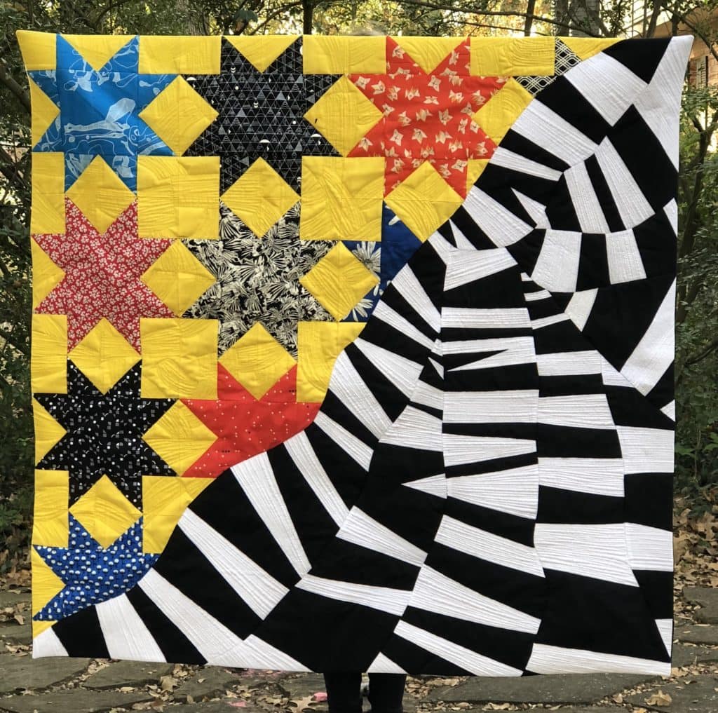
Most of us know this one: red-yellow-blue. Two warm colors and one cool. The colors are evenly spaced around the wheel.
I really wanted to make an improv quilt so I chose a primary color scheme with two neutrals.
Analogous Scheme Quilt
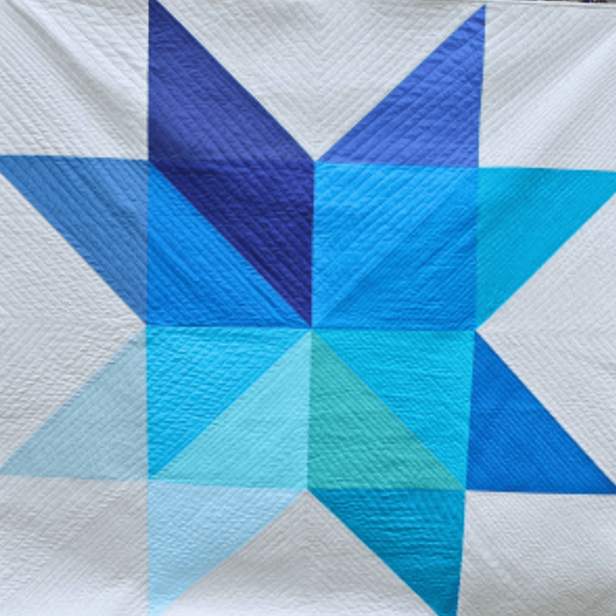
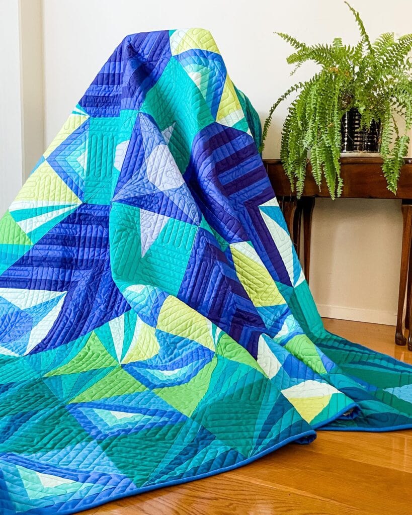
My pal, Analogous! I use analogous colors extensively in my quilts to create gradations in sections. Choose several neighboring colors to make your color palette.
Complementary Color Scheme Quilt
Complementary colors are directly across the color wheel from each other: red and green, yellow and purple, orange and blue. A legit complementary palette is any two colors across the wheel – like yellow orange with blue violet. Surprising colors for a quilt!
Red and green is a great example of a complementary pair. Holiday quilt project! Winter holiday fabrics have expanded into teal, orange-red, pink and purple – all colors next to either red or green on the wheel.
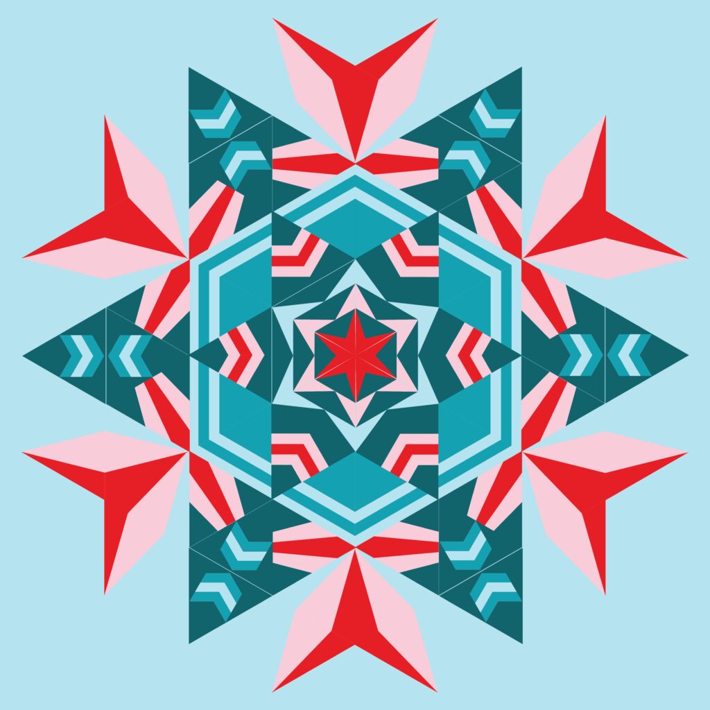
My favorite color purple crept into Halloween quilts as a split complement with orange and yellow. In the olden days – STRICTLY orange and black!
Note: Did you know? Three pairs of complementary colors make a rainbow palette. I still love you, Rainbow.
Split Complementary Color Scheme Quilt
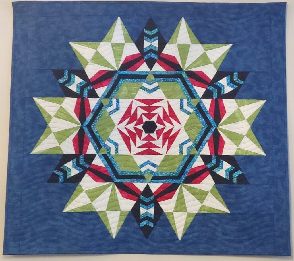
Split complementary schemes use one color on one side of the wheel and two colors across the wheel split apart by one. The quilt below was created by Wendy R. using a yellow green, blue green and red in. Using shades and tints in those colors made it a unique.
Me, not a red fan, but I adore the splits across from it. I’m “forced” to play with a red, which I wouldn’t use otherwise.
Triadic Color Scheme Quilt
Triadic colors are a set of three spaced equally apart on the wheel. Primary colors are a triad color scheme.
When you make one, you’ll want to make two quilts in a triadic scheme! The color combinations are exciting and stretch your color muscle.
Square Color Scheme Quilt
A square color scheme is four corners pointing at colors on the wheel. They are same distance from each other.
Tetrad Color Scheme Quilt
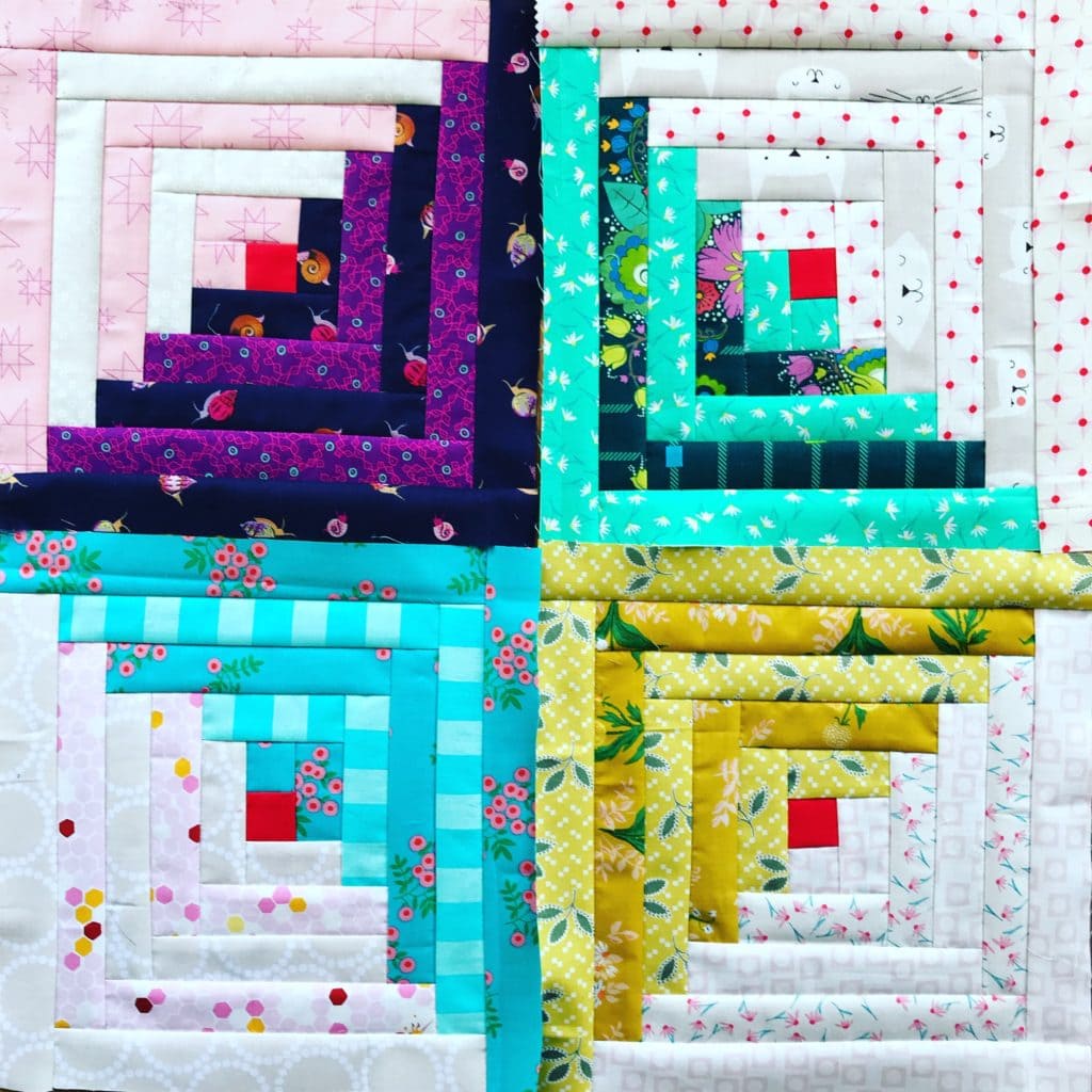
A tetrad scheme is two pairs of colors. Each pair is analogous and sits directly across the wheel from the other complementary pair. This scheme is super glowy due to the pairings!
This cute log cabin is made with a red violet, red orange, blue green and yellow green.
A Word about Yellow Green and Red Orange
They want to be in your next color quilting project. They can overpower a palette, but they play play nice in a tetrad color palette with red-violet and blue green.
Mixing Fabric Collections for Your Quilt
I still splurge on bundles or a brightly colored fabric collection. Going cold turkey on bundles should never be a thing!
Designers labor over choosing colors and patterns for fabrics with beautiful results. Many fabrics in collections only work well in their own collection – ever try to match blues?! Sheeesh.
Use a few fabrics from a collection to build a palette from. The rest of the collection will point you in the right direction, but with fabrics you choose. Now you’ve got a great start to build a palette.
Print Fabrics for Quilting
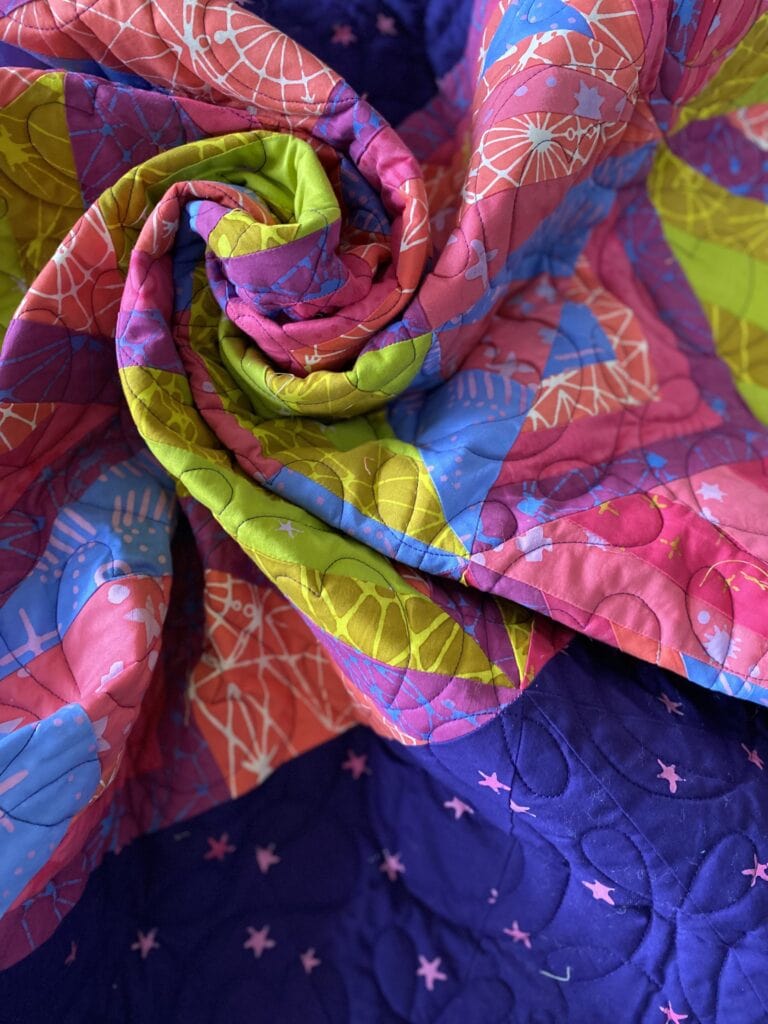
Print fabric helps pull a palette together by blending colors and adding movement. Figuring out the exact color of busy print fabrics can be tricky for a quilting project.
These tips will help you know what you’re dealing with!
- Give it a squint test and see what color dominates.
- Determine value with a value finder.
- Determine the warm and cool colors.
Next Steps
A personal color wheel is like mints in your purse – you never know when you’ll need one. When you go fabric shopping, tuck it in your bag.
Fabric Stash: Discover your personal color wheel (read this post for a deeper dive) in bins and drawers. Your past fabric choices are great clues.
Wanna play?
Start with playful prompts to begin quilting with color schemes.
- Find fabrics and items at home in your favorite color – in shades, tints, warm and cool versions. Pair two up at a time and select a keeper. Put the keepers in a pile. How are the keepers different or the same?
- Pick a favorite fabric in prints and find its colors on the wheel. Now pick shades and tints of those same colors.
- Do several fabric pulls with three analogous colors. Now find a complementary color for each of the three colors. You’ve just made a tetrad scheme. It was so easy, right?
- Primary colors aren’t just for kids. Red, blue and yellow color palettes can be quiet also, like Easter M&M’s. Create a quiet primary palette using tints and shades, with warm or cool colors.
MAKE A MODERN TRIANGLE IN MY FREE “ScraPPY WHirligig ” CLASS
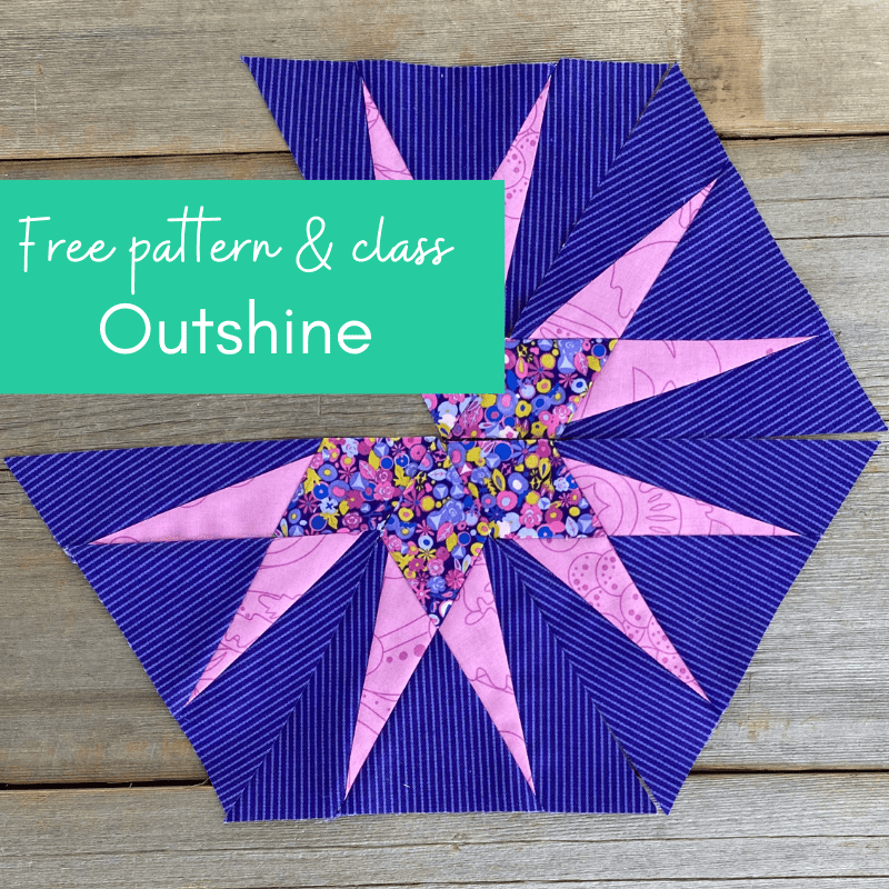
Don’t miss my free tutorial and pattern featuring a versatile modern triangle block called the “Outshine Star”. Make your first block and turn a bunch into a colorful stars quilt.
Click here to take the free triangle class.

Great information about color schemes and I love all the examples you shared. Thank you!
Hi Julie and thank you! Revisiting my quilts and my members’ quilts with a color scheme lens was fun and eye-opening. I’m glad you liked the examples. Thanks for stopping by!