One of my favorite things about vintage quilts are that they pair a solid with a print within a block. I love that. And I love incorporating the same idea into my quilts.
In talking with Pat Sloan a few weeks ago, I was reminded of my love for pairing solids with a print. This week finds me pairing up a solid with this Anna Maria Horner print from her Folk Song fabric line. (This is for a test block that I’m not quite ready to show. Soon though!)
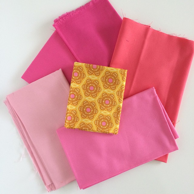
In matching my solids to prints, I always pull a rough draft selection. You can see my initial pull in this pic. As I was making my final choice, I was struck by how many colors matched. If you would have asked me a few years ago, I would have told you that only one matched – the matchy match one. But this time I can see that more colors match, but they read in different ways.
Had I wanted the EXACT match, I would have chosen the pink at the bottom right. The exact match seemed a little too plain Jane for the quilt I’m making – I guess I’m going for a visual KERPOW! This I’m sure is quite debatable, but had I wanted to go softer I might have chosen the soft pink. Sometimes you need a softness to juxtapose against the KERPOW, but not in this block. Maybe I’ll do that later. I think I like to do my KERPOW first. Had I wanted to get a wee bit funky, I would have chosen the really pretty coral toned pink. Maybe I’ll work in a funky block pairing later as well.
I ended up choosing the fabric right above the soft pink.
But now that I’m typing all this out and declaring my assessment of these solids, I wonder if I might should have chosen the brightest pink right at the top. Maybe it was a touch too dark. Hmmmm. Oh well, it’s only fabric.
😉


I think the one you choose and the top pink are very similar in tone and value and would proably have the same impact regardless of which you went with (at least when compared with the other colors here.
Can't wait to see what you're making! Love the colors! I'd like to see a quilt with ALL of them together.
Call me funky, but I love it with the coral & your idea to bring a bit of it in!
Sewing friends are wonderful! I don't have any here in the small town where I live, so I connect virtually with quilters through my blog and Instagram. It's great to have so many like-minded friends, even if I've never actually met any of them!
obat kuat
obat kuat semarang
I love the thought that goes into choosing fabrics. I need to be doing more of the solid/prints mixing. It really does look fabulous!
I agree, that one above the exact match really adds some spice. I winced how it would look with bits of all of them? Confused? Sparkly? I do like that coral best with the print….
I agree, that one above the exact match really adds some spice. I winced how it would look with bits of all of them? Confused? Sparkly? I do like that coral best with the print….
I agree, that one above the exact match really adds some spice. I winced how it would look with bits of all of them? Confused? Sparkly? I do like that coral best with the print….