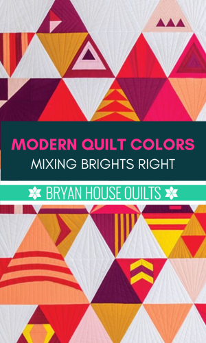
Modern quilt colors often sport bold, saturated hues. Have you seen a boldly colored quilt and had to look away, only to see an afterimage in blue or violet?
Bright colors cause an afterimage effect, where an image continues to appear in the eyes after a period of exposure to the original image. Two or more bright colors together cause afterimages that interfere with one another, causing a “visual vibration.”
It’s called color vibration and I call it like I sees it: COLOR CHAOS!
In the post, learn how to use bright saturated colors with confidence and avoid color chaos with two exercises. We’re dipping into color theory, and I promise, it’s pretty interesting.
Bright Quilts + Color Vibration = Color Chaos
My peanut butter and jelly go-together is bright colors and quilts. Rainbow palettes have been a long standing color crush (maybe since grade school?) and magenta with orange. And teal blues.
Choosing saturated, bright hues make a visual modern quilt statement. Without a doubt, it’s modern. Too much saturation and brights dampen the design elements, like shape and line. Color chaos takes over.
Reducing color vibration is simple: use one bright color with a neutral in between or choose a pastel or dark shade as a mate, like this:
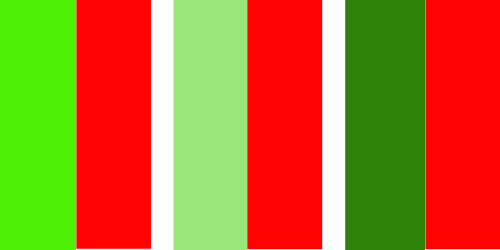
Medium pastel green calms bright red as well as very dark green.
Look at the color pairs below. Most of them have been paired with a calming color influencer. Several blocks are still creating chaos, several have been tamed. Can you see the differences?
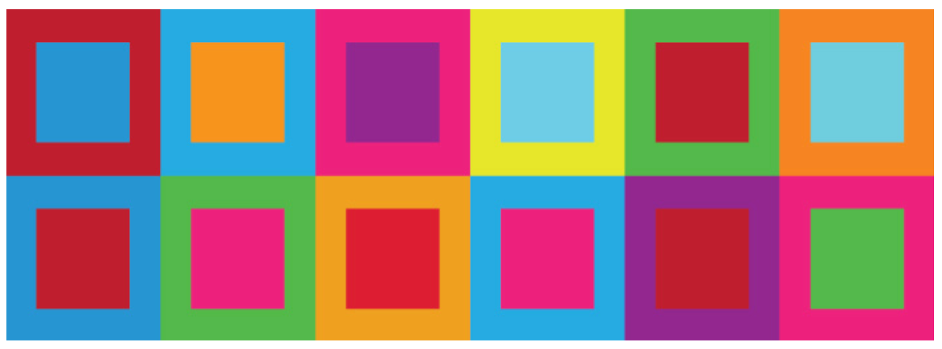
Still bright, but your retinas get a rest.
Another way to say this: I reduced the temperature (cooled the color down) with a tone (adding gray) or a shade (adding black) of that same hue. The color is still saturated but not competing less with the bright one. Also, I reduced the contrast (a design principle) just a little bit. More harmony, less eyeball angst.
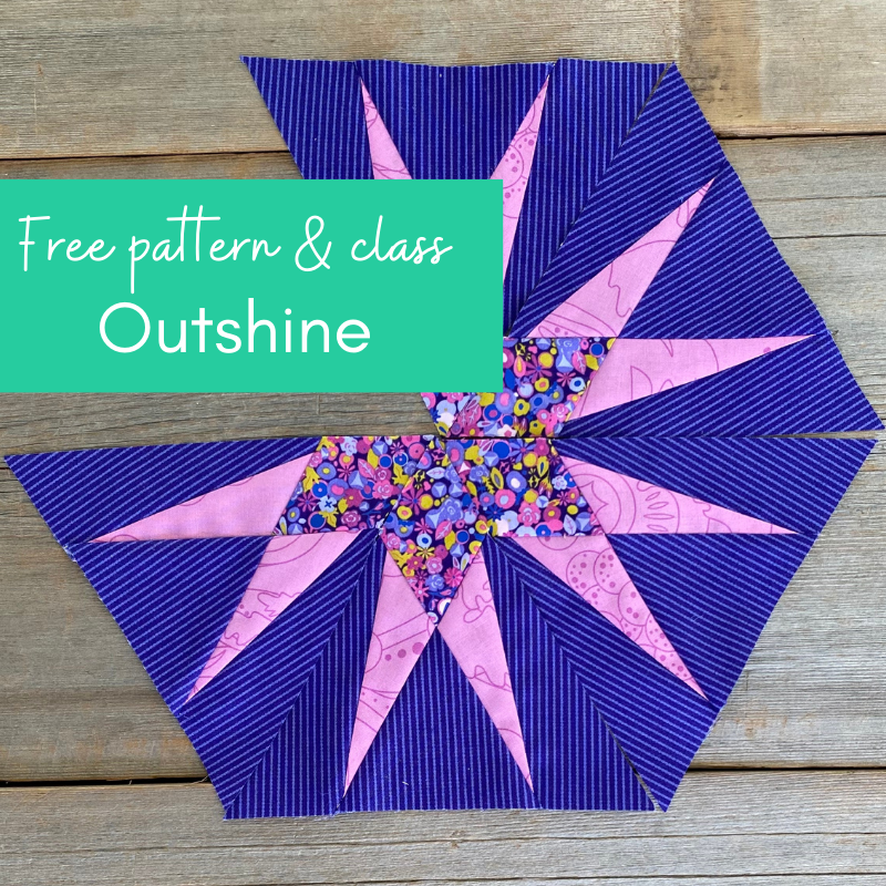
Make a modern triangle in my free class and learn the magic of Freezer Paper Piecing! Download the free pattern and I’ll walk you step-by-step through the technique. Get started here!
Modern quilt colors: Mixing brights right
How do you mix bright colors right from the start? And how do you stop color chaos after it starts?
In Upstart, I chose bright red, orange, yellow and magenta for my palette. Obviously, a recipe for color chaos! I’m not gonna let that happen tho’.
I’ve pulled the three bright colors out of the quilt and placed them side by side.
Is this hard to look at? Look at this image for 30 seconds, then look away – you’ll see a bluish afterimage.

After-image effect
What’s happening?
Bright colors cause an after-image effect, where an image continues to appear in the eyes after a period of exposure to the original image. Bright colors interfere with one another, causing a visual vibration, hence the afterimage. Tough on brains, too – where to look? It’s all bright, all the time.
To round out the palette, I play with adding white (tint), gray (tone) or black (shade) to one of the colors. Here’s what happened to bright orange:
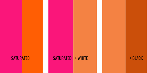
This helps me choose which colors look best calmed down.
Below, I tamed the brights without turning off their lights. They are the same colors surrounded by calming influences:
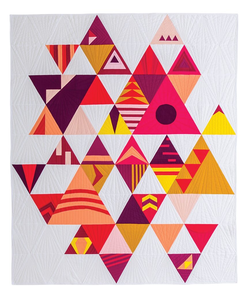
- Yellow: Calmed by avmedium red shade and very dark red.
- Magenta: Calmed by darkest red.
- Orange and bright: Calmed by orange tint.

Here’s the finished quilt. Can you spot the calming influencers?
Note how often the bright colors are used, paired or proximal to other colors: Bright yellow is paired twice in a triangle a the quilt’s focal point on the right side. Otherwise, there are no contiguous bright colors. They are paired with their calming color influencers.
Now let’s look at a soft color palette that wants to go modern.

By the way, you can join our Modern Triangle block of the month quilt programs anytime. Work at your own pace with a great community of quilters. Learn more about all the goodies in the Club!
Traditional TO MODERN QUILT COLORS EXERCISE
The gentle interplay of colors like sage and lavender offer a soothing visual effect, as comfortable as a quilt. The colors are cooler and closer together on the color wheel. However, it lacks contrast and a modern quilt color in a bright.

What would you do to make it modern?
Our exercise makes them modern by changing saturation, value and temperature.
I made it modern by saturating the lavender (removing white/tint). Then I moved along the color wheel from green to teal blue and then lightened it with white. It checks my modern color boxes.
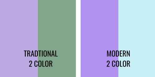
Sage and lavender are more 1990’s than say, right now, for modern quilts. I played with Julep, Kona Cotton Color of the Year 2024, for a four-color palette.
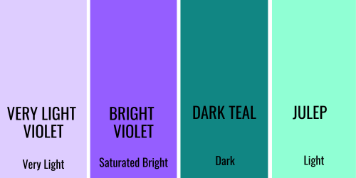
To add Julep, I moved the light teal towards green on the palette. A simple, 4-color solid color palette has a very light, light, medium saturated bright and dark colors.
- Saturated color – I could even go more saturated!
- Enough contrast
- Unexpected, interesting color combination
What do you like?
QUICK MODERN QUILT COLORS PALETTE GENERATOR
Color wheels make quick work of adjusting and choosing colors by tint, tone and shade. Or you can use a color palette generator.
The Canva Palette Generator is an easy and free tool for making color palettes.
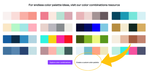
I’m a fan of color wheels, however, playing with color swatches and helps me see color with my brain and hands at the same time. You may already have a method to create palettes. Please share in the comments below – I love learning about how other quilters make modern quilt colors work.
reducing color vibration exercise
Now that you know about color vibration and color chaos, let’s do one more for color confidence.
On the left, a 100% saturated teal is paired with a 100% saturated magenta/pink. Oooomph.
That’s tough to look at! If you stare at them long and then look away, you’ll see an afterimage.
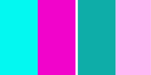
Reducing color vibration is simple: use one bright color with a neutral in between or choose a pastel or darker shade as a mate.
On the right, I added gray (tone) to the teal and a lots of white (tint) to magenta. I maintained the contrast and lost the afterimage.
I built and balanced the palette from there, adding in the two original brights.
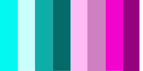
Overall, I added two very light colors, (teal and very light pink) and two very dark colors by adding gray or white to the original two colors. It’s still a two color palette, albeit a modern one. The super brights made it modern, the pastels made it fresh. Without the brights, I’m ‘back to the future’ in a living room circa 1990s!
COLOR REBELS WITH a Cause – Hold the Chaos
Wanna bend some rules? Buck some trends? Set the trends?!
Blending unconventional color pairs creates a fascinating modern quilt. Like, “Wow, I never considered those colors together” and “I’m off to the quilt shop now”.
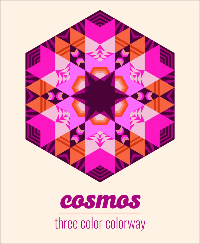
I use the same hue in different tints, tones and shades. Check out the colors in my modern triangle quilts below. Technically, I used two or more colors from the same hue. Show us the two-color rule that says we can’t, mustn’t ever do this.
Here’s an example of modern quilt colors in a bright and a tone, Cosmos, from Make Modern Triangles Club.
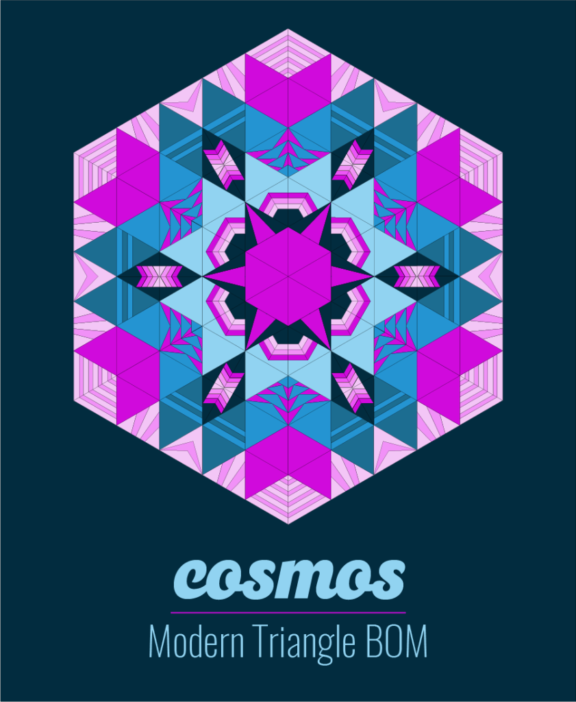
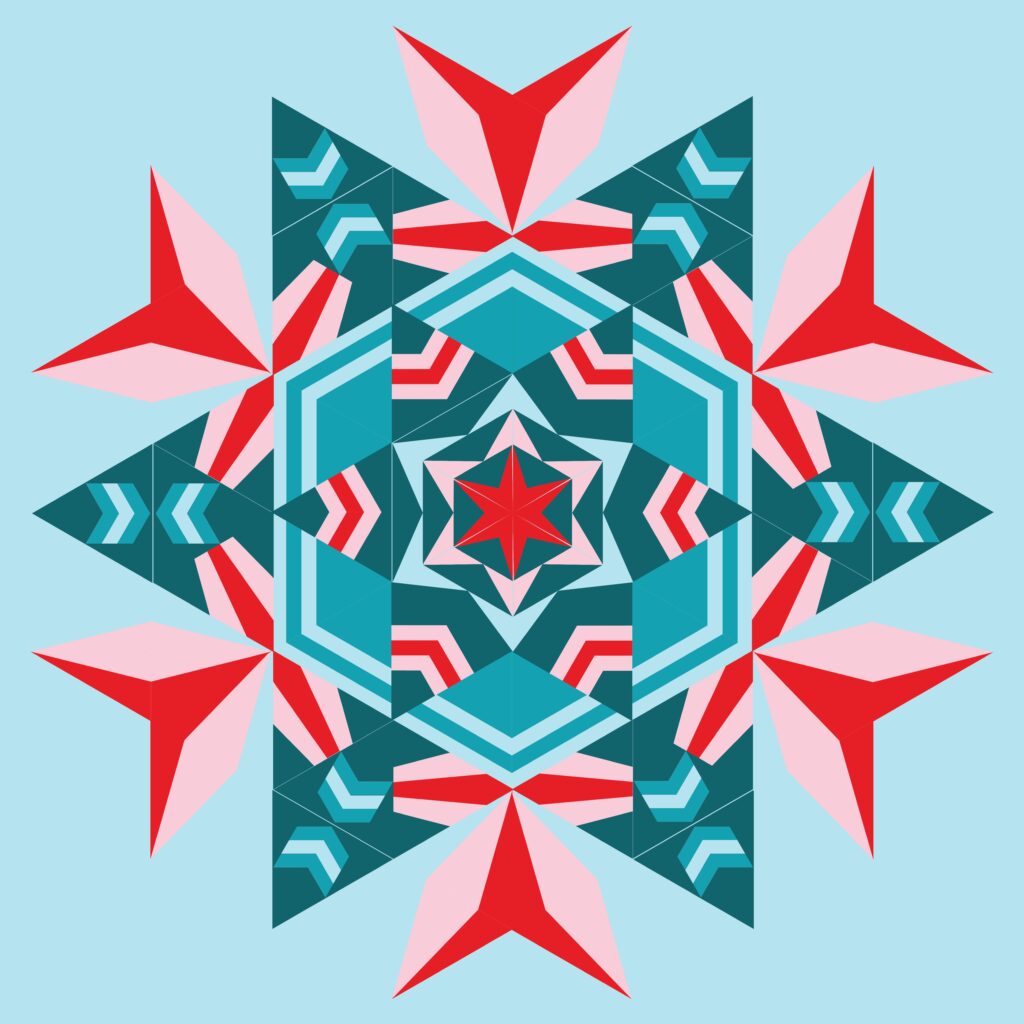

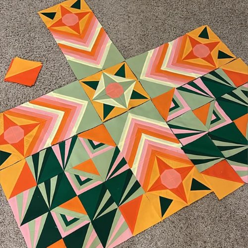
Make Modern Triangles member Betty R. surprised us with a mix from very light to bright to very dark.
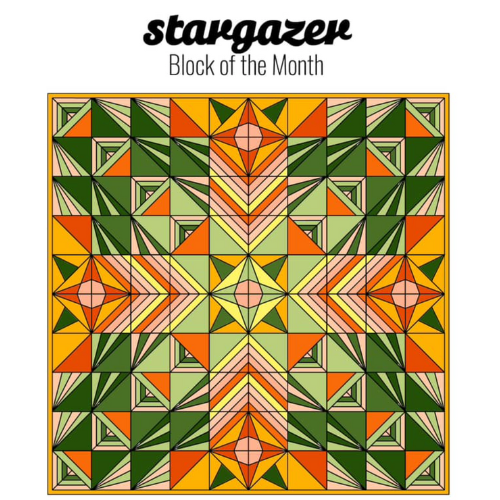
Betty’s work in progress. Wow!
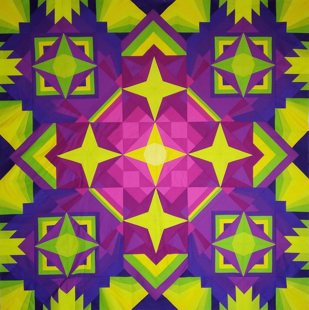
Modern quilt colors, especially the brights for me, make me excited about all the quilts I want to design and make. Which bright colors do you fancy most? Share your bright color crush in the Comments below.
Rebecca xo
Free Quilt Pattern and Modern Triangle Tutorial

Outshine, my newest triangle block, is a free block pattern with a tutorial. Piece the triangles together to make a stunning quilt. Start yours here!
BY THE WAY, YOU CAN STILL JOIN Aurora BOM

Introducing the Aurora Block of the Month, an all NEW design for 2024! Colors and shpes create beautiful symmetry in this modern triangle quilt design.
Learn more about making modern triangles with the Aurora BOM and Make Modern Triangles.

Great tutorial -appreciate this!!
So glad you found it helpful!
These are amazing! I admit to being at a complete loss understanding color theory and I devoted quite a bit of time to researching it. I’ll try the Cam a Palette Generator and see if it helps.
so glad you found this helpful!
Great information. I love mixing bright colors , these suggestions made sense.
Thanks Patti!
I use a book called Swatch THIS by Haruyoshi Nagumo. I have found it very helpful.
Ah, thanks for the recommendation!