Quilters color wheel tutorial today! I’m sharing one of my favorite, most useful tools in choosing color for quilts: making a personal color wheel that reflects my preferences. And today, you can make one for you.
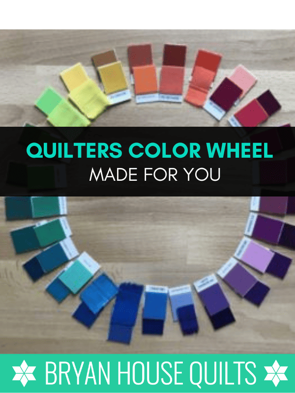
Trust me, you’ll want one of these. Your personal color wheel helps you create unique color palettes based on colors you love.
I use this color-choosing practice-slash-tool again and again. Coordinating fabrics is easier because my personal wheel steers me to other colors I’ve already chosen as winners.
Bonus: In this demo and exercise, I’ll ask you to stay inside your comfort zone. So good.
Do you use a color wheel?
More quilters are using color wheels. I want to feel awesome about fabric selections for quilt projects. Selecting the wrong colors feels so wrong! Your chances get much better by using a color wheel.
Not only will you see colors more clearly, color wheels do color combinations for you.
Why DO I NEED a personal color wheel?
Here’s why a personal color wheel really makes a difference between muddling through color or mastering color.
Using a personal color wheel steers my fabric selection process in the right direction to the colors I already love. From there, I begin designing a color palette I love. The personal color wheel will prevent you choosing fabrics that aren’t ‘you’.
Stop muddling through color selection
I often hear from quilters who muddle through color and fabric selections.

They typically experience dilemmas – like frequently changing their color choices – sometimes in the middle of making a quilt? OUCH.
Or they’re stumped about why a color or fabric doesn’t work, even though it’s pretty.
Or use colors they hate because they “go with the other colors”?
If that’s you even sometimes, you’re gonna love the personal color wheel tool. It puts the right colors in your wheelhouse!
I declare (by the color power invested in me) it’s time to switch from muddling through color to playing with color! Download the free worksheet and I’ll walk you through the process in the video below.
DISCOVER YOUR PERSONAL COLOR WHEEL
We’ll do a simple exercise to build your personal color wheel inside your comfort zone that takes about 15 minutes.
My Playful Color Theory stresses that your personality shines through your color choices.
Note: I like doing this exercise with my hands and color chips versus a digital tool. Your personal color connection between your eyes, brain and hands is a powerful creative generator.
And another note: If you’re not familiar with the ins and outs of color wheels, read the tiny bit below on how color wheels are designed.
Otherwise, skip to the video or instructions.
Color Wheel Overview
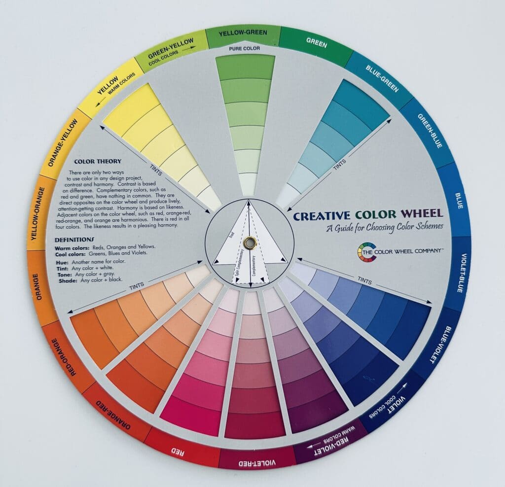
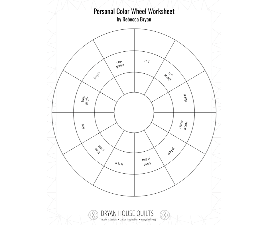
A color wheel shows 12 hues (hue is another word for pure color). They are arranged into three sections:
- Primary – the three primary colors are Red, Blue, Yellow. At least two of these are the basis of every other color on the wheel.
- Secondary – the three secondary colors are Orange, Purple (Violet) and Green
- Tertiary – the six tertiary colors are Red Orange, Red Violet, Blue Violet, Blue Green, Yellow Orange and Yellow Green.
The primary, secondary and tertiary colors are shown along the outer edge of color wheels.
Most people are familiar with the primary and secondary colors but the tertiary colors may be fuzzier to recall. They are located in between a primary and secondary color. For example, green-yellow and yellow-green are located between yellow (primary) and green (secondary).
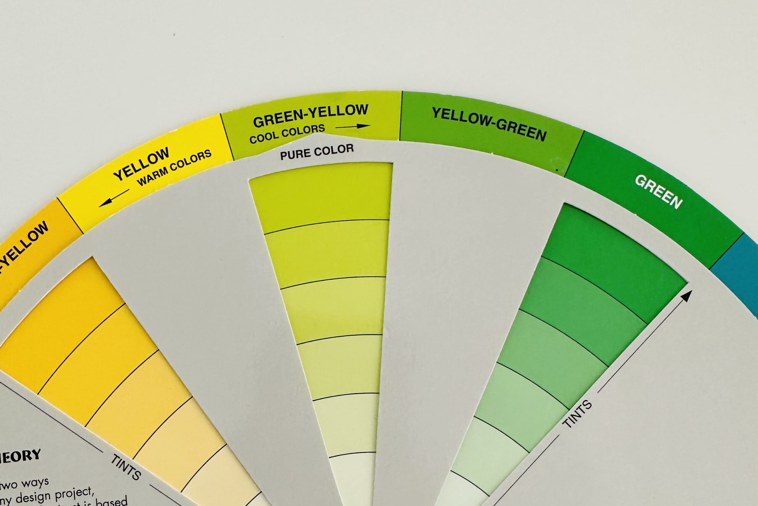
Many color wheels also include tints one side of the wheel and shades on the other side.
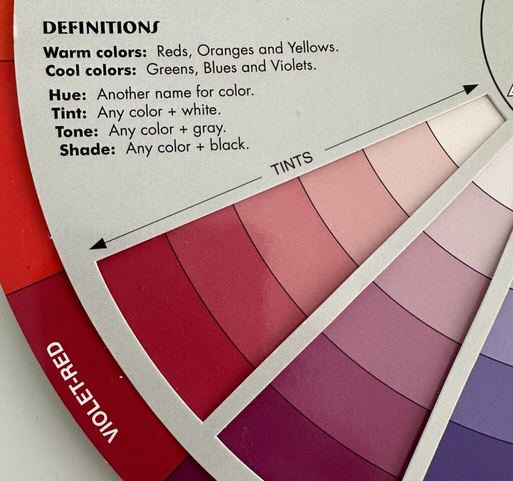
- Shades are created by adding black to a pure hue.
- Tones are created by adding grey to a pure hue.
- Tints are created by adding white to a pure hue.
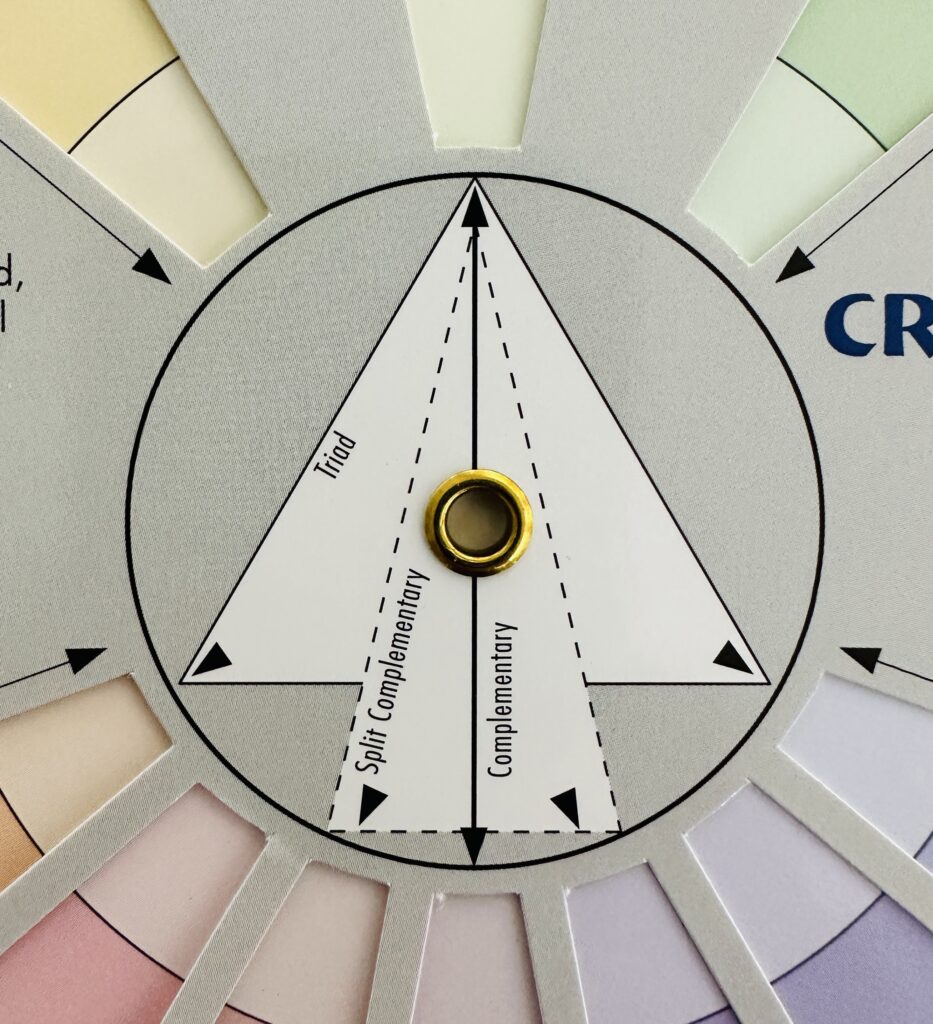
Color wheels indicate color schemes like complementary (across the wheel), triad (three colors equidistant on a color wheel) and analogous (next door). Just move the wheel and it lines up the color scheme for you.
Okay, let’s get started!
MATERIALS
Blank Personal Color Wheel worksheet (Download the printable PDF worksheet here.)
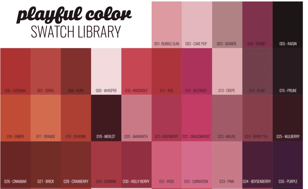
Download my printable Playful Color Swatch Library here – then cut it apart.color card chips apart. Paint chips from the hardware store or fabric swatches from your stash work, too.
Follow along in the video or use the instructions below.
Make a Personal Quilters Color Wheel
Primary Colors
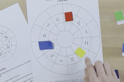
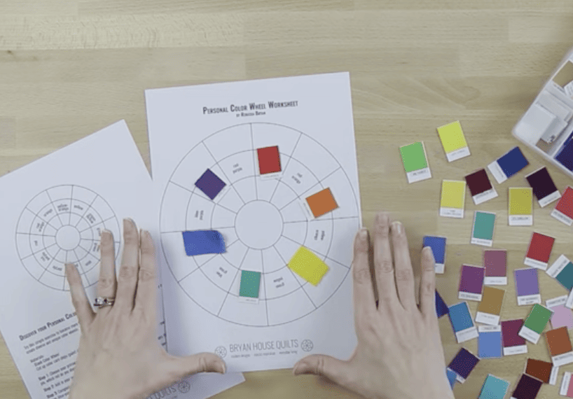
Choose your primary colors first – red, yellow, and blue. Choose the colors that speak to you personally. For example, which red do you identify as a true or favorite red? There’s no one correct red out there. This is your personal color wheel so pick what you like!
Secondary Colors
Add in your secondary colors – orange, green, and purple. Again, choose the colors that best suit your taste.
Tertiary Colors
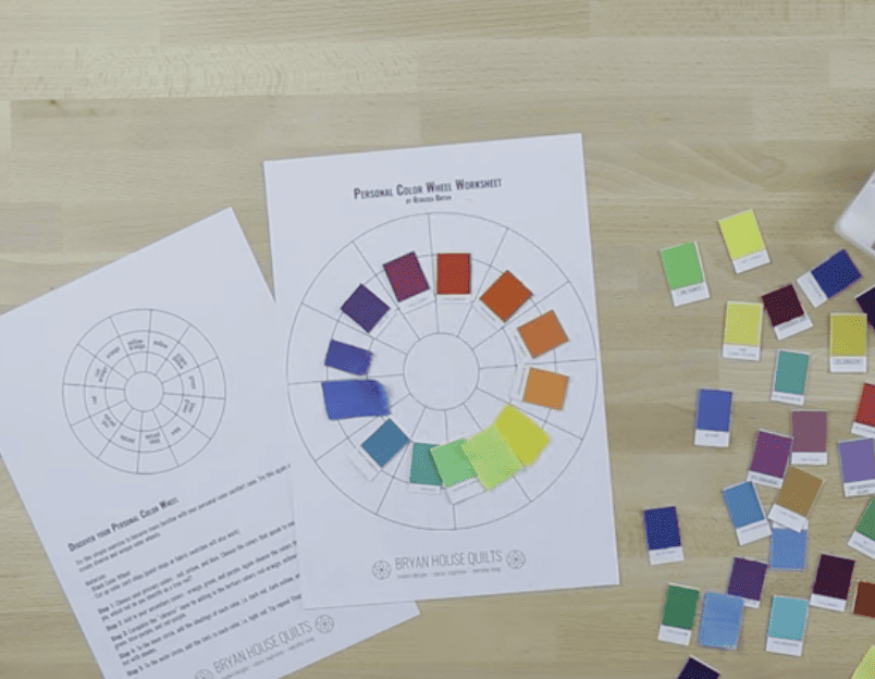
Complete the “hue” layer below by adding in the tertiary colors: red-orange, yellow-orange, green-yellow, blue-green, blue-purple, and red-purple.
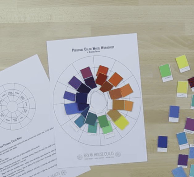
Next, add shades of each color to the inner circle, i.e. dark red, dark yellow, and so on.
Last, add the tints of each color to the outer circle. i.e. light red, light yellow, etc.
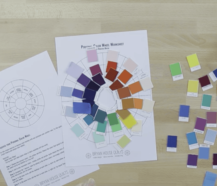
And now you have a personal color wheel. Sweet!
More Options
You can repeat the exercise in different ways to further curate your colors. For example, if you are unsure of the results, snap a pic to save it and then repeat the process. Or only use pastels or jewel tones.
If you feel stuck or can’t decide, use the colors in your favorite fabrics as a guide.
YOUR Next quilting project
A personal color wheel is like mints in your purse – you never know when you’ll need one.
Take it (or a photo) to the quilt shop for a madcap fabric spree. This tool makes silent but powerful suggestions…which might be too much of a good thing?!
You could wear it on a lanyard although that’s serious nerd territory, except at a quilt show. (Howdy, fellow quilt nerds! -wave- I’m wearing a color wheel!)
Last, make sure to take your personal color wheel for a spin through your fabric stash.
MY IN REAL LIFE EXAMPLE
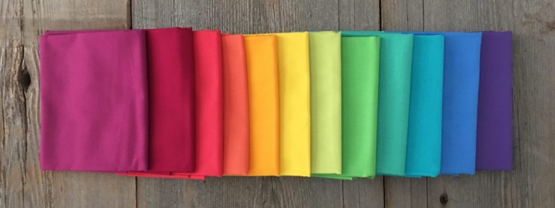
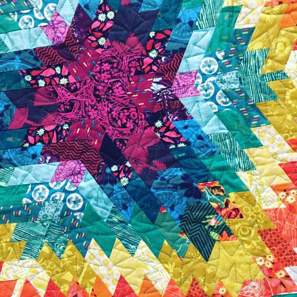
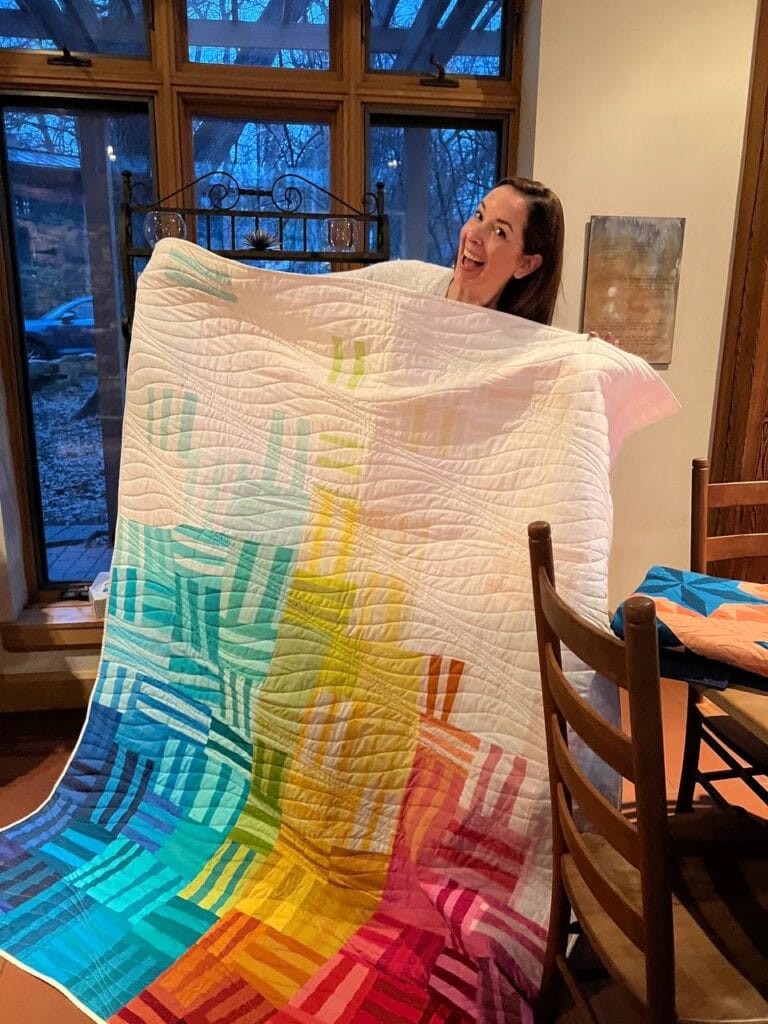
Here’s how I created my color wheel for the Ancient Radiation quilt.

Notice how some colors blend together, especially the green and teal, and the two oranges. The gradation effect with my fave colors never disappoints.
I used 12 colors and this exercise to choose the rainbow colors for my Ancient Radiation quilt.
Consider scaling the number of colors up or down – you don’t need 12 to make a beautiful quilt.
I’m all about simplifying. Having a Personal Color Wheel technique streamlines the color choosing process. So simple.

Color Theory
Yup, there is more to color theory for quilters than making a personal color wheel. And really, it’s a great start.
- Color combinations – analogous colors and complementary colors.
- Warm colors, cool colors
- Monochromatic palettes
- Color relationships
- Light, medium and dark values
Keep learning. Play with color. Mastering color is a process. Learn as you go. Also, I’ve got more color resources for you at the end of the post.
FAQ – QUILTERS COLOR WHEEL
Quilters gotta ask so let’s do a quick FAQ!
Is the color named blue violet or blue purple?! Blue-violet.
Some stash fabrics aren’t on my Personal Color Wheel. Should I keep them? Teach quilters how to make a Personal Color Wheel and swap out your fabrics. Who doesn’t love new fabrics?
What determines your color preferences? (colors of the objects associated with them).
Is magenta a real color? Not on the visible color spectrum, but it’s in my personal color wheel!
Green or blue: Which color is the most popular color in the world? Blue!
Why don’t I like orange and yellow colors in my quilts? You’re not alone. Orange, red-orange and yellow orange are the least favored colors in the U.S. I hear red-orange is making a comeback tho’.
Why is gray fabric so tricky to use? Gray has color roots in every color and shows up as warm and cool colors. That’s why matching gray fabrics is so frustrating.
Why are complementary color schemes popular? They balance and intensify colors at the same time.
What’s next you ask?
SharE your PERSONAL Quilters Color Wheel
Friends don’t let quilty friends lose color control. I know – and now you know – they need a Personal Color Wheel.
Share your Personal Color Wheel on the socials. Tag me @bryanhousequilts and/or with this hashtag: #playfulcolortheory. Or share your next project and how you chose the fabrics using the Personal Color Wheel.
Need a generic color wheel for quilters? Your new project deserves a fabric pull with personality! Click here for my top pick.
Have a colorful day!
Rebecca
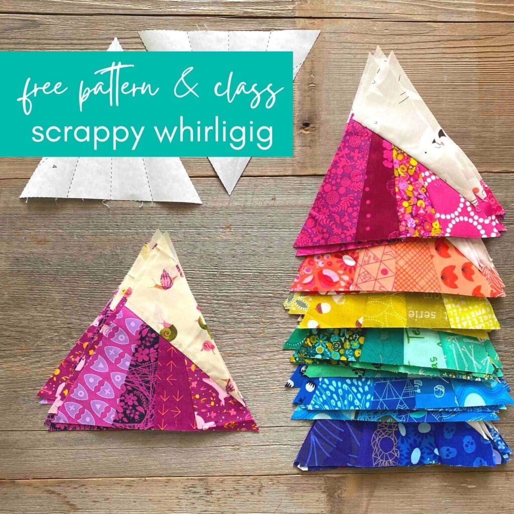
MAKE A MODERN TRIANGLE IN MY FREE “ScraPPY WHirligig ” CLASS
Don’t miss my free tutorial and pattern featuring a versatile modern triangle block called Scrappy Whirligig. Make your first block and turn a bunch into a colorful stars quilt.
Click here to take the free triangle class.

I would love to have one of these how do I get one.
Actually the primaries are cyan magenta and yellow. While your blue red and yellow is an old view this does not work at all for color mixing and painting. Look at your printer primaries. And primaries of light are red green blue.
This is very complex and people need study it seriously BUT in painting blue and yellow do not make green. You get closer to black. Learning true primaries is essential in art.
The reason that we can get away with using red and yellow and blue in concept is that paint runs close to cyan (is not cobalt) and good mixing paint is close to magenta.
So true, Jeanne! A painter has more flexibility with mixing colors than a quilter. We are limited to fabrics that are available, which change often. Interestingly, fabrics are printed with cyan, magenta, yellow and black.