Welcome to Day 4 of Playful Color Month. To catch you up, during Week 1 we talked about symptoms of color trouble (how do you know when you’re having trouble?) and the causes of color trouble. Now that we know how to recognize the symptoms and the causes of color trouble, this week in Week 2, we are starting to add tools to our Playful Color Toolbox.
Today’s Goal: By the end of this post, you’ll get a peek into my next “just for fun” project and add a new tool to your Playful Color Toolbox, a Framework for Mixing Fabric Lines. You’ll be able to use this framework to create your own custom look.
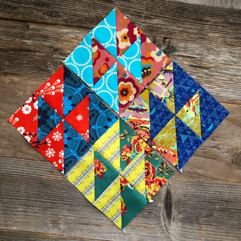
Because it’s easier for me to teach about color using a real life (not imaginary) quilt project and because I need a new “just for fun” quilt project, I started a new quilt project! One doesn’t need much to start, does one!? Ha! So here’s my new project; let’s call it “Hello Houston”. This quilt will be built of 3” finished Half Square Triangles (HSTs) in groups of four. I’m planning on setting the blocks on point with a triangular green border. (This is the HST technique I’m using.)
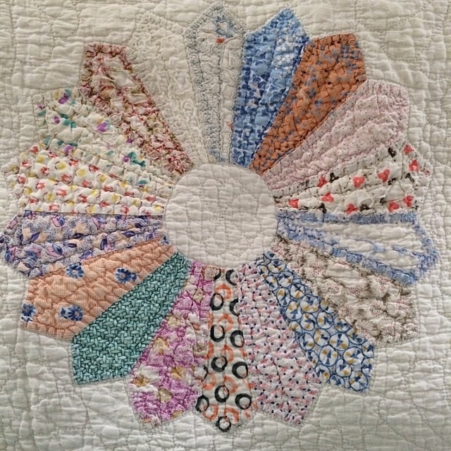
Before walking you through my thinking process for choosing fabric. I want to back up about 20-30 years first. My inspiration for fabric mixing is rooted in the vintage quilts populating my house. (Check out this post for more on this Dresden quilt from the Bryan House Vintage collection.) Back when I had time to lay or sit on beds and couches without immediately falling asleep I could consider the textiles around me. I found myself choosing my favorite blocks in a quilt, but I also found myself strangely drawn to blocks I castigated as “ugly” blocks. So my philosophy, like many quilters, is you need some “pretty” and “ugly” blocks in a quilt. The pretty blocks make the quilt lovely, but the ugly blocks make the real, just like the “Velveteen Rabbit”.
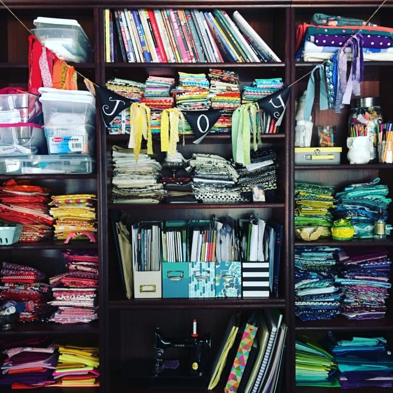
Ok, let’s get to choosing! For this project, each HST block combines two fabrics. Typically I like to see a distinction between the two fabrics. The visual contrast can either come from color, value, scale of the print.
My first step is to choose the fabric and then the color I want to accent. Then my next considerations are to choose the accent fabric based on scale of the print and if it’s geometric or floral.
My Framework for Mixing Fabrics
This is the general process I use with pairing and mixing fabrics from across different fabric lines. My hope is that you can use my framework and create your own fabric mixes. Let’s get started!
Step 1: Choosing Fabric 1
Naturally, our first step is to choose fabric 1 and then to identify some accent colors within the fabric. I’m doing my best in this post to choose multicolored fabrics, which many of us find really challenging. You can also opt to choose fabric with fewer colors.
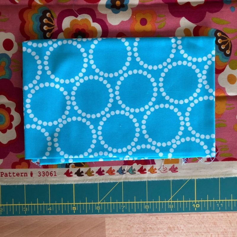
Selvedge Tip! If your fabric still has it’s selvedge, you can refer color dots to identify which colors were used to make the fabric print.
Step 2: Choosing Fabric 2
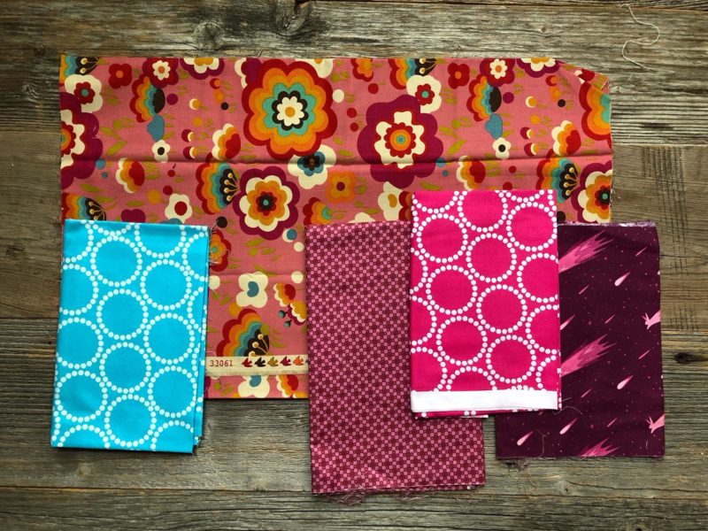
As you choose your fabric 2 candidates, you create “pretty” matches or “ugly” clashes using similarities or differences in hue and value, print scale, and print type. Consider the hue and value of the Fabric 1 and of the Fabric 2 potentials. Also consider the scale – is it large or small? Also consider the type of print – is it a solid, near-solid, floral, geometric, or novelty?
You can match or clash fabrics using:
- Hue and value – what color and value (light, medium, or dark) is the fabric?
- Print scale – is the fabric print small, medium, or large?
- Print type – is it a solid, near-solid, floral, geometric, or novelty?
Think Micro and Macro
In this post I’m generally teaching on a micro level, but I’ll also touch on macro as well. When I’m making a quilt I like to think of think both on a micro and a macro level. When I say micro I mean intra-block. For example, how do the fabrics look together within the block? When I say macro level, I mean extra-block. For example, how do the fabrics in all the blocks impact the look of the overall quilt?
Whether you’re choosing all your fabrics at the start of your project or as you go along, you will want to balance contrast. (Are all your fabric matches pretty or ugly?) Looking to the future of this Hello Houston quilt, when I arrange these blocks the final composition, I will likely have a variety of contrast in my quilts. Typically when I choose my Fabric 1 and Fabric 2 pairings I will vary the contrast.
In this first example, with my pink, medium value, big floral print Fabric 1, I could have chosen one of the calmer, monotone pinks on the right of the photo. But I really love the pop of the bright blue! Let’s look at a few more examples.
Example 2
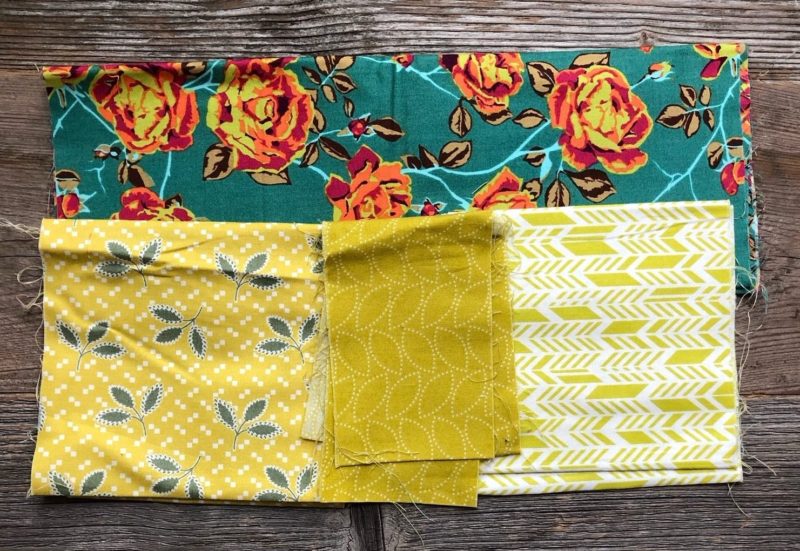
For fabric 1, I chose a large floral print and for fabric 2 candidates, I chose to match the lime green accents. I really wanted the middle lime, but I didn’t have enough fabric. So I had to go back to my stash.
Example 3
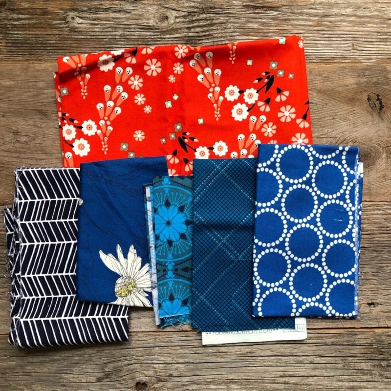
For my third combo, I’m starting with a fun orange red, medium to large scale floral. Navy is the accent color I wanted to play with, but I really don’t like navy. I’m navy averse currently, ha! So I chose a brighter blue.
Example 4
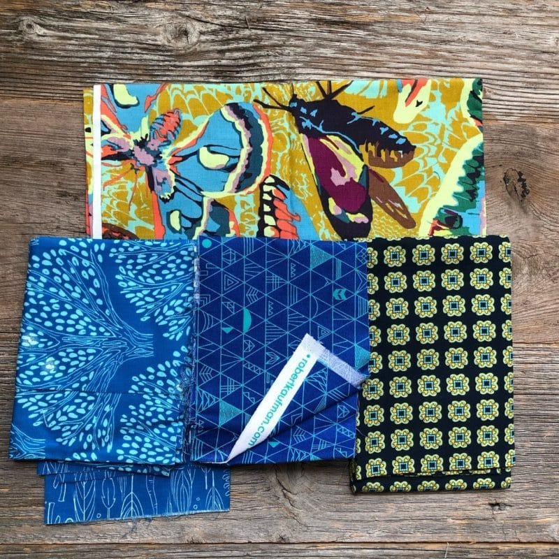
Next I chose a really busy, but awesome fabric featuring lots of colors and a big moth print. This print is a challenge because the colors change so much. So one HST might look much different than the next, which can be fun. Here, I wanted to again use bright blue as an accent.
My results so far and my next steps

And here’s where I’ve landed. Let me tell you about my color trouble symptoms I personally experienced while choosing fabrics. I mentioned in last week’s post about my mindsets I personally carry into my studio. While I was choosing and making these blocks, my evil twin kept trying to bring me down with my “you’re only good at rainbow colors” mindset. Ugh, it’s always a battle! I kept working through the colors despite my mindset. I’m not sure about my blocks, but I think I’ve got a really solid start. And that is good enough for me!
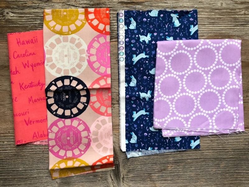
Currently, I love the start I’ve made but I do think I’ve got a lot of contrast. I’m thinking that my next few blocks will play with fabric combinations safer combinations, with less contrast. Here’s a preview of some draft fabric combos. I’m going to try these and see how these fabrics fit in with the rest of the blocks. I dunno…. the purple combo is one I love but it might not work in this quilt. I might have to save it for a rainbow quilt. This quilt for me now is a living design, so things will likely change until the binding is sewn. I’ll keep you posted!
Closing Thoughts
Now you’ve seen a peek into my next “just for fun” project and you have my Framework for Mixing Fabric Lines.
I hope that you were able to glean some meaningful tips here. Just as with any new skill you’ll need to work through my Framework to find your own style for mixing fabrics. But in general if you use this process and guidelines you’ll be off to a good start.
A quick review of the framework:
As you choose fabric pairs consider matching or clashing fabrics using:
- Hue and value – what color and value (light, medium, or dark) is the fabric?
- Print scale – is the fabric print small, medium, or large?
- Print type – is it a solid, near-solid, floral, geometric, or novelty?
Remember to think Micro and Macro
You’ll want to balance and play with the level of contrast in the overall quilt. So do think how the fabric pairs look together within the block but also consider how the pairing may impact the look of the overall quilt.
The Playful Color Month Goal
My goal for you this September is to start you on the path away from “Color is hard and I can’t do it” to “Color is hard, but I have some tools to work with Color.” (I love that gif!)
Playful Color Toolbox
To that end we’ve added two tools to our toolbox! Yah!
1. Playful Color Tool: The best way to use big, busy, bold fabrics is to reign in the chaos by organizing your quilt either by pattern or color.
2. Playful Color Tool: a Framework for Mixing Fabrics
Up next
Next week I’ll be back with a new(ish) pattern for you and we’ll be talking through one of my favorite Playful Color Tools, the Personal Color Wheel and a video demonstration of fabric choosing in a video.
If you are loving these Playful Color Tools and you want more, you’ll love my online workshop launching at the end of the month, Playful Color Theory for Quilters. This workshop is a great resource to learn more about color theory and to add more tools to your Playful Color Toolbox. Specifically you’ll be learning alllll my tools in that workshop, should you choose to enroll. In the meantime, I’ll be back on Thursday with another installment of Playful Color Month.
Schedule of Events
Subscribe to the Playful Color Month Emails
As a reminder here’s the schedule of events and please remember this plan is a bit fluid because of my life transitions. (I just can’t wait to be perfectly settled to share this awesome stuff with you!)
Week 1
Tuesday September 4 – My Top 9 Symptoms of Color Trouble – Do you have a problem?
Thursday September 6 – The 2 Root Causes of Color Mistakes
Week 2
Tuesday September 11 – How to use Busy, Loud, but GORGEOUS Prints
Thursday September 13 – How to Mix Fabric Lines for a Custom Look (You are here!)
Week 3
*New(ish) Free Pattern*
Tuesday September 18 – The Color Secret Artists use to Maximize Creativity
Thursday September 20 – Using the Personal Color Wheel (I’m planning on a live event!)
Week 4
Tuesday September 25 – My Favorite Playful Color Tools
Thursday September 27 – I’m sharing and demoing live (I think!) one of the painting exercises from the Playful Color Theory for Quilters online workshop.
Next steps after Playful Color Month
The Fall Session of Playful Color Theory for Quilters will start September 28, 2018.

How would you use BIG MOTIFS like kaleidoscope prints in quilts? Would you cut them up or leave them intact?
I really want to do something unique because I have collected these for years.
Hi Cath! Ohhhhh, good question.
I have a few ideas… one idea is to use a Kaleidoscope fabric with a solid (or solids) and just letting the kaleidoscope fabric play in the different pieces.
Or you could do a quilt pattern that features different portions of the kaleidoscope fabric.
It seems to me that all the designs in the HST are fighting each other. They are all bright and bold. Where does the eye really rest? Will there be sashing?
Definitely!
The plan is to make lots and lots of these babies and hopefully, once there are a ton, they will stop fighting with each other and start playing for the same team. At least that’s the plan. At this point, when there are only a few blocks, color can be really scary because the colors are definitely fighting each other.
Usually when I get to this point it’s a leap of faith. It’s easy to get intimidated and quit or find some safer color choices. The trick is knowing when to stay committed to your original idea (even if it’s scary) or start to incorporate a new color design.
To answer your sashing question, no there won’t be any sashing. There will be a green border around all of the blocks. Again, that’s the plan for now. It’s like a living document – things change! I’ll keep you posted.
Thanks for asking this question!