Welcome to Week 2 of Playful Color Month. Last week we talked about common symptoms of color trouble and the two root causes behind all color trouble. This week I want to give you a few solid tips to add to your Playful Color Toolbox Today we’re learning how to use those busy and bold, but oh so beautiful prints.
My goal: As we go through the month, my goal is to take you from thinking, “Color is hard and I can’t do it,” to instead thinking, “Color is hard, but I have some tools to work with it.”

Many of us struggle with using “busy” but beautiful fabrics. Though I’m a minimalist and rarely encounter this specific issue, I’ll share what I’ve found helpful. We’re going to use a busy, traffic laden, highway as an analogy and a few examples showcasing fabrics designed by Kaffe Fassett, the king of busy and beautiful prints.
Playful Color Tool: The best way to use big, busy, bold fabrics is to reign in the chaos by organizing your quilt either by pattern or color.
Make it easy for your passengers
Photo by Peter Hershey on Unsplash
If we think about our work as a highway and our viewers as our commuters, we need to provide easy access points for our commuter to “travel” our work. When using busy prints, our work can become crowded with visual noise that can quickly overwhelm our viewer. And like a crowded highway, our viewer will either have to work really hard to travel our work or turn around and go a different direction.
We don’t want that! We want to make it easy for our viewer to access our work. But what are some ways to help our viewers access our work when we use busy prints?
The problem isn’t the busy fabrics, a problem arises when we fail to give our viewer an onramp. We need to provide our viewer a way to organize the visual information they are receiving so that they can comprehend what they are looking at! Once we’ve organized the view and made it easy, the beauty of those prints will shine!
Playful Color Tool: The best way to use big, busy, bold fabrics is to reign in the chaos by organizing your quilt either by pattern or color.
How to give your viewer an on ramp:
The best way to use big, busy, bold fabrics is to reign in the chaos by organizing your quilt either by pattern or color. In many cases using of pattern and color play to set boundaries and rules helps the viewer see the beauty of the print. Let’s look at some examples using Kaffe Fassett fabric – notoriously busy, famously beautiful.
Organize Using a Strong Pattern
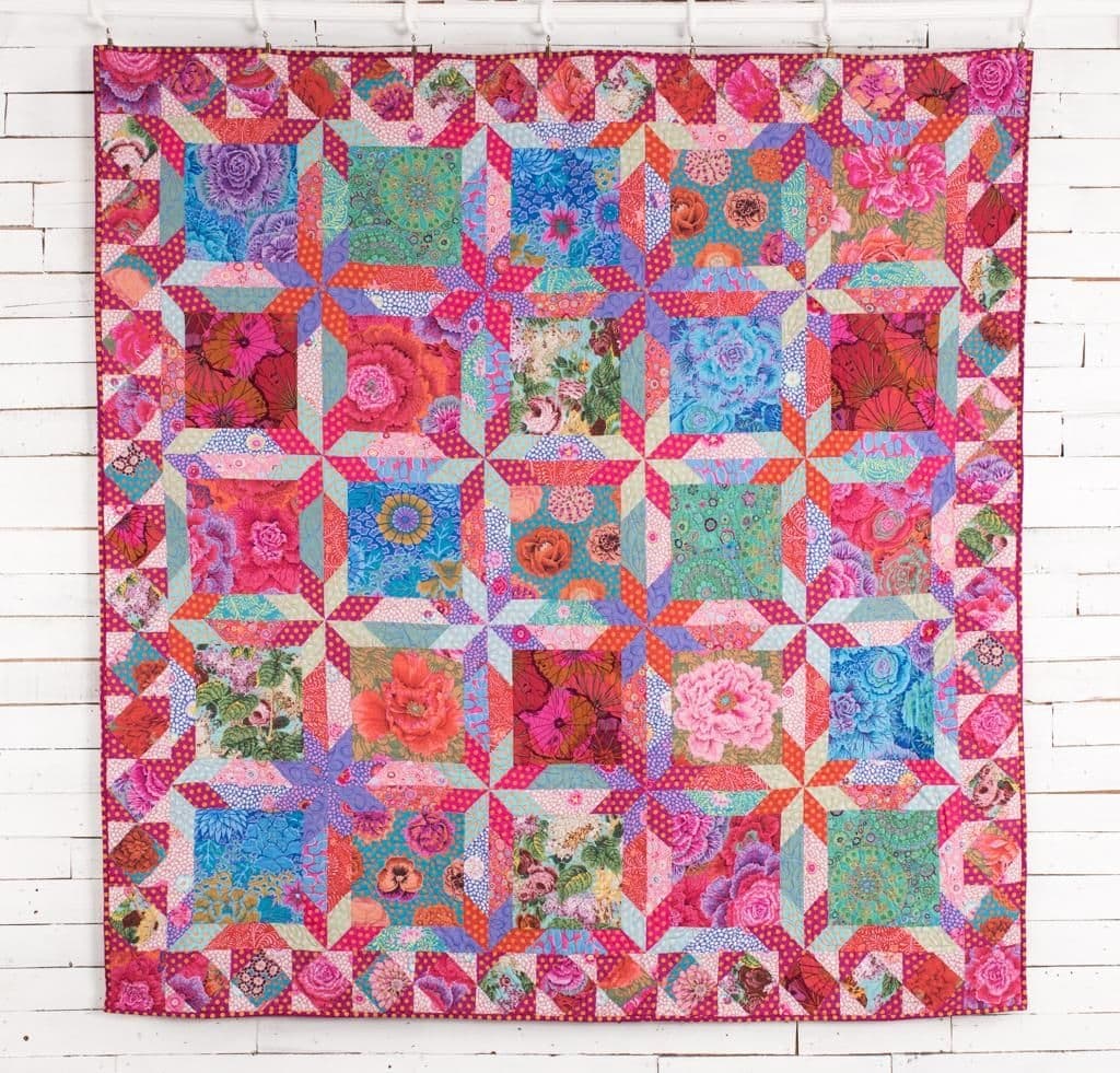
A strong pattern will control the wildness of those bold beauties. The strong pattern gives the viewer a place to rest their eye and a way to access and understand the image. Once the busy is controlled, we can really appreciate its loveliness.
Designed by Pauline Smith, page 86 of Quilts en Provence
Shimmering Triangles, by Jenny Bowker
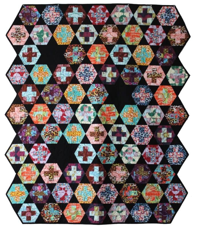
I don’t have too many personal examples of using strictly big and busy prints. But here’s one of my quilts where I use busy prints in a really strong pattern. This is Hexy Plus using Anna Maria Horner fabric and a healthy dose of black background fabric.
Organize Using Color
Another way to control the potential craziness of busy prints is to organize your piece using color. You can use elements of color theory here, which I cover in my Playful Color Theory for Quilters workshop. Let’s talk through some specific examples using hue and value.
Hue
Hue is the color of the fabric. My personal favorite (obviously!) is using rainbow order to organize busy prints. But you could also organize your project by warm/cool color or complementary colors.

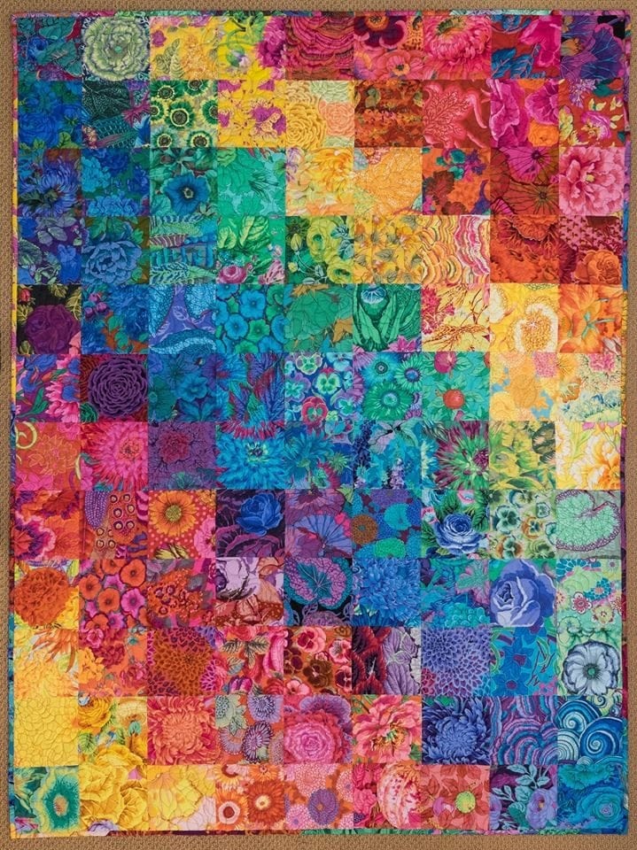
Floral Rainbow by Julia Hill Enzenberger from Kaffe Fassett Collective
Floral Rainbow by Julia Hill Enzenberger organizes the busy fabrics in color order. Yummy!
Value
Think of value as the lightness of the fabric.

Pastel Floral Bouquet, Kaffe Fasste
Pastel Floral Bouquet, by Kaffe Fassett, uses both color value and pattern to organize the lovely fabrics.
Closing Thoughts
The Playful Color Month Goal
My goal for you this September is to start you on the path away from “Color is hard and I can’t do it” to “Color is hard, but I have some tools to work with Color.” (I love that gif!)
To that end let’s add this lesson to your Playful Color Toolbox. Playful Color Tool: The best way to use big, busy, bold fabrics is to reign in the chaos by organizing your quilt either by pattern or color.
At the end of the month, I’ll be offering my online workshop, Playful Color Theory for Quilters. This workshop is a great resource to learn more about color theory and to add more tools to your Playful Color Toolbox. Specifically you’ll be learning alllll my tools in that workshop, should you choose to enroll. In the meantime, I’ll be back on Thursday with another installment of Playful Color Month.
Schedule of Events
Subscribe to the Playful Color Month Emails
As a reminder here’s the schedule of events and please remember this plan is a bit fluid because of my life transitions. (I just can’t wait to be perfectly settled to share this awesome stuff with you!)
Week 1
Tuesday September 4 – My Top 9 Symptoms of Color Trouble – Do you have a problem?
Thursday September 6 – The 2 Root Causes of Color Mistakes
Week 2
Tuesday September 11 – How to use Busy, Loud, but GORGEOUS Prints (You are here!)
Thursday September 13 – How to Mix Fabric Lines for a Custom Look
Week 3
*New(ish) Free Pattern*
Tuesday September 18 – The Color Secret Artists use to Maximize Creativity
Thursday September 20 – Using the Personal Color Wheel (I’m planning on a live event!)
Week 4
Tuesday September 25 – My Favorite Playful Color Tools
Thursday September 27 – I’m sharing and demoing live (I think!) one of the painting exercises from the Playful Color Theory for Quilters online workshop.
Next steps after Playful Color Month
The Fall Session of Playful Color Theory for Quilters will start September 28, 2018.


This is completely fabulous, and so useful! I’m sending a link to so many other local quilters! Thank you!
Thanks! I appreciate that!