Many quilters want to design their own quilts, but don’t know where to get started. In this post, I’ll be running through some quilt design vocabulary. A great place to start learning about any topic is by understanding common vocabulary. I know…. so sexy… don’t you want to read a vocabulary list? Ha!
But, when you know the words… you’ll know the keywords to google!
Ok, so vocabulary isn’t the most fascinating read, but my plan is to make this vocab lesson “fun” by showing you examples from the Isosceles section from Modern Triangle Quilts.
And, if you’d rather see this vocab list in action, register for my free virtual trunk show, “A Quilter’s Guide to Graphic Design. Register here.
Today, I’ll be running through these quilting design vocabulary:
- Color
- Texture
- Framing
- Figure/Ground
- Symmetry and balance
- Scale
- Rhythm
- Grid
Most of these examples are from my book, Modern Triangle Quilts. Let’s jump right on in to today’s lesson on quilt design vocabulary!
Color
No definition needed for color right? In graphic design and in quilting you can use color to evoke a mood or a feeling. You can also use color to unify or to make something special stand apart.
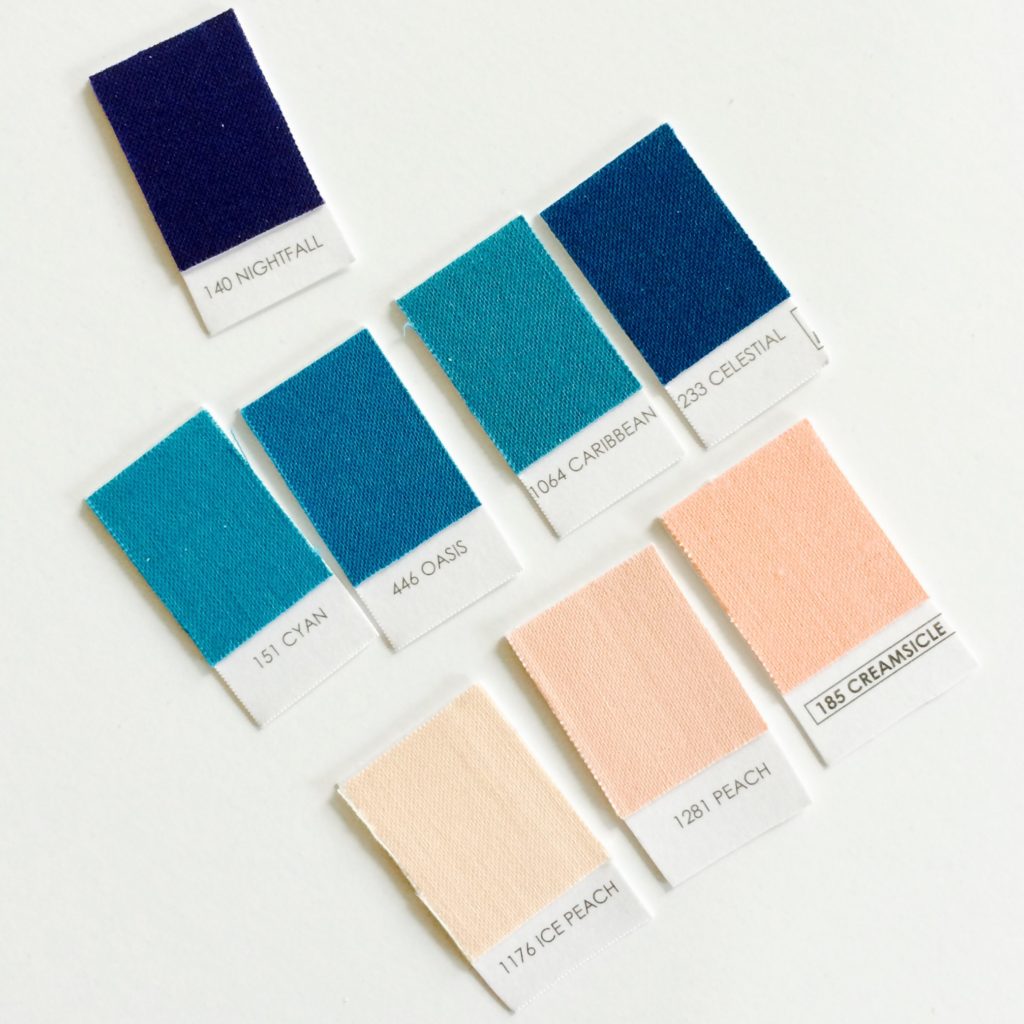
To unify the Isosceles section, I used a peach, sea green, and navy color palette pictured here for all of the triangle blocks and quilts. By the way, big thanks to Robert Kaufman for providing ALL of the fabric for the quilts in the book. Thank you!
Texture
In short texture is what a material feels like (e.g. cotton or linen, wool or polyester) or looks like it feels like. There are two general ways we can add texture in graphic and quilt designs: actual texture and virtual texture.
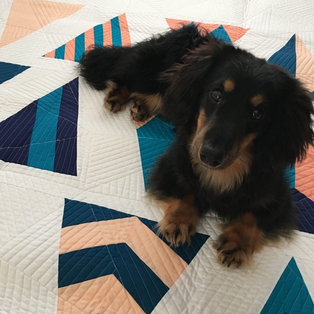
Actual texture is texture that we can see and feel with our eyes and fingertips. For example if we were to close our eyes, we could feel a difference between the quilt and Bruce Wayne the Wiener Dog in the above picture.
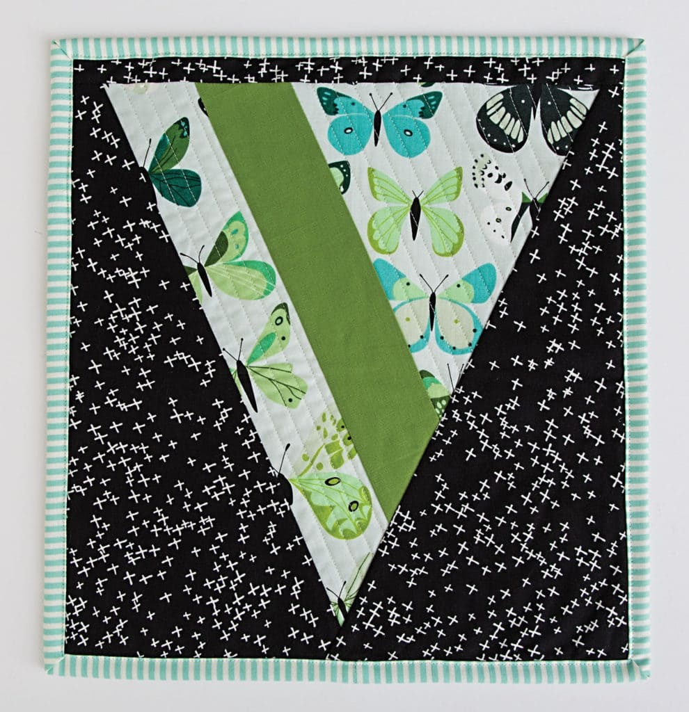
Pieced by Heidi Staples
Virtual texture is texture we can see but we can’t feel. So in Heidi’s mini for example, we can see a difference in texture between the printed and solid fabrics. But since each fabric is cotton, we wouldn’t be able to feel a difference in texture.
Framing
We can think about framing like a picture frame. There’s a couple of ways to frame a picture, with a mat or without a mat. And if you do have a picture matted, you can center the picture or offset it. Generally, in quilting, we have three framing tools: 1) We can use a block to frame (e.g. fussy cutting), 2) We can add sashing between blocks, and 3) we can use borders or no borders between the blocks and the binding.
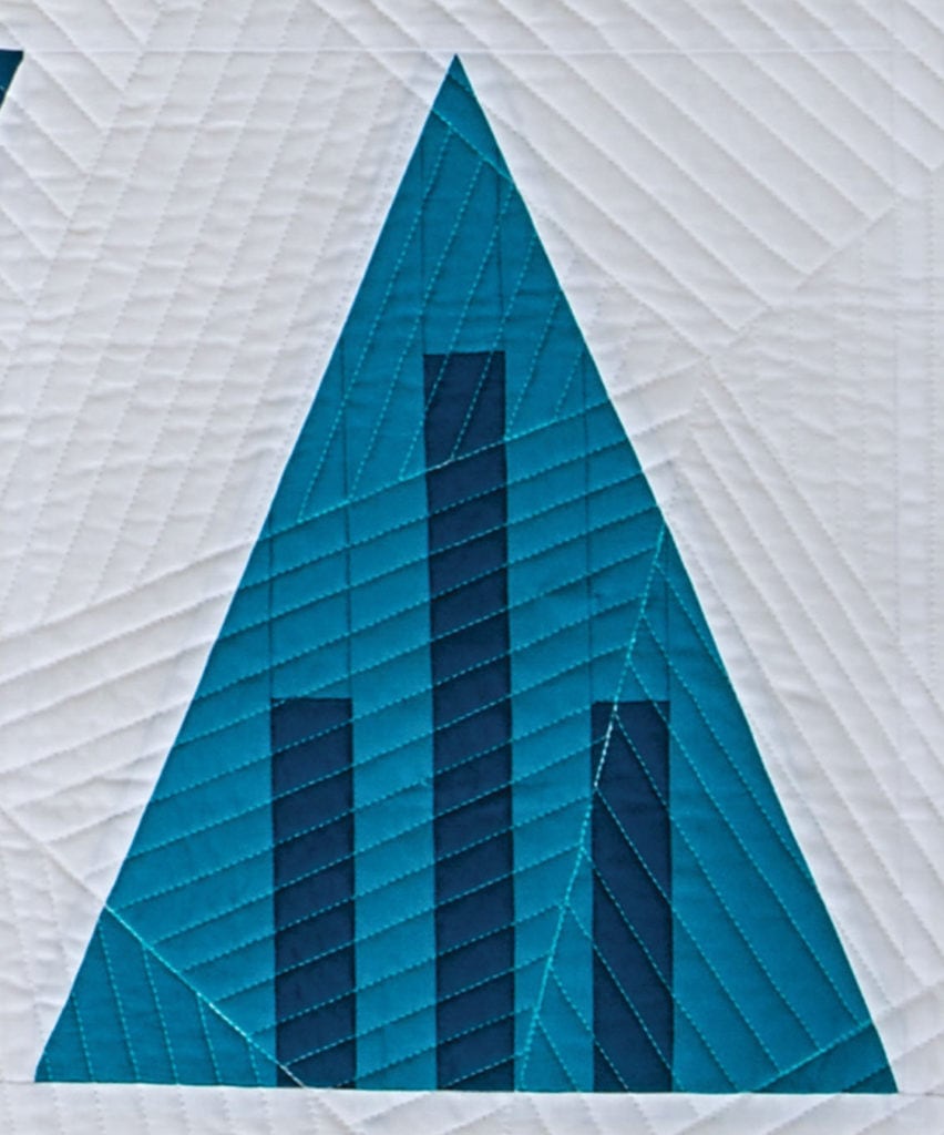
Modern Triangle Quilts, Isosceles Sampler, Block 1
In Block 1, I’ve framed 3 lines within the triangle.
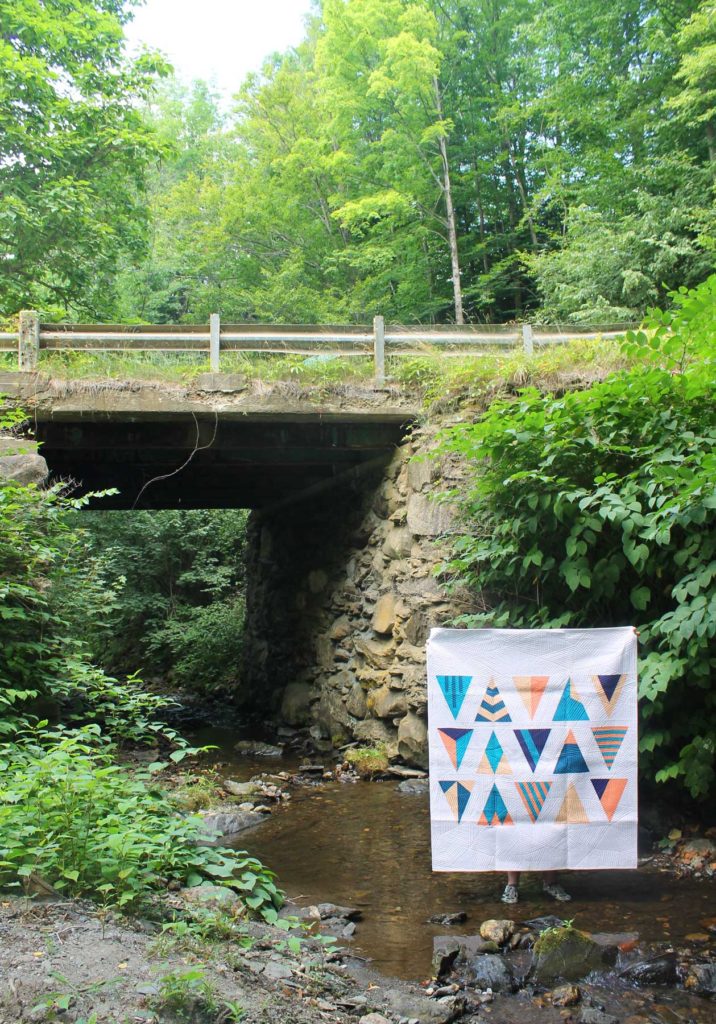
Isosceles Sampler, Modern Triangle Quilts, Rebecca Bryan
In the Isosceles Sampler, I’ve used a sashing between each Isosceles Sampler block and I’ve also used a border on the top and bottom to center the design. Note how different the triangle blocks look without sashing in Stardust and Riptide below.
Figure/ground
Figure/ ground relationships are fun to play with. The figure is the focal point and the ground is the supporting space around the focal point. By playing with the tension between figure and ground, we can create fun visuals for the viewer to explore.
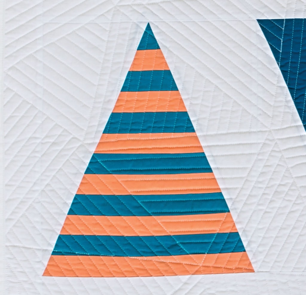
Modern Triangle Quilts, Isosceles Sampler, Block 8
We can play play with the figure/ground relationship within each block or what I like to call the micro level. In Block 1 above, the figure in the triangle is the set of three lines, but the actual triangle itself is also the figure in the quilt. Look at Block 8, and notice there is not a clear figure and ground within the triangle. The peach and turquoise stripes compete equally for your attention. So I would say the figure is the triangle block itself. The sampler blocks with a quilt don’t need to have the same figure/ground relationship; we can vary the intensity of the figure/ground relationship to make it interesting!
We can also play with the tension between figure/ground with the overall composition or at the macro level. You see how in Stardust, below, the focal point is the grouping of triangles, which I’ve chosen to offset frame in the lower right.
Symmetry and balance
If we think about balance in terms of the weight of elements in a design, then good balance in a design is the careful and deliberate distribution of elements in a design. In general, we can balance design elements in a quilt through symmetric balance or asymmetric balance.
There’s lots of ways to play with symmetry in design. I love symmetry! The Isosceles Sampler (above) and Riptide (below) are both symmetrically balanced designs.
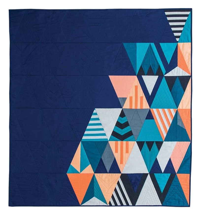
Stardust, Modern Triangle Quilts, Rebecca Bryan
You can play with asymmetric balance in design by balancing the weight of elements in your design. If you look at Stardust, you can see that to balance my asymmetrical design, I chose a heavy, dark, navy blue background. I felt this deep and wide swath of color, balanced the clustering of triangles on the lower right of the quilt. (Note how I use the texture of the quilting to tie the design together.)
Scale
Scale is the relative size of design elements. In the Isosceles section, all the triangles in each quilt are all of the same size. But there is a lot you can do just by playing with the relative sizes of the triangles in one quilt. There are 2 sizes available for each Isosceles, 6” and 12” finished. The Isosceles Sampler and Stardust (above) both use the large size while Riptide (below) uses the small size.
Rhythm
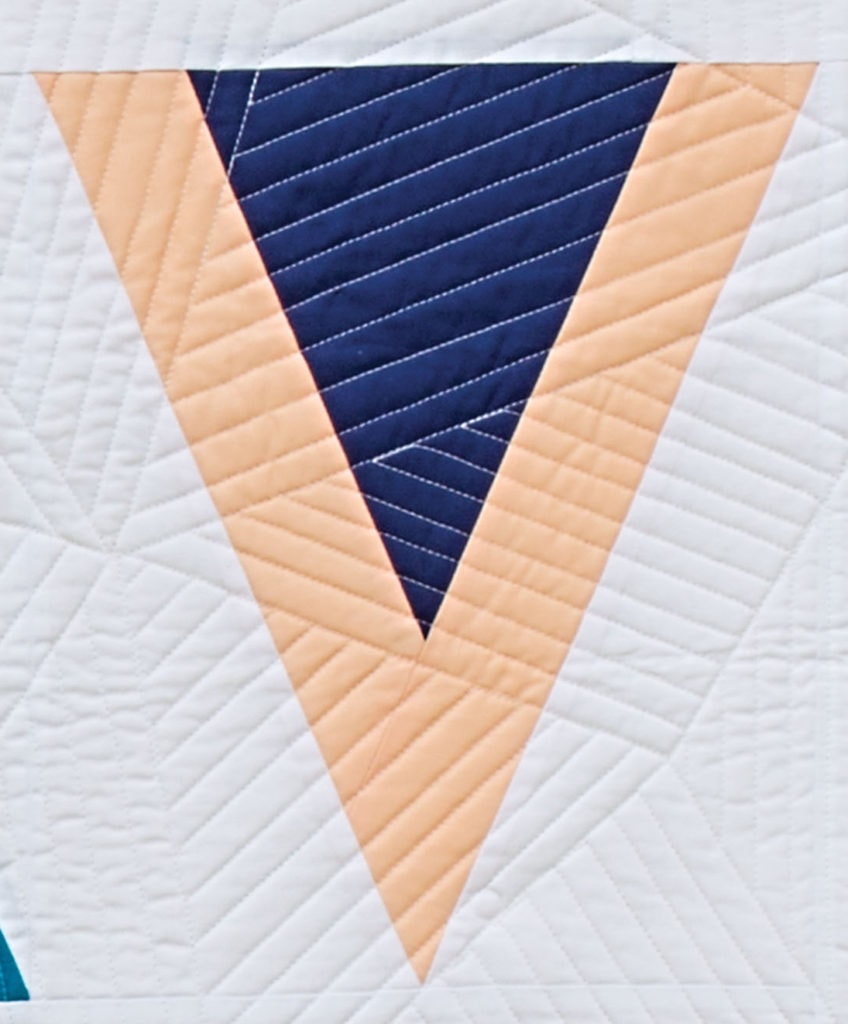
Modern Triangle Quilts, Isosceles Sampler, Block 4
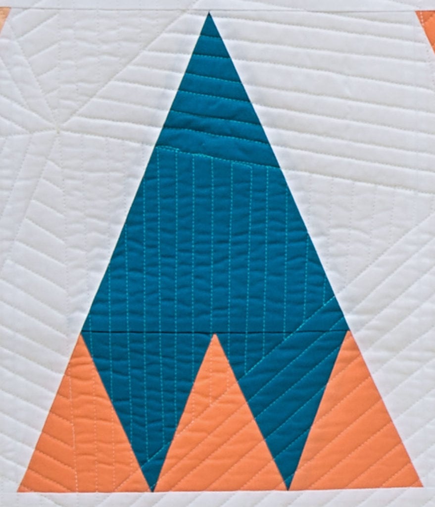
Modern Triangle Quilts, Isosceles Sampler, Block 5
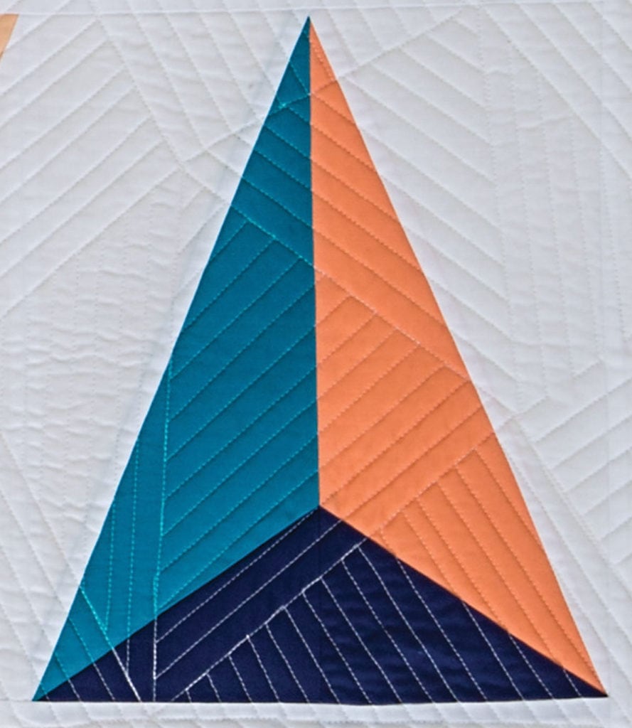
Modern Triangle Quilts, Isosceles Sampler, Block 14
Rhythm is a repeating beat in a song or element in a design. In the case of Modern Triangle Quilts, our rhythm of course is the constant shape of the triangle. A constant rhythm lets us designers play within the scaffolding of the rhythm, but not lose our viewer to chaos.
Grid
Grids are a network of seen or unseen lines. By simply beginning with a gridded paper (as opposed to white), we have a structure to play with other elements like scale or balance. There are lots of different grids we can start with, like graph paper, or in this case triangle grids.
Pattern
Patterns are created by repeating motifs, or triangles in this specific case. We can play with primary and secondary patterns by layering triangles together.
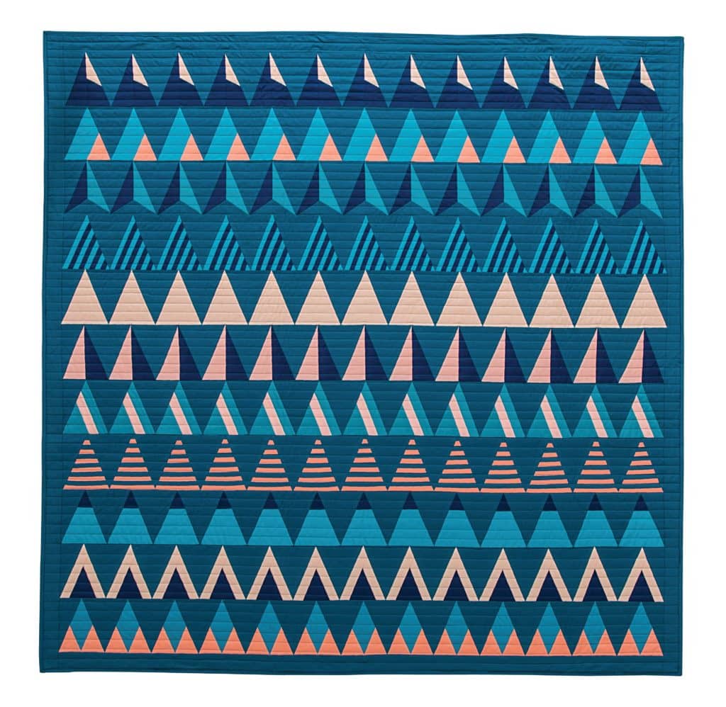
Riptide, Modern Triangle Quilts, Rebecca Bryan
In Riptide, just by repeating the same triangle across the width of the quilt top I’ve created a horizontal pattern. In Stardust (above) you can see hints of a few secondary patterns as certain triangles are tiled together. There’s a lot of fun yet to be explored using this element.
Ok, that’s all the quilt design vocabulary I have you today! See? That wasn’t sooo bad, right?
And now, you know some key words you can google. And perhaps you can start using these ideas to improve your design skills in your own quilts.
Want more?
- Go deeper with this quilt design vocabulary lesson by registering for my free virtual trunk show, “A Quilter’s Guide to Graphic Design. Register here.
- Think you can design? Take the “5-Day Design a Modern Triangle” challenge.
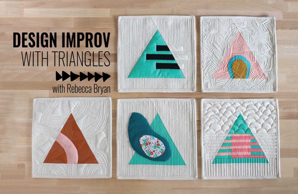
- Start exploring and playing with these design elements by taking my virtual workshop, Design Improv with Triangles. Register here.

Lots of things to think about! I am already beginning to think about designs I might want to use!