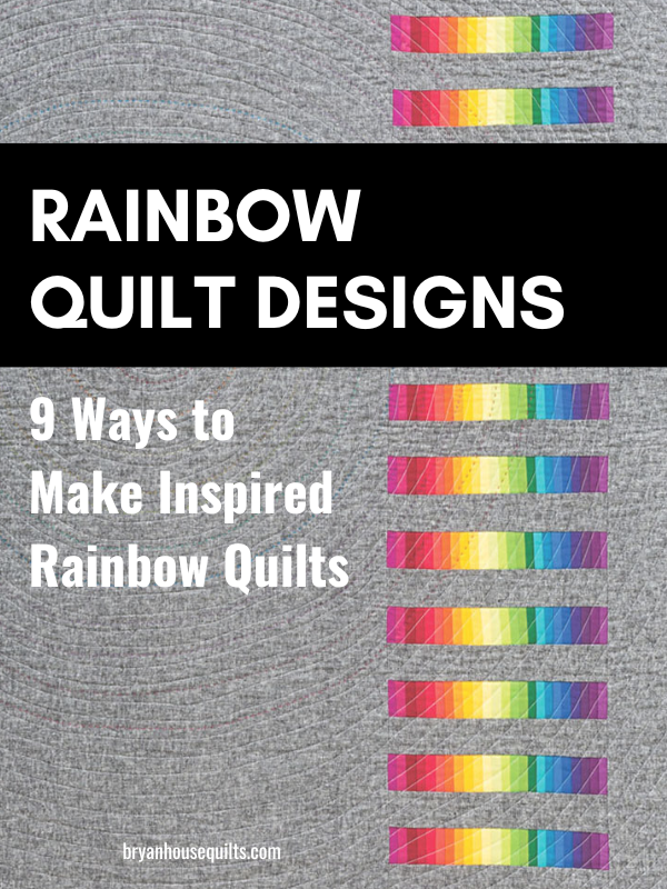
Rainbow quilt designs and color palettes are a fun way to create. The rainbow spectrum is a built-in palette. And who doesn’t love color?!
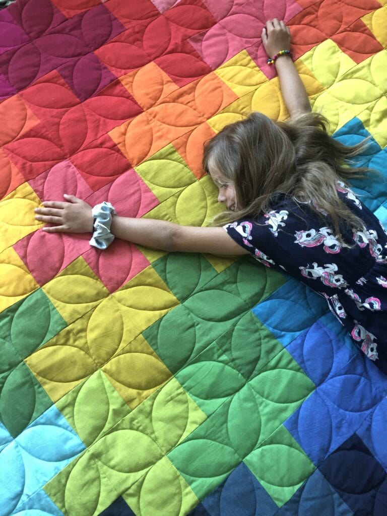
Always, always have loved rainbow color palettes. And quilts made with them. Rainbow palettes are sometimes predictable but never boring. Which makes it impossible to look away from a rainbow quilt. I like that in a quilt.
I used to think of the rainbow spectrum in a traditional way – pure, bright colors in always-perfect order. But I wanted to go over the rainbow (hehe) and think beyond tradition.
That meant design had to pull its weight. And I needed to play with color even more. So I went to work/play. While writing my book Modern Rainbow I pushed hard on my rainbow comfort zone. I rebooted my color choices and designed a quilt pattern to showcase each palette.
I’m sharing 9 ways to make an inspired rainbow quilt with my rainbow quilt palette and design techniques. Get inspired to give rainbow quilts a try!
Key Takeaways
- Get to know the color wheel. The color wheel is essential in rainbow quilting, guiding color choices and ensuring a harmonious design that combines primary, secondary, and tertiary colors, as well as balancing warm and cool colors.
- Let go of traditional rainbows by experimenting with color order, neutrals, pastels, jewel tones, gradation, intensity, value, omission and print fabrics.
- Choosing the right quilt pattern design helps support a rainbow palette.
Rainbow Spectrum: Primary, Secondary and Tertiary Colors
The color wheel is at the heart of a rainbow quilt. I use it to guide my color choices and identify possible color schemes. Learn more about how to use one here.
Simply put, the color wheel consists of 12 ordered colors. There are many ways to visualize the rainbow, but typically in quilting, we use a quilters color wheel.
Fun fact: There are only seven colors in the official rainbow according to Benjamin Franklin, but 12 on a color wheel. Originally, it was six, but Mr. Franklin liked the number seven for its lucky properties. Rainbows are lucky, right?
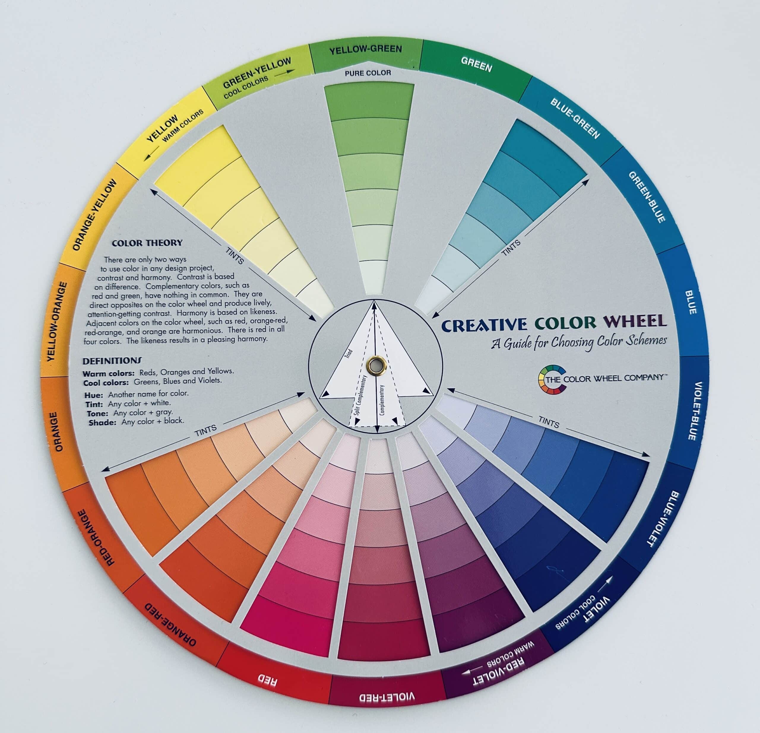
Looking at the wheel, we see that the primary colors – blue, red and yellow – when combined, form the secondary colors – purple (red + blue), orange (red + yellow) and green (yellow + blue).
Tertiary colors include: blue-purple, red-purple, red-orange, yellow-orange, yellow-green and blue-green. They are created when a primary and secondary color blend or when two secondary colors blend.
An easy place to start building a palette for a rainbow quilt is to think of it like this:
- Primary colors are the main ingredients,
- Secondary colors support the overall palette by creating transitions between colors,
- Tertiary colors are a mix of the two.
A basic rainbow palette uses the 12 primary and secondary colors. Make it more interesting by adding in the tertiary ones, too.
Warm and Cool Colors
The color wheel also shows which ones are warm, cool and in between. Red, orange, and yellow exude a cozy and energetic warm vibe. Think red shoes and lipstick, fall leaves and orange juice! These appear to move toward you.
On the other side of the spectrum, cool ones are more subdued – like blues, greens, and purples. They are calmer and serene. Grassy slopes, purple mountain haze and blue sky. They seem to move away from you.
Determining Dominant Colors
In print fabrics, one color often stands out more than the others. This is the dominant one that sets the vibe for the fabric. Often, the entire quilt.
Can you identify the dominant one in print fabrics? Squint your eyes to see which ones pop out in the haze. Take the fabric outside in natural light to get a better look. The background in a multicolored fabric might “tell” you which team its on. Sometimes, there isn’t anything that stands out. Maybe set that one aside for another quilt!
Using a Value Finder
A value finder is a handy tool for quilters that helps determine how light or dark a fabric is by removing its color. This tool is essential for quilters.
Fabrics for Your Rainbow Quilt
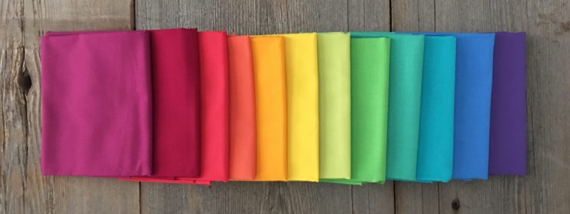
Luckily, fabric shops are like a crayon box and fabrics are the crayons. A well-rounded fabric stash includes fabrics within each of the 12 basic colors. Yes, you need lots of fabric for a rainbow quilt (quilts!). Weeeeee!
I don’t have to tell you that more fabric choices are better! Stock your stash with a variety of each color by value, tint, shade, tone and saturation. Wondering if you have enough variety? Pull a quick rainbow palette with 12 colors. Then see if you have tints or shades of those choices. Take a photo so you see what you’re missing and shop like you mean it!
Solids and Prints
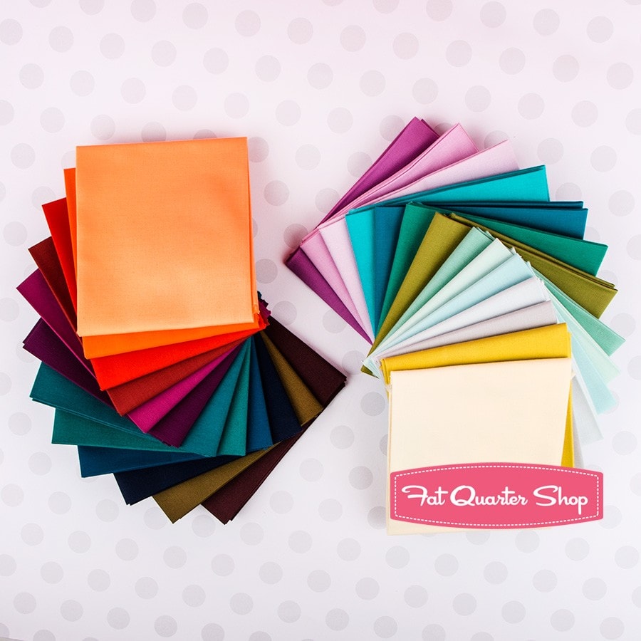
Solids are an easy basic. They are simple to arrange in color order and widely available in many tints and shades. To make the perfect color easier to identify, manufacturers offer color cards, which show samples of each solid fabric offered – similar to paint chips.
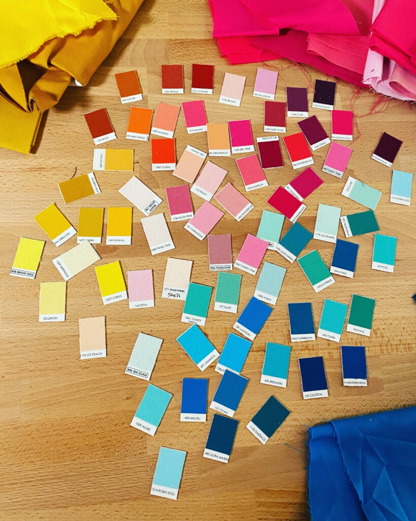
Single-color fabrics
With tone-on-white and tone-on-tone pattern fabrics, it’s an easy sort session. They add depth and texture to a rainbow quilt.
Prints
Print pattern fabrics can be a game-changer in your rainbow quilt. The patterns add visual interest, texture, and movement. They harmonize with all of the fabrics.
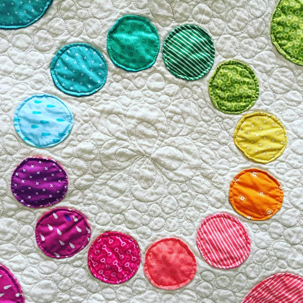
Using prints are fun – most quilters are drawn to the pattern – but the multi-colored prints are tricky in palettes. Which color is dominant in the pattern? (I see you, Red). Does it have a warm or cool cast? Red, yellow or blue undertone?
Prints are a lucky penny in rainbow quilts in spite of their differences. And luckily, most fabrics are a one or two-color pattern. When you look at a designer’s fabric collection, there is usually one large multi-colored pattern print, maybe in several colorways. The rest are one and two-color fabrics.
My Rainbow Quilt Palette Techniques
EXPERIMENT WITH CONTRAST
Contrast is how fabrics look different when shown in proximity to each other. Increase or decrease contrast by changing fabrics with color, tint, shade, and tone. To decrease contrast, use more colors or fabrics, to increase contrast, use fewer.
Did you know that balancing warm and cool fabrics creates harmony in a rainbow quilt? Warm colors bring vibrance while cool ones offer a resting spot for your eyes.
SOFTENING CONTRAST
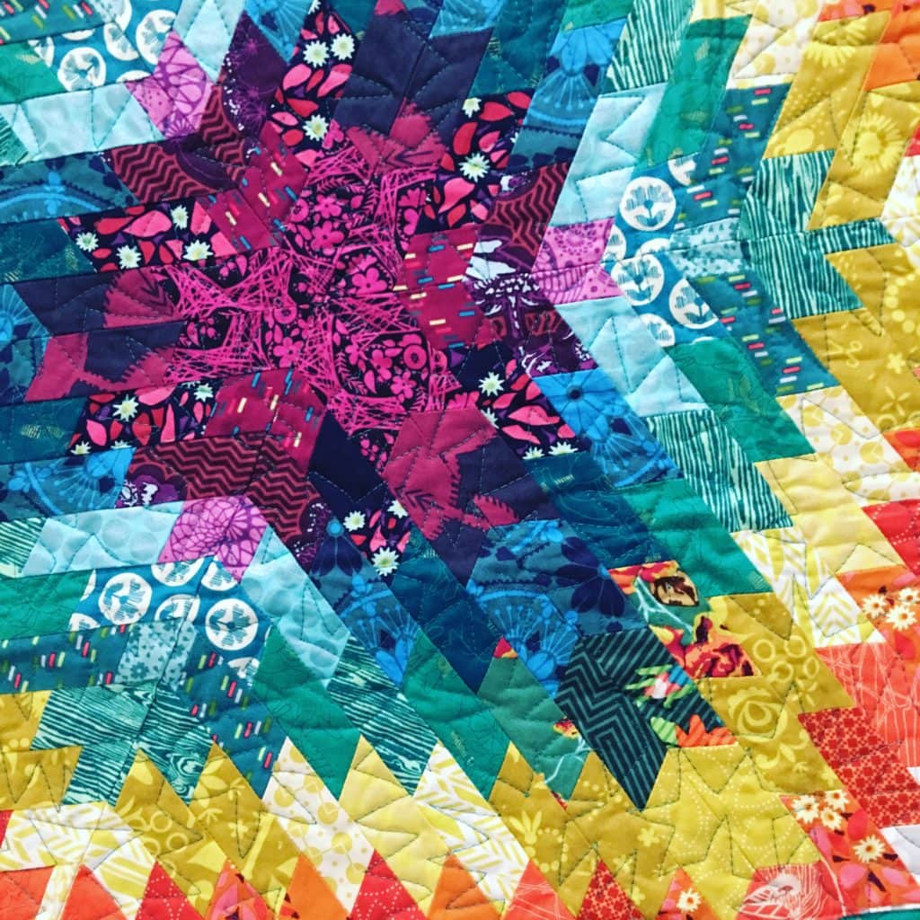
My Lightning Streak chevron quilt uses contrast and prints to soften the transition between colored fabrics. I used different print fabrics within each hue.

When you look at the quilts below, notice how fabrics are softened by print patterns in the same color family.
CONTRAST BETWEEN THE FOREGROUND AND BACKGROUND
Wavelength has a floating vibe because I varied the whites used in the background, which added to the depth and contrast.

LESS THAN A FULL SPECTRUM
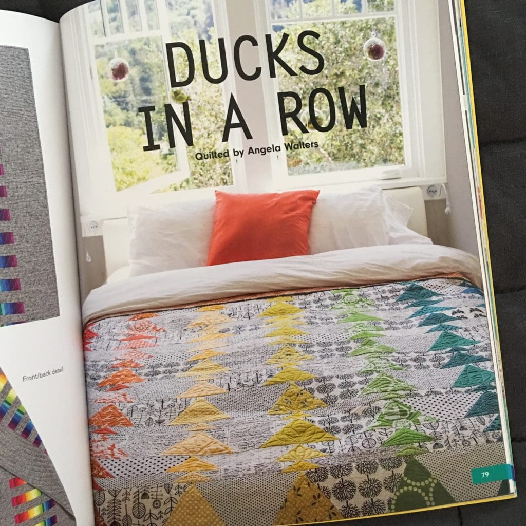
Ducks in a Row quilt pattern doesn’t use true reds, blues or purples like a traditional rainbow palette. The spectrum goes from red-oranges to blue-greens. No purple.
REARRANGE THE ORDER
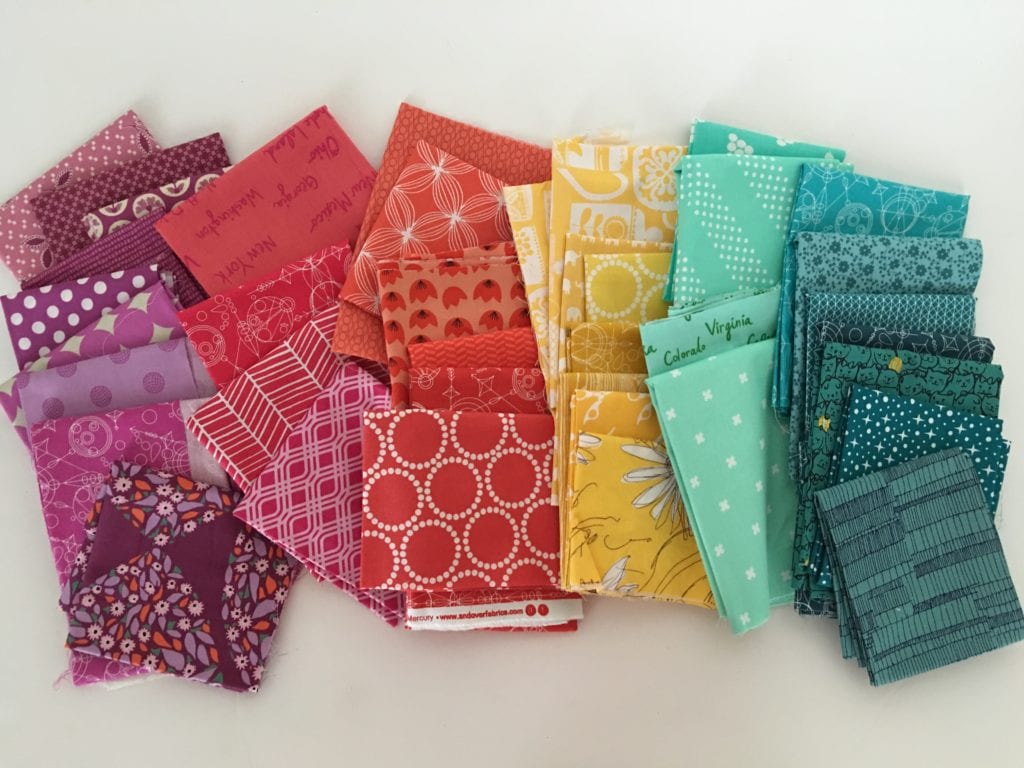
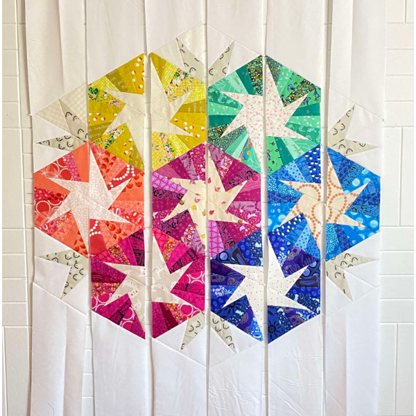
Use the entire rainbow spectrum in an out-of-order placement. It still reads rainbow.
JEWEL TONES, PASTELS AND NEUTRALS
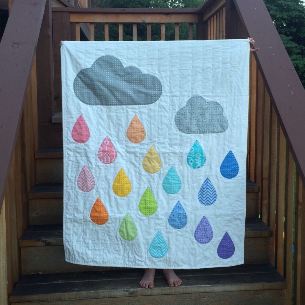
Push the regular color characters aside and use a palette mixed with jewel tones AND pastels. Replace yellow with a yellow-leaning white. Blue with a bluish white. Use all 12 colors on the wheel but in unexpected ways.
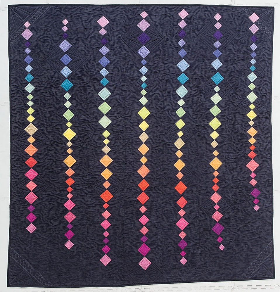
The black background makes the pastels appear more vibrant than they are.
FAVORITE COLORS
You’ll notice that I use my favorites OFTEN (all the time). Teals, magenta and citron. Is citron in real rainbows? Nope. Use your favorites and round out a rainbow palette around them. Inspired!
SCRAPPY
Going scrappy is always an option for rainbow quilts. They are vibrant, eclectic and inspired by your creativity. You’ll make more decisions using scraps for a quilt so pick quilt designs with a strong block patterns.
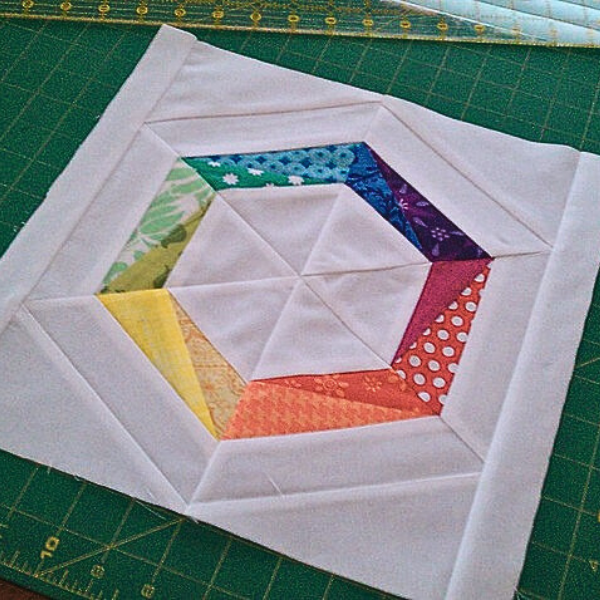
Organize your fabric pieces in scrap bins makes for easier decisions. Sort them out in patterns and solids, too. (Overachievers: sort by value and tertiary colors, too. Arrange in a giant circle. Ask me how I know you’ll do this.)
In the next section, I’ll share my quilt pattern designs and how combine them with rainbow palettes.
Putting it All Together: 9 Rainbow Quilts by Color and Design
I’ve used traditional, modern and improvisational quilt pattern designs for rainbow quilts. I’ll tell you how I did it, using these techniques: color order, contrast, seamless spectrum, gradations, neutrals, pastels, jewel tones, intensity, color omission and print fabrics. Whew, that’s a long list.
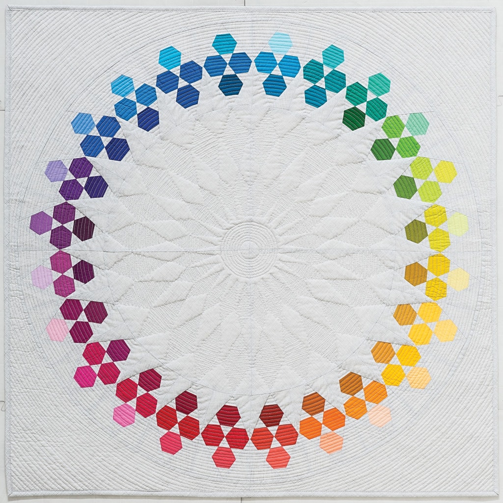
Circular Design – Huckleberry
A full spectrum works so well with circular designs. 72 colors!
How I did it: I used more fabrics within each color to create a seamless spectrum. I chose the inner ring fabrics first, made up of darker values. Then I selected the middle ring (mostly medium values) and outer ring (medium light to light values). The innermost ring moves towards the viewer while the outer ring moves away. Do you see it?
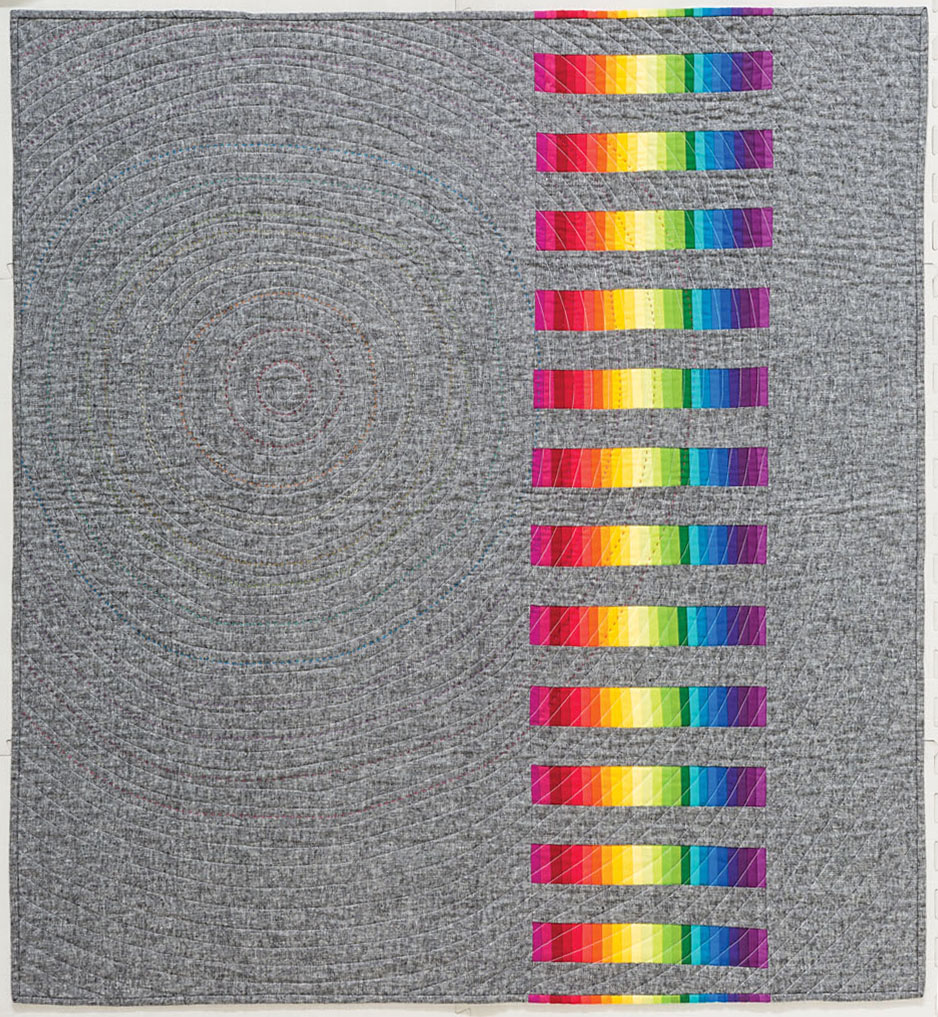
Linear Spectrum: In the Throne Room
In a linear design, you can use a spectrum from one end to the other.
How I did it: If you’re a purist, this type of design is for you. The first and last colors don’t need a transition color because they won’t be next to each other. I used saturated colors and gradations from one end of the spectrum to the other, which was offset by the negative space and gray neutral background.
Multiples of a Single BLock – IRish Plus
Irish Plus quilt is a simple design that becomes interesting when you play with the foreground and background fabrics. This type of design is perfect for using the entire spectrum.
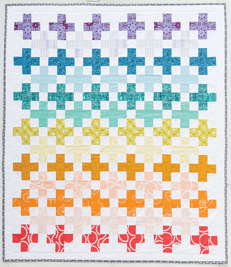
How I did it: Repeating blocks are easy designs for a quilt of many colors. Irish Plus design uses the entire spectrum in high volume fabrics in the foreground pluses and low volume fabrics in the background pluses. Bringing the background into the color mix in subtle ways makes this quilt inspired. Bring on the scrappy, too, with a repeating blocks design because while the fabrics change, the design controls the chaos.
Grid layout with carefully planned color placement – Lucy in the Sky
Lucy in the Sky is inspired by the traditional Ohio Star block on point in an an ordered grid.
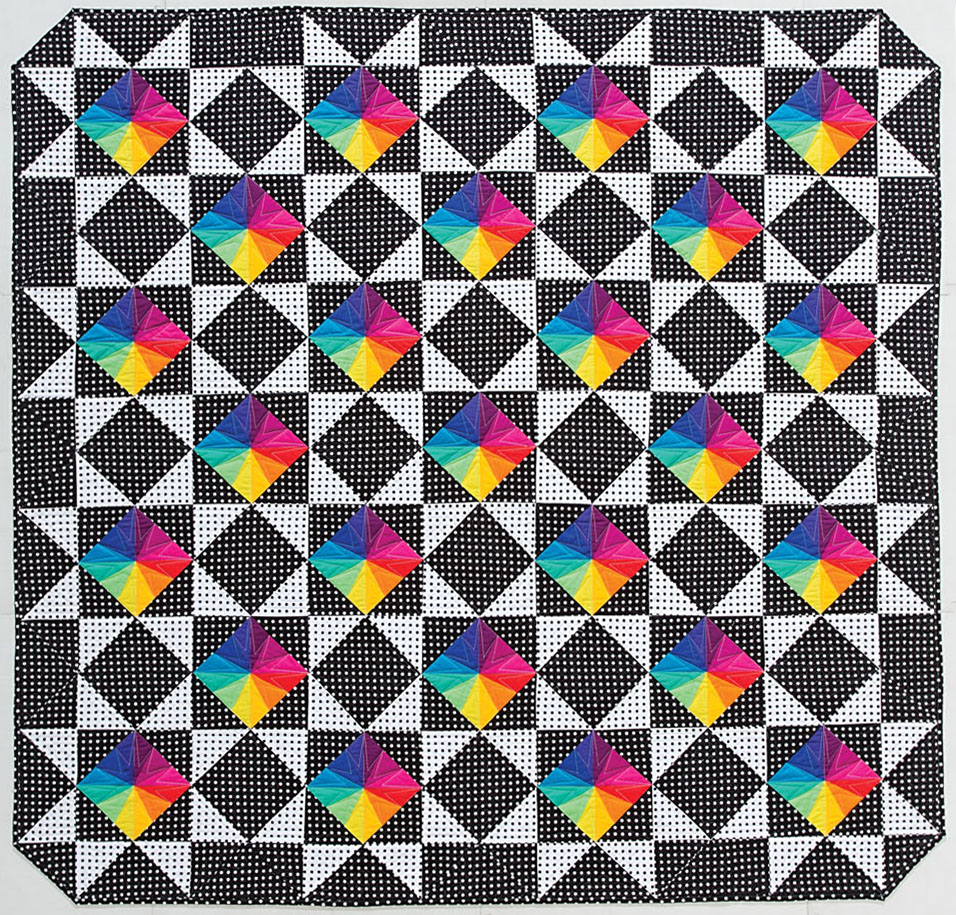
How I did it: I paired traditional repeating blocks with a bright, modern palette, going all-in! Rainbow palettes make great statement quilts when I want to bust out some color. Adding black and white print fabrics (versus solids) gave it an electric, psychedelic feel. Even though the bright rainbow blocks repeat themselves, the black, white and neutrals in a planned negative space made each one stand out. Without the negative spaces, the quilt would be too extra.
Historical Blocks – Bubbles
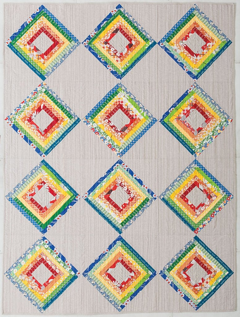
Bubbles is a log cabin block quilt. I shook up tradition by spacing the log cabins apart and creating a rainbow palette inside each block.
How I did it: I used print fabrics in different values to amp up the contrast and soften the colors in certain spots. The design has interesting transitions and contrast due to the fabric choice s. These blurred lines create an original log cabin quilt.
HIstorical BLocks – Streaked Lightning
Streaked Lightning is a take on the chevron and zig zag blocks. The vertical design created a built-in spectrum top to bottom.
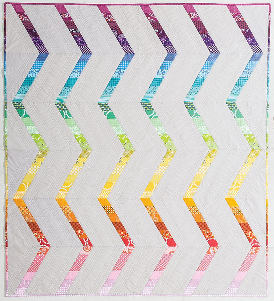
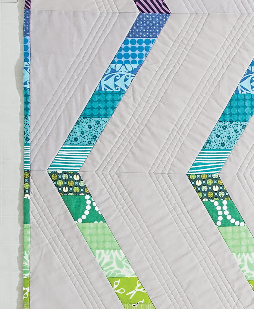
How I did it: I used a lot of tricks…
- Print fabrics created a seamless transition from one color to the next.
- Transitions from bright to pastel prints creates interest and movement along the strip.
- The spectrum colors move in one direction, which paired well with the vertical design.
- The zigzag design created a logical place for color transitions. That design element made alone made this quilt easier to visualize, especially with so many print fabrics.
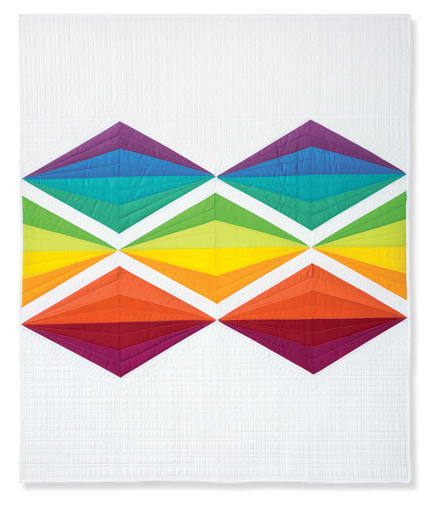
Large, graphic impact by repeating one shape – FLAME
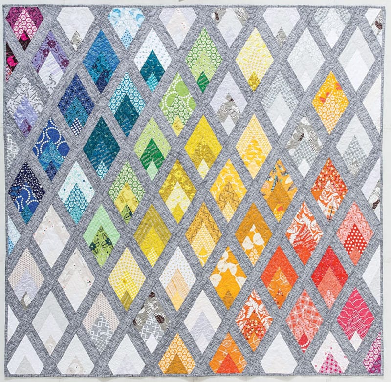
Flame repeats a large diamond with saturated and neutral colors colors, which creates a balanced design.
How I did it: I’ll admit…there’s a lot going on in this quilt! Gradations, movement, rainbow colors, prints and solids. The key was finding the right balance between the complex design and colors. The medium gray sashing frames and low-volume background fabrics balanced the bright diamonds. Notice how the color gradations inside the diamonds create depth? Gradations make any quilt more interesting and work beautifully with rainbow quilts.
Improvisational
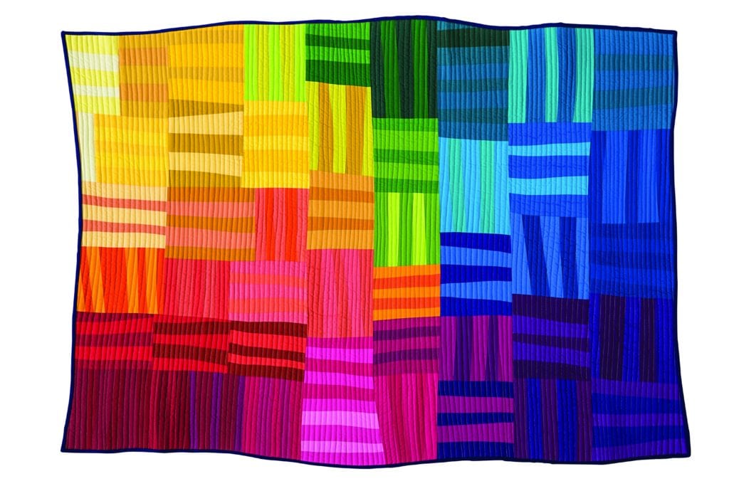
Rainbow Remix shows how many directions you can take color and composition in ONE quilt. I like throwing the rules aside when a wonky design needs a quilt. Rainbow Remix was inspired by several Gee’s Bend quilts.
How I did it: I dug into my huge solids stash and played with sets of each color until I found a combo I loved. The other criteria was using only medium and dark value fabrics. A design wall is super helpful with a wonky quilt. Test out your combinations and move blocks around until you’re satisfied. I considered adding a neutral strip in each block…maybe someday!
Negative space – in the throne room
In the Throne Room quilt pattern features a large negative space which balances out the rainbow intensity on the right side of the quilt.
How I did it: The colors are hot and saturated on the cooler gray print. Adding a printed background under intense solids created depth – the bars seem to float over it. The negative space balances the overall design: one-third is a colorful column, two-thirds for the background. Sometimes, bold saturated color needs an oasis of calm to make it work.

Minimalism – Scattered is a minimalist quilt pattern design which pairs well with a smaller palette.
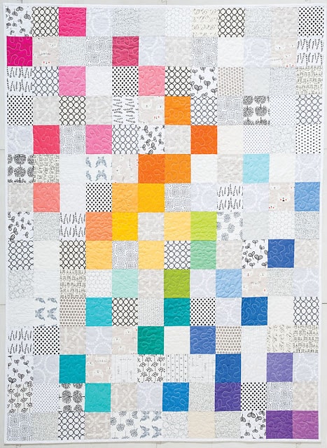
How I did it: I used pastels and medium value fabrics for a third of the blocks and neutrals for the remaining two-third. Pastels are tricky because they can become the background! They become unified focal points when used in a rainbow palette. I placed the colors diagonally to create movement and harmony. This principle of design is often called similar objects in a field. There’s a method to my scattered-ness!
Scattered is an example of using fewer colors while making design principles and elements work harder, like movement, repetition, composition, direction and dynamic line. If you end up with a blah rainbow, play with design principles to shake it up.
Ready to make your own rainbow quilt?
Start to finish, making a rainbow quilt involves a variety of techniques, including:
- Using a color wheel or rainbow spectrum
- Choosing fabrics by value, contrast and saturation
- Considering prints for color transitions
- Choosing a design that plays well with a rainbow palette.
- Quilting the top with straight lines, curves or textures
- Adding a binding to tie the color and design together.
FINISHING Your Rainbow Quilt
See my blog post series on finishing quilts – get the details on products, different methods and examples.
Types of batting for quilted projects range from warm and cushy to thin and sturdy. And those aren’t the only features. Learn about 9 factors that help you choose the right type of batting.
Learn all about different kinds of backing fabrics, how to sew them and ideas for piecing backs together.
Learn four methods for making a quilt sandwich and using the right tools to get it done.
Quilting as the final layer on top adds so much to the finish. Take time choosing your thread color and the stitching pattern – curves or straight line quilting. Use templates or mark your fabric for sewing curves and patterns if you’re not comfortable with free motion quilting. See my post below on Finishing a Quilt with Stitching to learn some easy straight line methods.
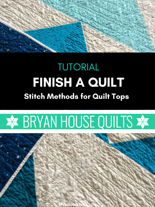
No longarm? No worries. Never stitched a quilt top? Got you covered. Learn how to stitch with straight-line quilting, use notions and presser feet, make a plan, and find more resources and tutorials on stitching.
I stitched a gigantic echo curve on In the Throne Room (see quilt above). Incorporating curves in a linear design makes a fantastic finish. Making curves in quilting might seem intimidating, but with a little practice, you’ve got this. See the resources section on free motion quilting.
Inspirational Rainbow Quilt Ideas
I hope I’ve given you helpful knowledge to craft your own quilt, lots of ideas and examples of how to apply my rainbow quilt recipes. Will these spark your creativity? Gosh, I hope so! Explore more similar ideas and inspiration that spark your creativity below.
Online Resources: YouTube Tutorials, Sites and Blogs
Check into these resources for rainbow fabrics and tutorials to get started. These sites and YouTube channels offer shopping, YouTube tutorial videos for all skill levels, from beginner to advanced.
- Missouri Star Quilt Company
- Fat Quarter Shop
- Sew Very Easy videos and tutorials
- Just Get it Done Quilts YouTube videos and tutorials
- Jordan Fabrics
Frequently Asked Questions
What are the primary, secondary and tertiary colors?
The primary colors are red, blue, and yellow on a quilter’s color wheel. The secondary colors are orange, purple and green. The tertiary colors are red-orange, red-violet, blue-violet, blue-green, yellow-orange, and yellow-green.
How can I add texture to my rainbow quilt?
To add texture to your rainbow quilt, use different stitches such as outlining, echoing shapes, running stitch, and by hand with cross-shaped stitches. These techniques will create visual and tactile interest in your quilt.
How do I choose the right binding and backing for rainbow quilts?
Choose longer strips with fewer colors for the binding to maintain a cohesive look, and opt for comfortable fabrics like cotton, flannel, or gray fabrics for the backing. This will ensure a cohesive and comfortable finish for your quilt.
By the Way, There’s Still time to join AURORA BOM!
Introducing the Aurora Block of the Month, an all NEW design for 2024! A beautiful symmetry of color and shape creates this stunning and enrapturing “modern triangle” quilt.

WOW, and triple WOW. Your article was so informative, very very interesting, and fun. I loved your remark “ask me how I know you’ll do this”. Haha, I’m can imagine you doing that same process. I love your quilts! I would say The Throne Room is my favorite, of all shown here. The vibrant on the grey is mesmerizing. And I don’t like grey colors. The circle stitching drew me in and made me love this quilt.
Your simple explanations on picking fabric colors made me want to jump back into quilting, almost. I have certain factors that it’s not possible. So I will continue to admire all quilts. I am grateful for your excellent,comprehensive article. I really did learn many new things. Thank you. I wish you continued success.
That’s wonderful to hear. Thank you!
Wonderful article. Lots of information and great ideas very inspiring!,
Thank you
Thank you for all of this information and your samples for using rainbow colors in a quilt. Although I love seeing rainbows in the sky, using the spectrum in quilts was never my thing. Seeing your quilts gave me a whole new perspective on how these colors can play out. I love all the quilts but was especially impressed by Streaked Lightning and how you managed to match your pieced binding to your chevron piecing. Amazing! Thank you again for such an informative post and opening my eyes a little wider to using the rainbow spectrum in my quilts!
love all nine ways………gotta do this before i get anynore white matter on my brain……..
ha! yes!