One question I frequently hear from quilters pertains to how to use printed fabric? No matter where you are on the path to quilting in color, finding the perfect fabric for your quilt is kinda a big deal!
Before knowing how to use printed fabric, it’s helpful to know what types of printed fabric is available to us quilters. I like to think about prints in two ways – by color (Part 1 – you are here) and by design (Part 2).
In this post, we’ll talk about prints in terms of color complexity – monotone fabrics, analogous fabrics, and multicolored fabrics. As we discuss each, think about identifying hue and saturation for each category.
As a quilter, identifying a fabric’s color and saturation is a key skill every color artist needs to master. It’s easier to do with fabrics like solids or monotone prints where there’s just one color but identifying a fabric’s overall color becomes more challenging as more colors are added. Once we know the print’s overall color and saturation then we’ll have a better idea how to use our printed fabric
Watch the Video Version:
Solid Fabrics
Identifying a solid’s hue and saturation is on the easy side. Though it can be tricky when grays are introduced to the hue. Typically it’s easy to first identify the hue and then the saturation.
When working with color palette building, I recommend working with solid fabric swatches or chips, without the distraction of print.
Monochromatic Fabrics
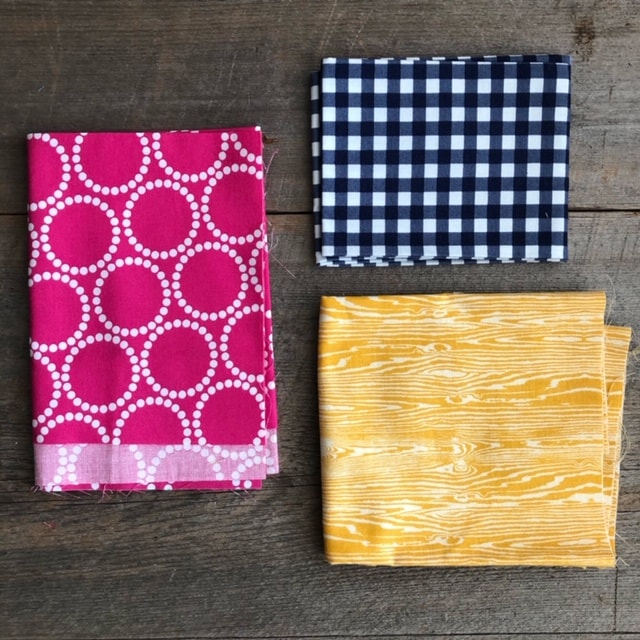
Monochromatic prints, or tone-on-white fabrics, are prints with just one color, making it relatively easy to identify the hue and then saturation. Naturally, we see the hue first but don’t forget to think about the saturation. Is it light, medium, or dark?
Tonal Fabrics
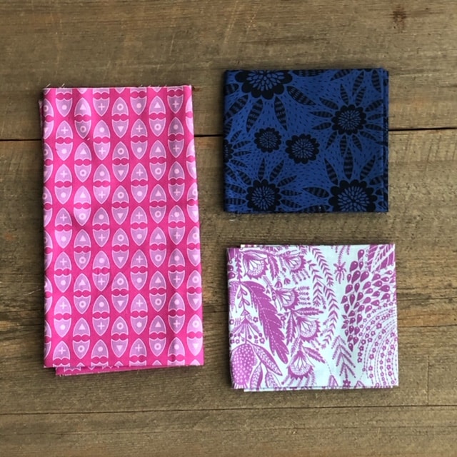
Tonal fabrics have shades, tints, or tones of the same color, e.g. pale blue with medium blue polka dots. The colors are still readily identifiable but don’t forget to consider whether the fabric is light, medium, or dark.
Analogous Colored Fabrics
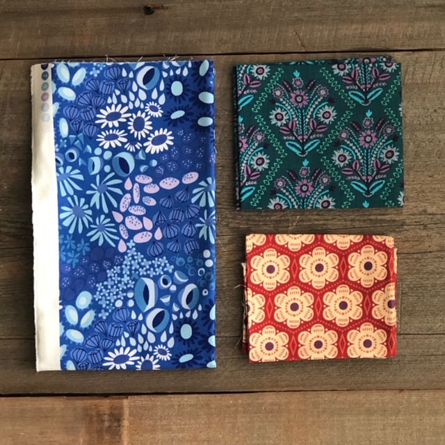
Identifying a fabric’s color and proper placement within a color palette gets trickier as additional color accents are added. Fabrics that have analogous colors (colors right next to each other on the color wheel) are easier to read. For example a blue fabric with yellow and green accents may still read blue but the addition of accent colors can make the fabric’s color or saturation read differently to the viewer.
Multicolored Fabrics
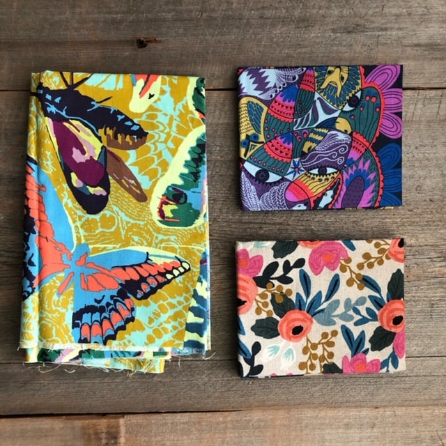
With multicolored fabrics there are many colors on the fabric, which sometimes makes it a judgement call when it comes to identifying the fabric’s overall color. The biggest struggle I hear with multicolored fabrics, is that many quilters struggle with where to store multicolored fabrics let alone how to use multicolored fabrics. We can look at the fabric’s selvedge to get a sense of what colors were used in the printing, but putting the fabric in a color category is going to continue to be a problem. Full stop.
But what if we didn’t sort multicolored fabrics by hue? Instead of sorting multicolored fabrics by hue, let’s consider sorting them by value.
Go Deeper
Think about how you might use monochromatic, tonal, analogous, and multicolored fabrics in turn. Oftentimes, but not always, a “successful” quilt mixes in a balance of all different types of fabrics.
We go deeper in the Playful Color Quilt Guild – members find this and a full discussion of each fabric’s purpose and potential pitfalls in the Prints Primer.
Not a member yet? Sign up for the waitlist here and I’ll let you know when the membership is open. And as a bonus for joining the waitlist, you’ll get the “10 Playful Color Tips” printable to help you play with color today.

Why is the membership restricted? When might I expect to advance from waitlist to membership? I am eager to play with colors with like-minded others.
I’m so excited you’re excited! It’s a great program and I really enjoy geeking out with the community. Hehe! The membership (for now) only opens to the public twice a year. The next opportunity to join will be early March. In short, I do this to focus on the current members and current content.
I have trouble picking a dark, medium and light hues… My medium and light hues tend to look the same…