Hi guys!
In a few days I will be launching my first online workshop, Design Improv with Triangles. (Get excited!) In the workshop I will be guiding you through designing and “improving” your own triangle blocks, a la the triangle block designs in Modern Triangle Quilts. As you design your own blocks, you’ll be learning about elements of graphic design and how they can apply t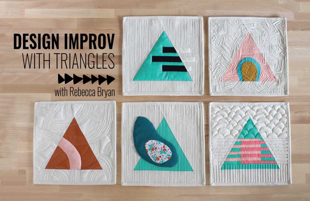 o quilt making through the lessons and hands on exercises.
But before I open registration, I want to introduce you to the field of graphic design. Today I will show you a few examples of graphic design and Monday I will be back with a post about common graphic design vocabulary. As I show you each example, I’ll show you how I think I might glean inspiration for quilt making.
Much of my design inspiration for Modern Triangle Quilts came from the field of graphic design. What I wanted to do with the book is to explore graphic design and how the field can be used in quilty adventures. I shared a bit of my experience in designing the equilateral triangle blocks in this post.
What is graphic design?
So what is graphic design? From The Professional Association for Design, “Graphic design, also known as communication design, is the art and practice of planning and projecting ideas and experiences with visual and textual content.”
In other words, graphic design is communication via pictures. Like an emoji. 🙂 😉
If you think about it, we consume graphic design everyday in many forms. From emojis to advertisements to signs to our gadgets and gizmos, graphic design is all around us. Personally I began to be more curious in graphic design as I became more involved in designing and writing my own quilt patterns. (And please know that I have NO official art training or graphic design training. I’m *just* a quilt maker. 😉 See now, I hope that winky emoji tells you that I’m kidding about the “just” part.)
What I find most striking about graphic design, is it has 2 components – form and function – just like a quilt. Each example of graphic design, like a quilt, serves a purpose and looks good while doing it’s job, too.
Ok, let’s jump right into some examples of graphic design.
Infographics
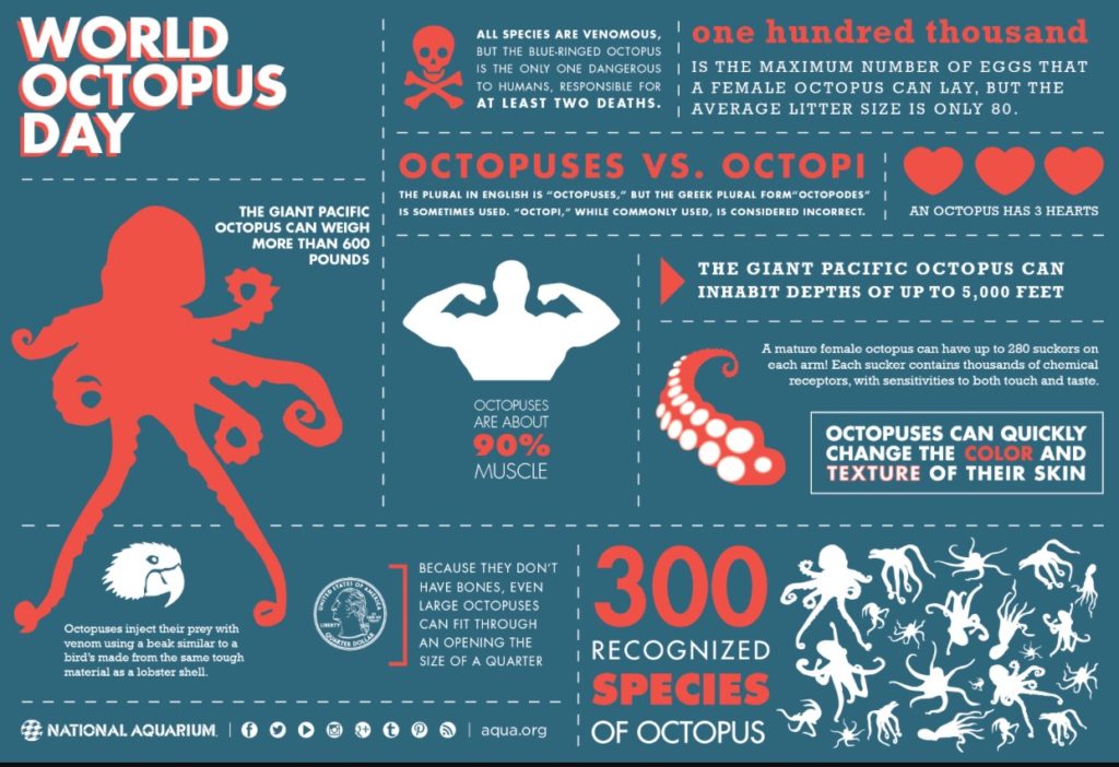 Infographics are some of my favorite graphic designs! Infographics use visuals and text to portray information quickly to the viewer. As a former researcher, I recognize that infographics are a great tool for researchers to communicate high level data in layman’s terms so us non-scientists can understand, and understand it quickly.
Take this infographic about octopi as an example. (What a fun, quirky topic!) By the way, if you like infographics you might enjoy this website or this series of books (there’s a new book every year).
How I might use this as inspiration: What inspiration might a quilter find in infographics? Truthfully, probably not a lot from this specific example. But we could observe how the designer has: divided the space into a grid/alternate grid; used scale to communicate important details. We can see how the designer used a unifying color scheme and used that color scheme to effectively communicate his message.
Magazines
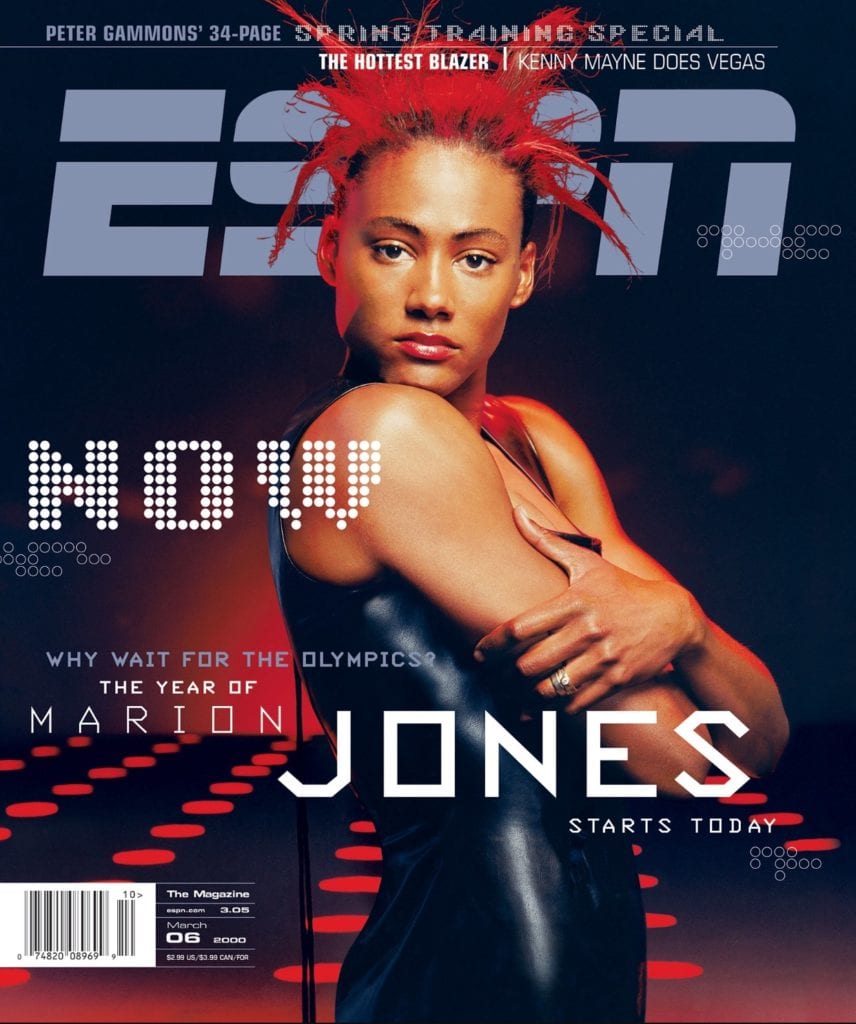 My husband subscribes to ESPN the magazine, and it may be silly, but I love the bold graphics and layout of the magazine. I chose this particular cover, because as a former track and field athlete (go Rice Owls!), Marion Jones was one of my idols. I got her autograph once at a meet. Sadly, she was too good to be true…
Magazines and newspapers and the like, are great examples of graphic design with a function and form. The graphic designer combines the journalists’ articles and phographers’ photos with a plan. Not only for beauty’s sake, but so that the reader wants to pick them up and take them home (ahem, after paying of course!). And one could argue the design, though it is visually appealing, is useful because it helps the reader digest the information.
How I might use this as inspiration: Personally for me, I love this magazine because of the bold graphic line work. And I do love their infographics. 😉 I find inspiration in the way they layer elements. Can you see the circles overlaying the bottom on the “n”? I love that texture and I think it would look really cool as texture on a quilt. Maybe in embroidery thread over a triangle block?
I’m showing you a magazine that resonates with me, but think about publications that might grab you? What elements about that publication do you like?
Product Design
So far we’ve just looked at 2-Dimensional designs, but products like furniture and
 gadgets and gizmos can be designed by graphic designers. Generally, a designer will consider the “look” of the product but also consider ease of use. Ain’t nobody want to use a gadget that is confusing.
Remember those mp3 players before the iPods Apple products are so successful because they are beautiful and a cinch to use. My babies could operate those suckers at 18 months! By the way, this article is a neat look into the history of mp3 players.
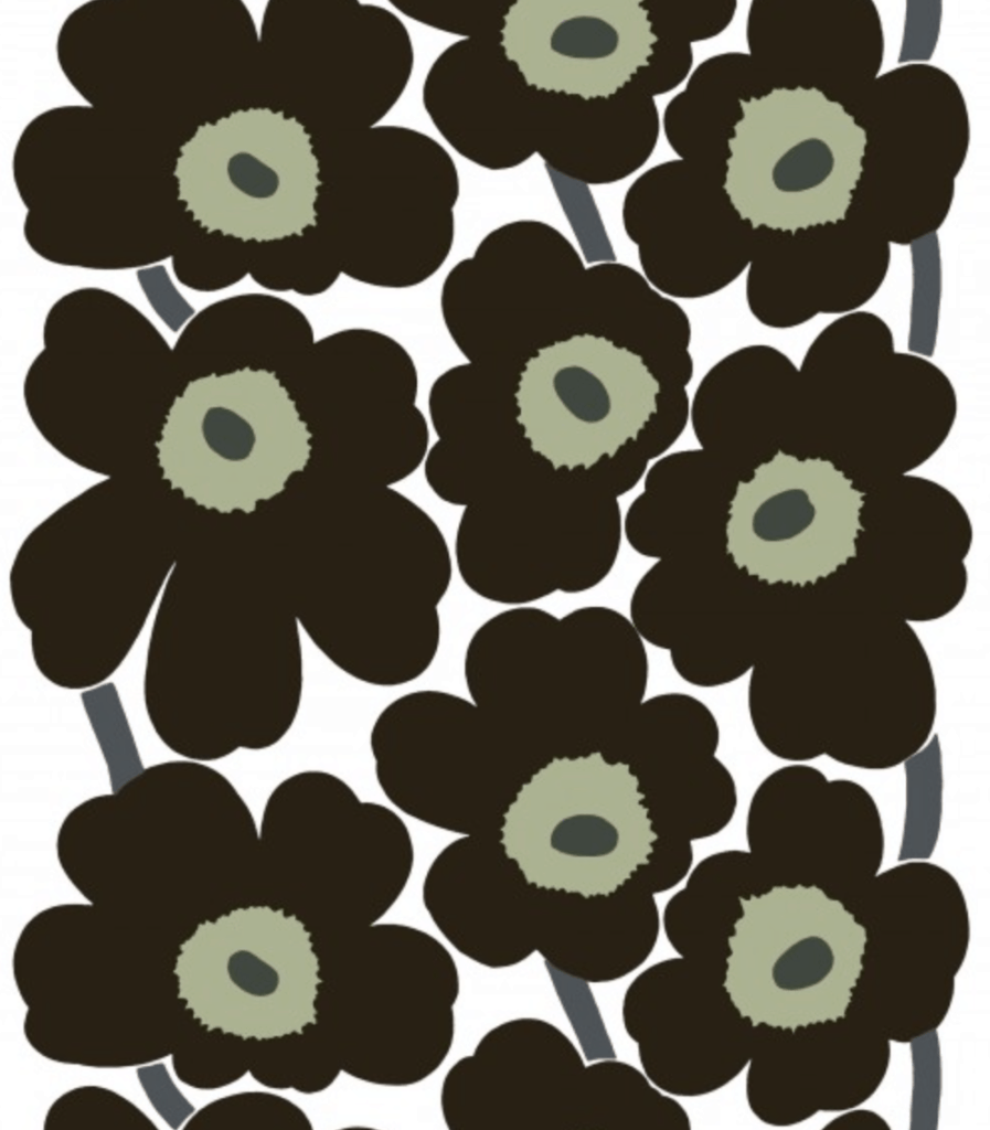
Speaking of product design, let’s look at Scandinavian design, which is a great source of graphic design inspiration and it often combines form and function. Think Marimekko and Ikea (squeeee!). It’s a movement characterized by simplicity, minimalism, and functionality (according to the wikipedia page). It’s a great example of form and function because we can use it tangibly, as opposed to consuming a magazine or a poster. We actually have a physical relationship with Scandinavian design. I love the idea that beautiful and functional everyday objects should be monetarily accessible and easy to use. That’s part of the function right? I personally have a version of this Ikea crafting table, and I love it! 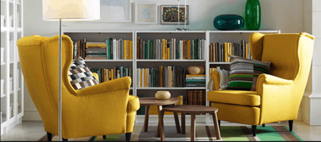
How I might use this as inspiration: So looking at products can be more akin to quilt making. We have that physical relationship with the object. Here I think it’s just to think about the intent of what you are making and how you want your audience to use it. For example, you would make an art quilt differently than you would make a quilt for a brand new baby.
Logos
Logos are fun. They are these bite size images that are supposed to communicate the essence of a company in 150 pixels or less. What a tricky balance. It’s an exercise in minimalism for sure. Side note… I always get distracted by tinkering with own logo.
Recently, I had an epiphany about minimalism. I never really thought myself to be a minimalist. But apparently I am. Minimalism is the bare minimum you need to make a point or an impact. Nothing more.

How I might use this as inspiration: I think logos can be an excellent example of minimalism and use of figure/ground. When you are forced to think small, sometimes cool designs can be discovered.
Posters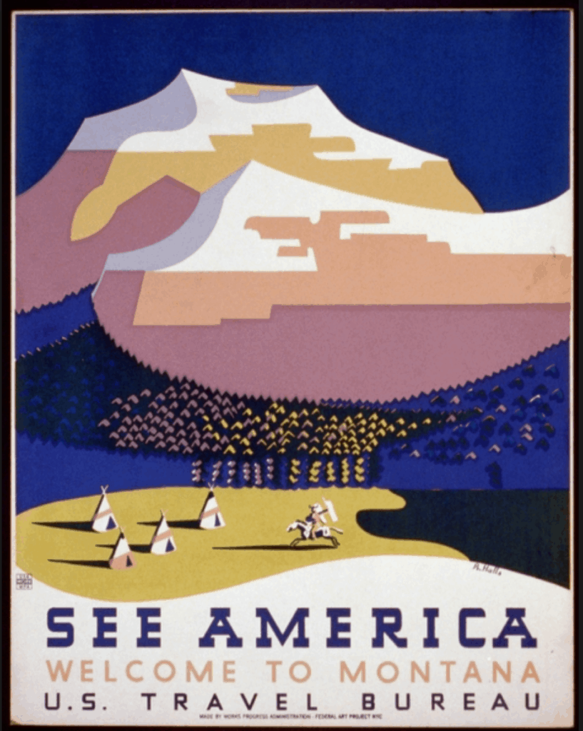
Posters, like infographics are a great place to look for great examples of graphic design. It’s almost like a paper version of a quilt right?
It’s really interesting to see how the designer divides the space and how he or she uses the information as an artistic element.
How I might use this as inspiration: Right off the bat, I am drawn to the colors in this “See America” poster. I also really love the simplicity of the mountains. The artist gave us just enough for us to know that those colors are mountains. Can you tell I’m a minimal type of gal?
There are also a lot of really cool lines to be found in this poster. I like the wavy line and then again the lines in the mountains are really cool. I do love the texture in the background too. The zig zag lines hint at the evergreen trees that would surely be at the foot of the mountain.
—
Now that I’ve shown you a few examples of graphic design, what now?
This project by AIGA is a really fun place to explore more graphic designs. And it’s a really beautiful presentation of the history of graphic design. It’s better than anything I could show you. Remember, I not a graphic designer, *just* a quilter! Ha!
Your next steps might be beginning to curate your owns tastes on Pinterest or an actual mood board. Peruse the world of media to see what grabs your attention. As you curate your pin board, you’ll get an idea of what kind of graphic design inspires you. You will probably get some fresh ideas for quilt making!
Also consider jotting down or sketching some ideas in your sketch book. I make sure to carry my sketch book everywhere because I find inspiration to strike in the most inconvenient places!
Ok, I’ll be back Monday with another post about graphic design in quilt making. This time I’ll be talking about common graphic design vocabulary. Also, if you want to preview my teaching platform, I’ve published this post in a mini-course about graphic design over on my teaching platform. You can check it out here.
In closing, I just want to add that these are examples that resonate with me and where I’m at creatively right now, so big bold, geometric designs with a side of octopod humor. What you like may be quite different and that’s ok. This is just a list of where you might start to consider different examples of graphic design.
What do you think? Have you considered graphic design for your quilts? What is your favorite source?

Becca — REally nice, and thought provoking review. Thanks.
Thanks Susan!
I love looking at old advertisements when I need something to spark an idea. Art Nouveau and Art Deco as well as 50ties newspaper, magazine and railway station ads are great a way for me to get started. Stamps too can be a good source. Illuminated manuscripts and heraldry can give ideas too.
BTW love Marimekko designs especially the earlier ones and another Scandinavian source for quilt designs is Georg Jensen Damask (https://www.georgjensen-damask.com/) and for piecing and embroidery I like Le Jacquard Francais (www.le-jacquard-francais.fr) .
Great to hear that others are interested in graphic design inspiration too
Ohhhhh! Lots of good info hear. I love old advertisements too.
I’m a bit familiar with your other mentions. I’ll have to do some research. Thanks for sharing!
Wow – I just re-read this post and I am excited. You are awakening a lost love in me. I used to cut out and save many graphic designs. Just have not done that for a long time. Now I see that those “boards” really were showing graphic designs that I loved. Just didn’t know the name for them. Thanks. This is going to be really fun.
No, I had never thought about graphic design per sé. However, I have been taking that “fork in the road” that is taking me into the modern world of quilts. I blame Jinny Beyer for that. Hew quilts really grabbed me enough that I have taken a few of her online classes. She is quite compelling both in the way she teaches but expecially in the quilts she designs… and her fabrics. I love the bold colors of her geometric designs. I love the way she plays with movement, color and mirrored images especially through her borders.
This morning my eyes were drawn over to Pat Basche;s quilt top. It caught my eye and immediately,, I forgot what I was doing and just… looked. I couldn’t take my eyes off of it. It reminded me of my Danish heritage and I’m proud to say that this was a “hygge” experience. (The term is Danish which has not a single English word for it. It’s many positive feelings like euphoria, contentment, happiness, peace, giddiness, loving.)