Today, I’m continuing the monthly series, From Color Palette to Fabric Pull, I began in August. To refresh, I’ll be choosing a color palette from my Love Patchwork & Quilting Color Theory column and building a fabric pull around that palette. In doing so, I hope to share more of my color and fabric choosing insights, which I hope you will find helpful. Creating these fabric pulls each month has already shown me a few things about my color habits!
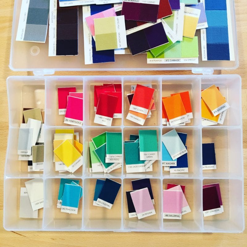
I love choosing color combos with color chips. (I’m using a cut up Kona Solids Color Card.) Using a cut up color card makes it easy to move colors around and compare. But color cards have most of the colors whereas my stash and even the available fabric on the market is limited in color range (Hello neon coral? Where are you?). So even if we have a killer color combo in mind and in color chips, we might not be able to create such a combo in our fabric pulls.
I must(!) share with you an organization strategy I learned from Violet Craft. In one of her instagram posts, Violet showed her Kona chips in one of these containers. My mom had an extra so now my color chips are organized! Woo hoo! They are so easy to find now. Before they were in a plastic bag! Lame!
Ok, back to the regularly scheduled series…
And even though we love fabric, unfortunately we can’t (easily) change it’s color. So instead we have to adapt our chosen color palette to our stash or what’s available for purchase. So as I go about moving my color palette to a fabric pull, I’ll show how I adapt my chosen color palette to fit my fabric.
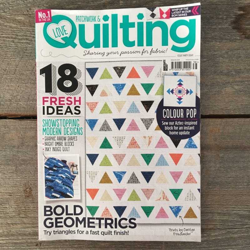
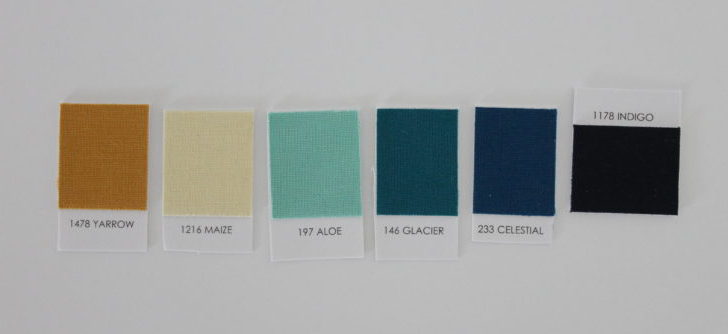
This palette, “Constellations” is one of my favorite color combos from Issue 38 of Love Patchwork and Quilting. The warm evening sky, newly dotted with stars inspires these colors.
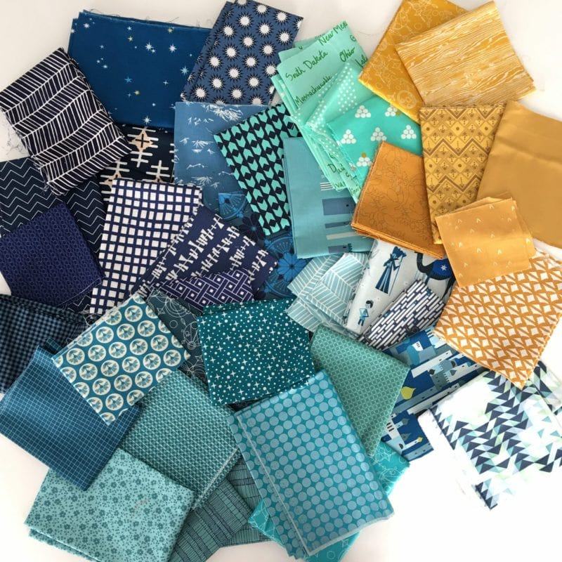
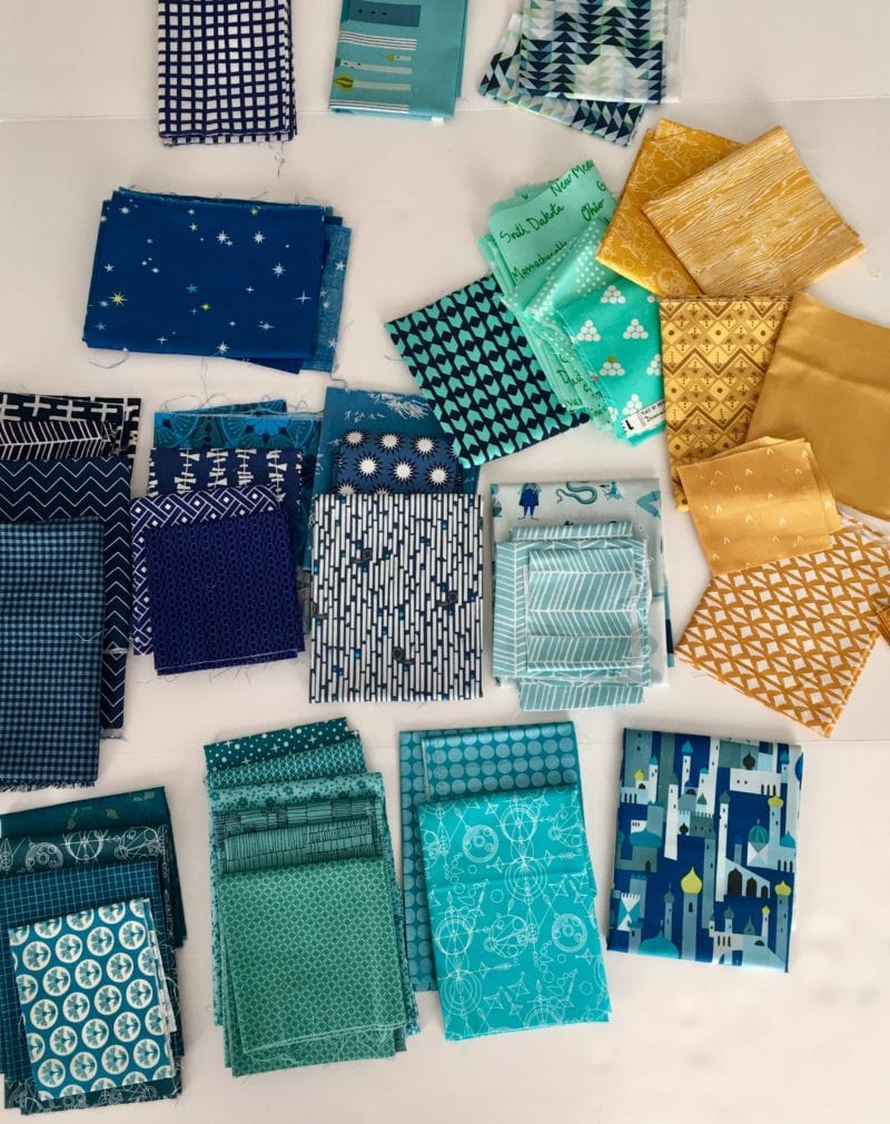
So after going to my fabric stash, I pulled all the colors I felt matched, “Constellations”. Then I laid them all about on a well lit surface. It’s great way for me to see how the colors play together and plus, it’s a really pretty picture!
I should note here that right away, I avoided pulling any low volume colors, which could have been a missed opportunity. I’ll get to that more as we move through this post. As I’ve done these fabric pulls, I’ve noticed something about myself; I tend to gravitate toward a darker or medium value fabric pull. But I think I can miss a chance to create depth by using different values.
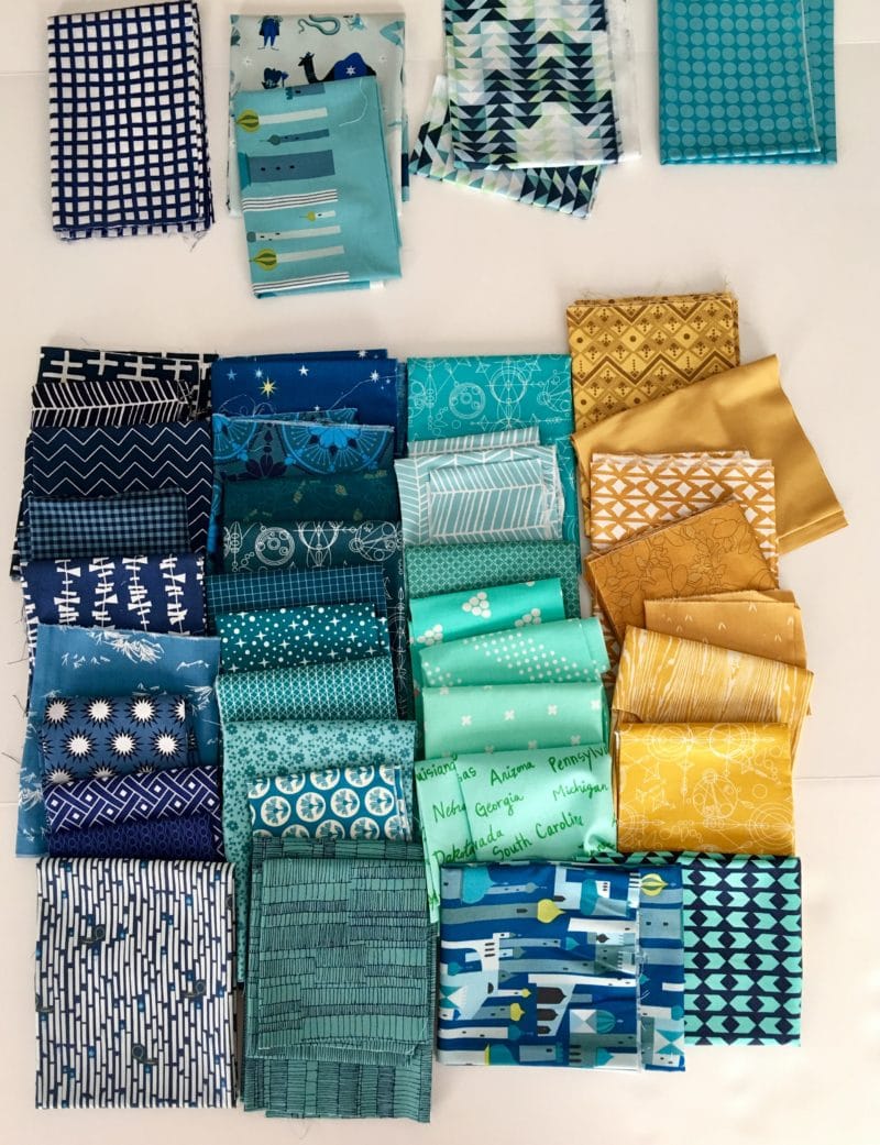
So, my next step, is to organize my fabrics a bit. Here I’m in the process of organizing the fabrics a bit better. This process is helpful for me as I can figure out which fabrics are similar in color. Once I have them arranged by color, I can arrange them from highest volume (darkest) to lowest volume (lightest). I’m already removing fabrics that I don’t think will work.
Here’s close to my final arrangement. The fabrics at the top I decided to remove from the final palette. The blue and white, I felt was too white. Again there’s my gravitation toward more saturated colors. Then there are 2 Lizzy House prints, that I love, but I guess I never can seem to find a use for them. Then, the flying geese print by 1canoe2, I wasn’t sure about because it’s not one color.
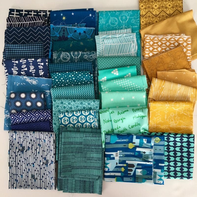
Here’s the shot of the final fabric pull. I love these colors together! These fabrics would look great on a warm neutral background. But as I write this post I realize that putting these fabrics against a rich navy blue background would be divine. If I were to use a dark background, I might go back to my fabric stash and look for some low volume fabrics to compliment the deep color.
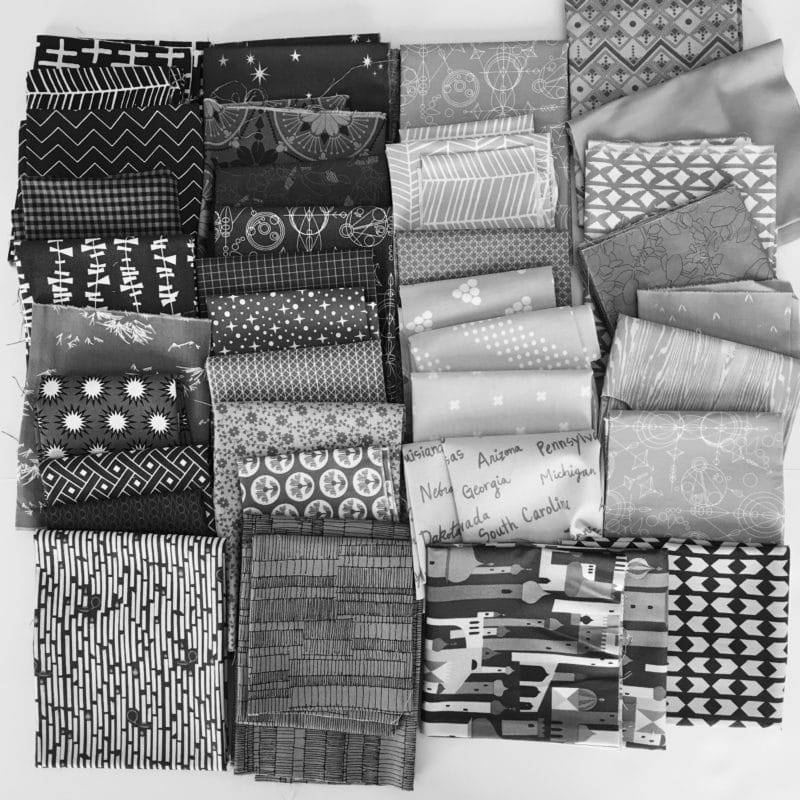
Let’s put a black and white filter on my picture… As the fabric pull stands now, I don’t think I have much variation in terms of value. I mean, how much is enough? I definitely think I could increase the volume changes within each color. Do you see what I mean? It looks like my navies and my teals are similar to each other in volume, while my aquas and yellows are similar to each other. I guess I’m just playing with color, but not value. Hm…. I think this is an area I could explore more going forward.
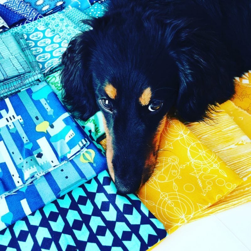
My puppy, Bruce Wayne, is helping to showcase the pretty colors.
(I hope these exercises are helping you all as much as they are helping me!)
Many of my fabrics shown are no longer in stores, so if you are shopping for similar fabrics you might consider shopping Pink Castle Fabric‘s navy section or aqua and teal section. At the Fat Quarter Shop, look at April Rhodes‘ fabric, who has some really lovely fabrics that would fit this particular color palette beautifully.
To sum up, I created a fabric pull based on one of my color palettes from my Color Column in Love Patchwork & Quilting, and I’ve realized I need to consider working on my use of low volume fabric. I can’t say that I’ll change, but I’m going to give it a whirl to make sure I’m not missing anything!
Everyone has their own sense of color, but if you feel you could use some help in the color department, it might be fun to practice building color palettes and pulling fabric for those palettes. Just by practicing you will gain confidence in your color choices and perhaps learn more about yourself, as I have about myself! If you’re creating a color bundle using my feature please share! You can tag @lovequiltingmag and use #LPQColourPalettes on Facebook or Instagram. You can also leave a comment on this post with a link.
Bonus Content: Subscribers to the BHQ Newsletter can download my free 6 Step Guide to Choosing Color Palettes.

Hi and thank you for a great post! I love your colours chips in that organizer. You inspired me to practise by making some bundles even not starting a quilt. x Teje