Hi there!
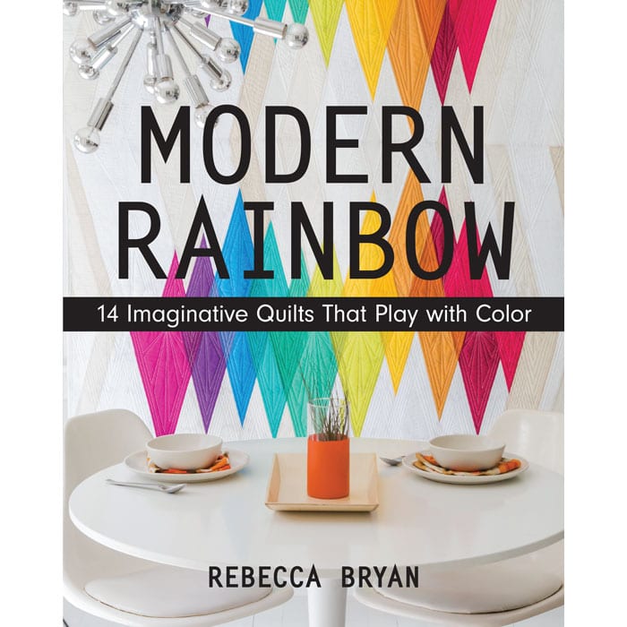
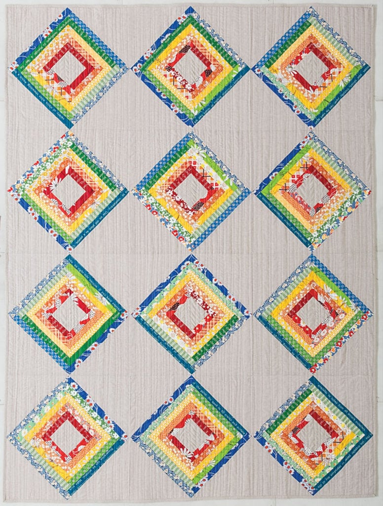
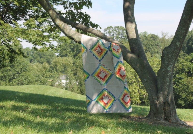
I’m continuing my quest to show you the rest of the quilts from Modern Rainbow. Next up is “Bubbles”. Though the quilt gets it’s name from that rainbow sheen seen on those big, floppy soap bubbles, we called my grandmother “Grandma Bubbles”. (She was not big or floppy.) So the name is a nice nod to my grandmother, whom I miss.
She passed away a month after I got married. Oftentimes, I think about her. I knew her when I was a girl. I sure would have liked to have known her as a grown woman with kids of my own.
This quilt, I categorized as “Traditional” because it obviously is inspired by the classic Log Cabin block. There’s so much you can do with Log Cabin blocks, whole books are dedicated to this one block! I chose to use the block to explore texture within each color.
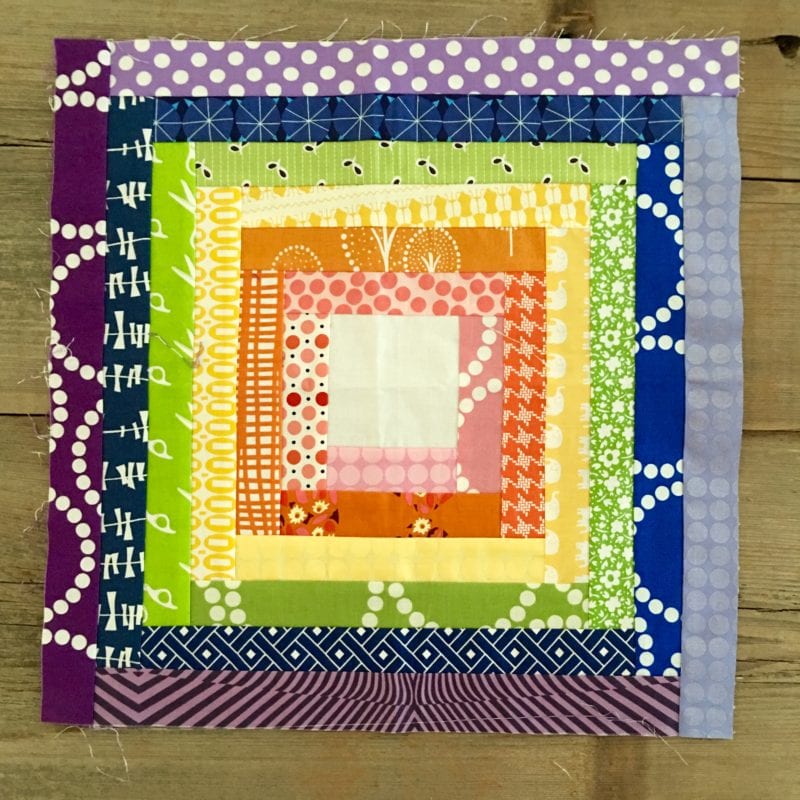
Before I show you more of the final product, I’d like to show you the test block.
At first, I tried these colors in the test block. I hated the results, and the colors were so bad that I doubted myself as a person. (Ha! I wish I were kidding, but I tend to be a bit dramatic.) As a result I shelved this quilt for quite awhile.
Upon reflecting on my discomfort and dislike of the test block, I realized this block needs a strict color range for each “layer” to pop. You’ll notice in the test block that within each color, there are variations in the saturation of the colors. For example, in the pink layer I thought it’d be fun to mix in some low volume fabrics. Maybe subconsciously I was working this out because the blue and green colors have little to no variation in saturation, but on the other hand there is variation in the blues and then purple is all over the board. It’s too much going on in one block.
After considering a neon rainbow and black center squares I tried again using a retro themed color palette. You’ll notice that my rainbow color palette is limited, very limited, to merely 5 colors. For other rainbow quilts, I might let the color fluctuate to build a transition between colors. But for this quilt, I didn’t want any kind of transition and I wanted each color to be uniform.
I love retro inspired fabrics and this pattern is just perfect for 30’s reproduction fabrics. To add variation and texture, I choose to use several fabrics within each color. But I stuck to the very strict color palette, the same reds, the same oranges, the same yellows, and so on.
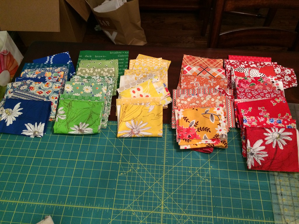
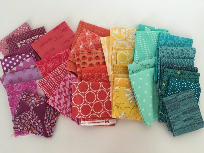
Though this recent fabric pull has 1 color too many, it’s a great example of a fabric pull that (I think) would look great in Bubbles. Each color is the same color and the colors contrast sharply.
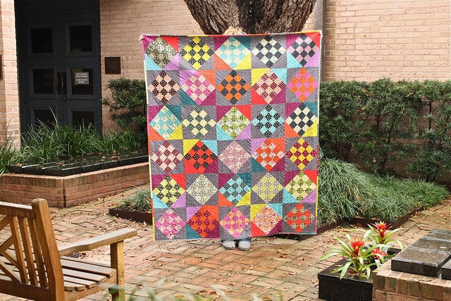
One last thing to mention, for the pattern I made the background squares a bit differently. Initially I was working toward creating a secondary pattern using those background squares like in my Mr. Jones quilt. I think using black and white prints to create the secondary pattern would be just darling.
Purchase a signed copy of Modern Rainbow in my shop. Find it on Amazon, or ask for it at your local quilt shop.
