I know it’s September, but ima slip this in like it’s August.
Cough. Cough… 🙂
Today, I’m continuing the monthly series, From Color Palette to Fabric Pull, that I started last month. I’ll be choosing a color palette from my Love Patchwork & Quilting Color Theory column and building a fabric pull around that palette. In doing so, I hope to share more of my color and fabric choosing insights, which I hope you will find helpful.
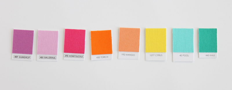
I love choosing color combos with color chips. (I’m using a cut up Kona Solids Color Card.) Using a cut up color card makes it easy to move colors around and compare. But color cards have most of the colors whereas my stash and even the available fabric on the market is limited in color range (Hello lavender? Where are you?). So even if we have a killer color combo in mind and in color chips, we might not be able to create such a combo in our fabric pulls.
And even though we love fabric, unfortunately we can’t (easily) change it’s color. So instead we have to adapt our chosen color palette to our stash or what’s available for purchase. So as I go about moving my color palette to a fabric pull, I’ll show how I adapt my chosen color palette to fit my fabric.
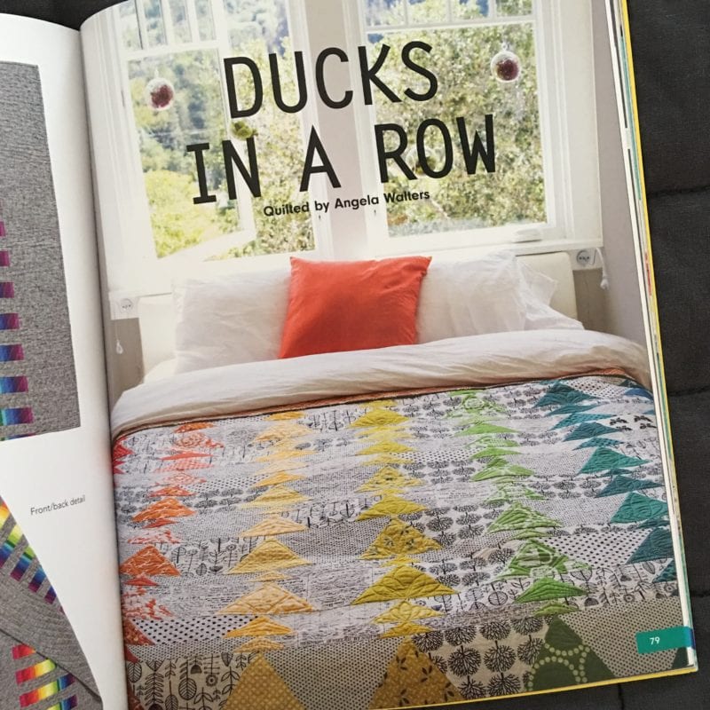
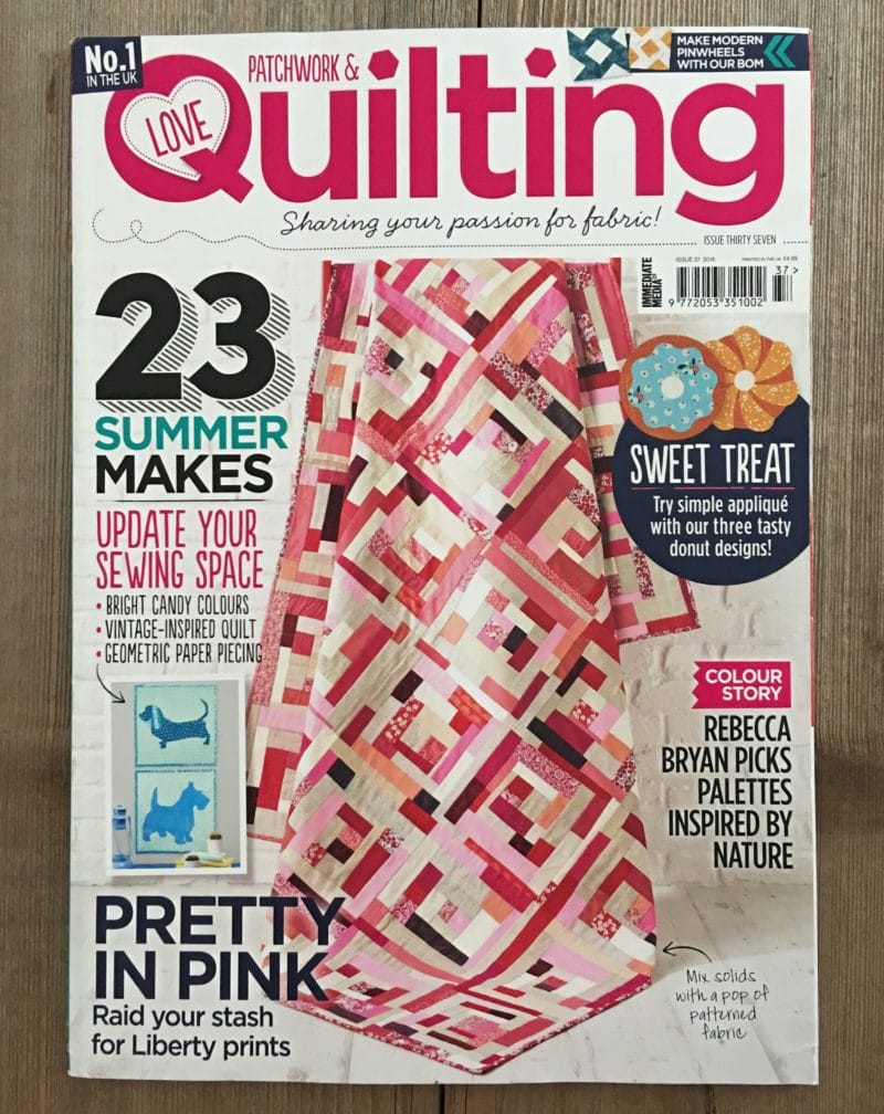
I’ll be teaching a class on the “Ducks in a Row” quilt from my book Modern Rainbow. I need to prep the step outs and I really want to work with this combo, “Fiesta Rainbow”, from Issue 37 of Love Patchwork & Quilting.
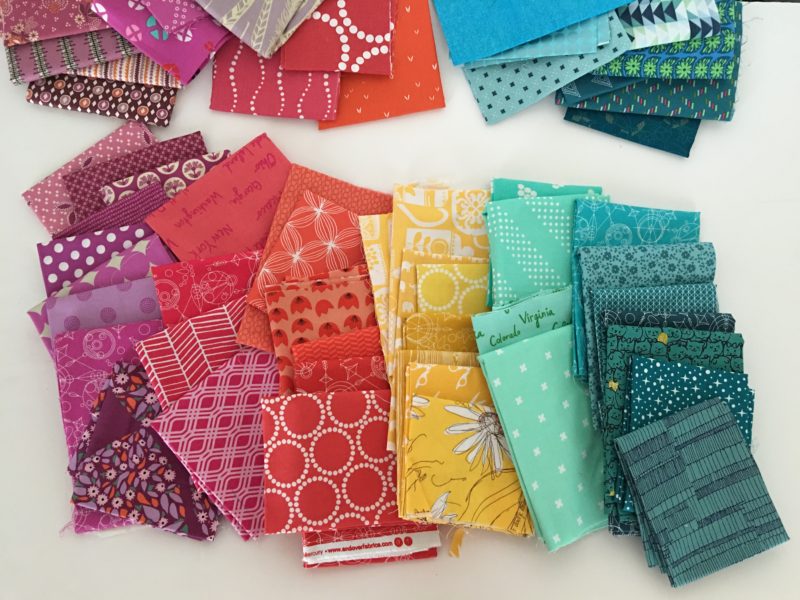
For my step outs, I’ll be needing 6 different colors. I’m going to use the “Gumdrop”, “Honeysuckle”, “Mango”, “Citrus”, “Pool”, and “Kale” as a starting palette. I started by going to my fabric stash and pulling all the colors I thought matched.
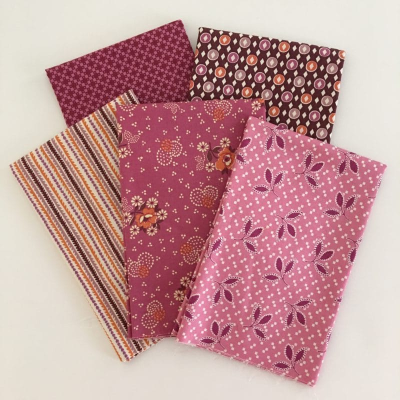
Then a half yard bundle of purple-pink Hope Valley by Denyse Schmidt distracted me. I’ve been hoarding it and I forgot about it! I would love to use Hope Valley, so I’m going to try to incorporate it into my fabric pull.
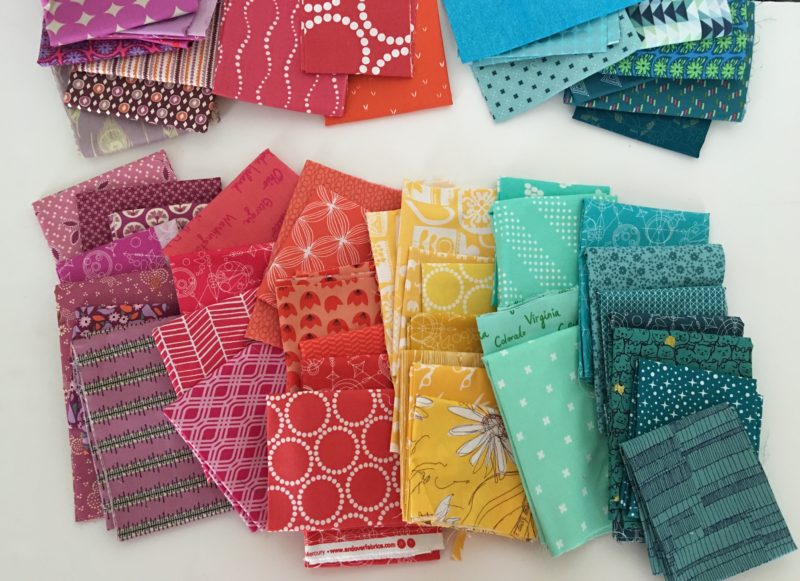
I quickly found that a lot of my yellow fabrics are more mustardy yellow than citrus yellow. Hm. I think that will work. And while I’d say “Kale” is a fairly true green, apparently my mental idea of “Kale” told me teal instead. The heart wants what the heart wants. I also think it’s interesting to note that I’m using a light teal and a dark teal.
For this fabric pull, I’m placing the purples by the warm colors. Normally in a rainbow purple is by blue and reads like a cool color. But for this palette the purple has a lot of pink in it and reads warm to me.
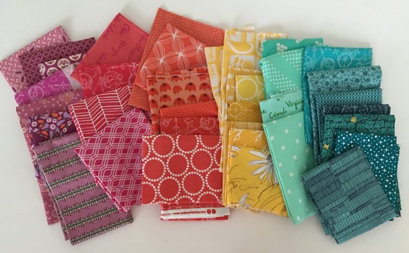
After distilling my fabric pull, I’m not happy with the purples. To my eye the purples look rather lackluster next to the coral pinks. Do you agree? I’d like to see more of a color contrast between these 2 colors. The fabrics are beautiful, but the Hope Valley purples aren’t quite as bright and saturated as the rest of the fabric pull. It also looks like some of the purples are reading cool whereas I wanted warmer, pinker purples. So, I’m going to go back and edit the purple-pink pile.
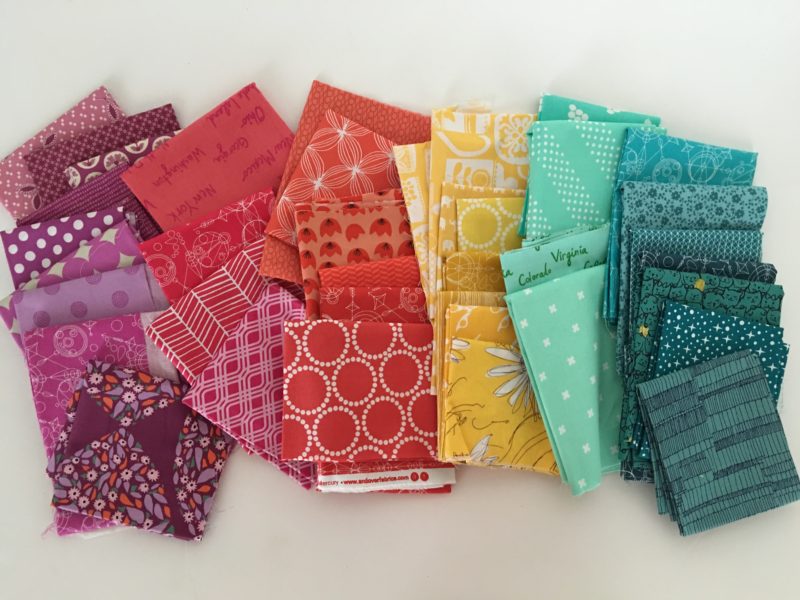
Ok, so I removed a couple more of the Hope Valley purples from my pile. I also added some vibrant shades to the purples. I also want to add that since I’ll be using a lot of different black and white background fabrics, I want the colors within each grouping to be very similar. The different fabrics are going to create a lot of contrast and busywork for the viewer’s eye. Keeping the colors fairly uniform within each grouping will allow the viewers eye a place to rest and give the quilt some consistency.
And here’s my final fabric pull. I’m really happy with this fabric pull. It’s so happy and colorful. Next step is cutting!
As I cut I decided to not use the Hope Valley (or the top 2 fabrics) from the purple pile. I think I’ll save the Hope Valley for a different project. I’d love to see the fabric next to some lime greens as in the original colors Denyse set forth.
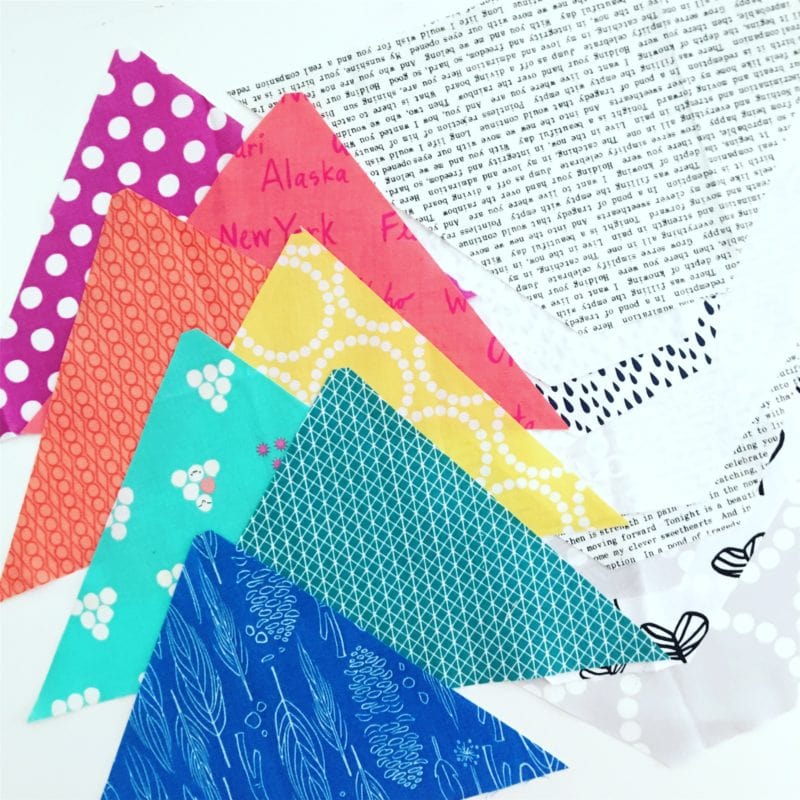
Here’s a preview of the colors together. It’s super bright and happy! Just what I needed for class.
So to sum up. I had a palette. I got distracted by fabric gold. The fabric gold didn’t quite fit into my color scheme. I tried to make it work, but it didn’t. Am saving fabric gold for future use. The end.
If you feel you could use some help in the color department, I encourage you to practice building color palettes and pulling fabric for those palettes. Just by practicing you will gain confidence in your color choices. If you’re creating a color bundle using my feature please share! You can tag @lovequiltingmag and use #LPQColourPalettes on Facebook or Instagram. You can also leave a comment on this post with a link.
Bonus Content: Subscribers to the BHQ Newsletter can download my free 6 Step Guide to Choosing Color Palettes.

Love your BFF quilt pattern. Just bought it my local quilt shop
Yah! Thank you so much!