Hi there!
Today, I’m starting a new monthly series about fabric pulls, From Color Palette to Fabric Pull. I’ll be choosing a color palette from my new Love Patchwork & Quilting Color Theory column and building a fabric pull around that palette. In doing so, I hope to share more of my color and fabric choosing insights, which I hope you will find helpful.
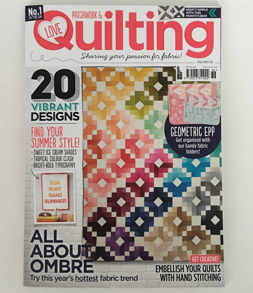
I love choosing color combos with color chips. (I’m using a cut up Kona Solids Color Card.) Using a cut up color card makes it easy to move colors around and compare. But color cards have most of the colors whereas my stash and even the available fabric on the market is limited in color range (Hello lavender? Where are you?). So even if we have a killer color combo in mind and in color chips, we might not be able to create such a combo in our fabric pulls.
And even though we love fabric, unfortunately we can’t (easily) change it’s color. So instead we have to adapt our chosen color palette to our stash or what’s available for purchase. So as I go about moving my color palette to a fabric pull, I’ll show how I adapt my chosen color palette to fit my fabric.
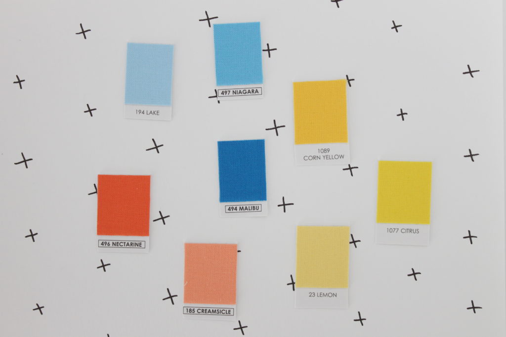
This month, I’ll be using the palette “Blue Skies and Beach Balls” from Issue 36 as a starting point. I chose this palette because I really want to play with a bright orange. Ok, for demonstration purposes, I’ve chosen Hexy Plus as the quilt pattern I’m going to make.
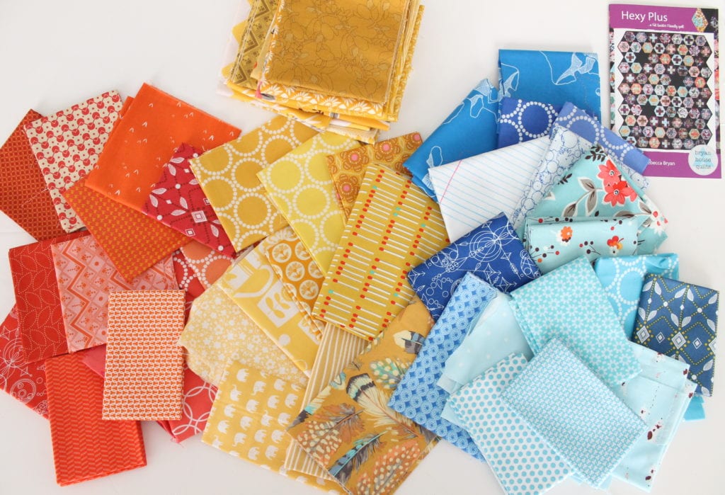
After choosing a pattern and color palette, I normally go to my fabric stash and start pulling fabrics I think will match. I’ve laid all my fabrics out in a bright place with natural, but not direct, sunlight.
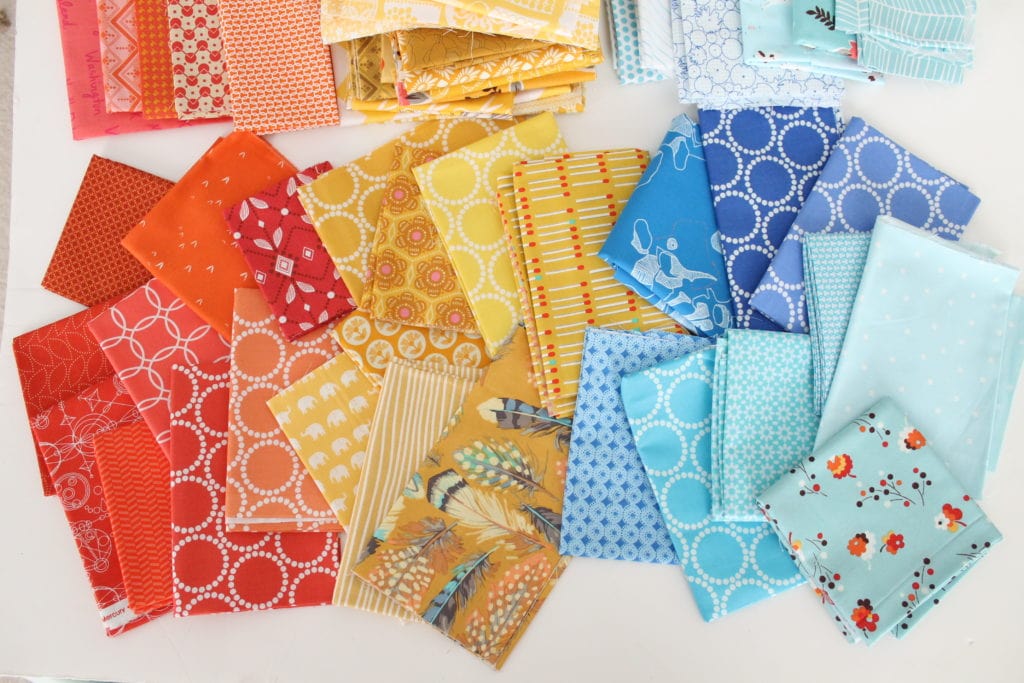
To make a throw sized version of a Hexy Plus quilt, I need 22 Fat Quarters or 1/4 yards. So I need to edit down my fabric choices both by color and number. Since it seems the number of fabric choices won’t be a limiting factor, I’ll start with paring down by color.
At the top of the pictures are the fabrics I’ve removed from consideration. With the oranges, I removed all of the oranges that read as coral or pink. My stash had more gold flavored yellows than bright yellow. Therefore, I decided to take my palette in the gold direction. For my blues, I really wanted more of a true bright blue, like the Carolyn Friedlander Carkai print in Malibu. But alas, my fabric stash did not accommodate. (Sob! This one hit me hard. I *need* more of this blue!) So I adapted the palette for an Aqua blue. For my last edit for this round, I removed all the low volume fabrics. I really want the colors to pop against each other. Using low volume fabrics would diminish the pop. And I just can’t have that. 🙂
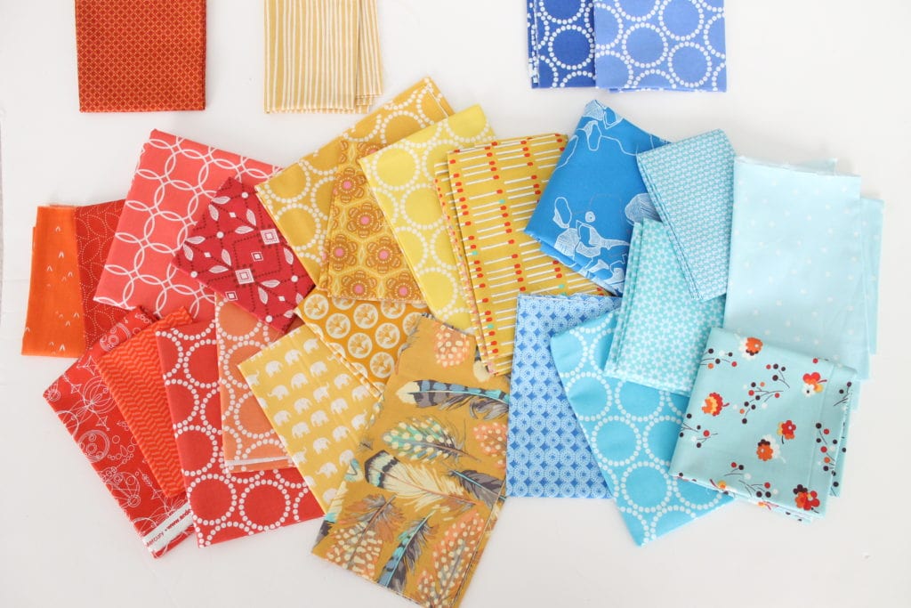
I need to edit my choices a bit more because I have too many fabrics! I need to take this palette down to 22 different fabrics. At this point, with the Hexy Plus pattern in mind, I’m trying to keep the colors mostly within the same hue. For example, I removed the dark blue and light blue Lizzy House Mini Pearl Bracelets.
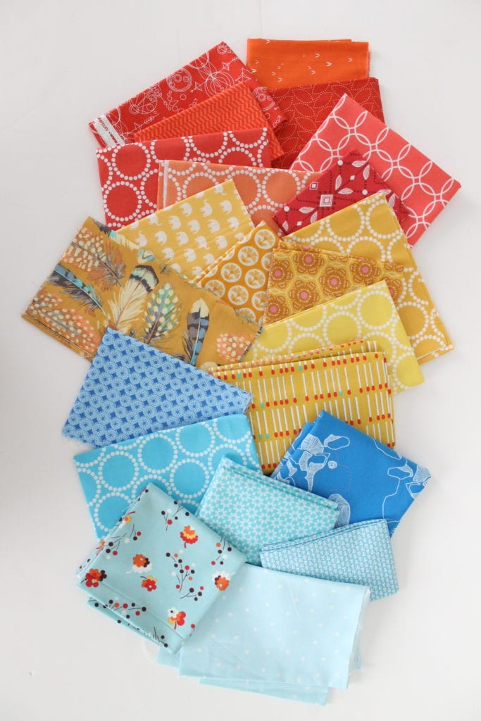
And here are my final fabric choices. For the background, I would likely use Kona Snow.
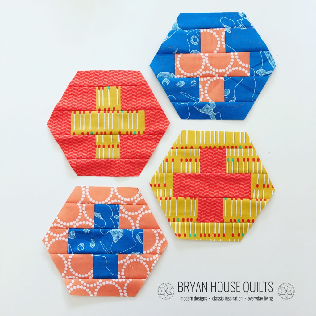
And here’s a couple of sample Hexy Plus blocks because I couldn’t resist making up a few!!
If you feel you could use some help in the color department, I encourage you to practice building color palettes and pulling fabric for those palettes. Just by practicing you will gain confidence in your color choices. If you’re creating a color bundle using my feature please share! You can tag @lovequiltingmag and use #LPQColourPalettes on Facebook or Instagram. You can also leave a comment on this post with a link.
Bonus Content: Subscribers to the BHQ Newsletter can download my free 6 Step Guide to Choosing Color Palettes.

Nice tutorial!
Thank you for sharing, I love the colors and fabric choices! Please share information on the feather fabric.
Thank you! I cannot remember who made the feather fabric. It’s from years ago! I’ve done a bit of googling and the name just escapes me. I’m sorry!
That’s ok, thank you for checking!!!
So fabulous, Becca! I love this sort of thing!!!
Thanks! That’s great to hear! 🙂
The desire for tranquility, strength, and optimism have inspired a Fall 2016 color palette that is led by the Blue family. Along with anchoring earth tones, exuberant pops of vibrant colors also appear throughout the collections. Transcending gender, these unexpectedly vivacious colors in our Fall 2016 palette act as playful but structured departures from your more typical fall shades.